
For Beginners: Making Your Own Visualization
– By Kristen Sosulski
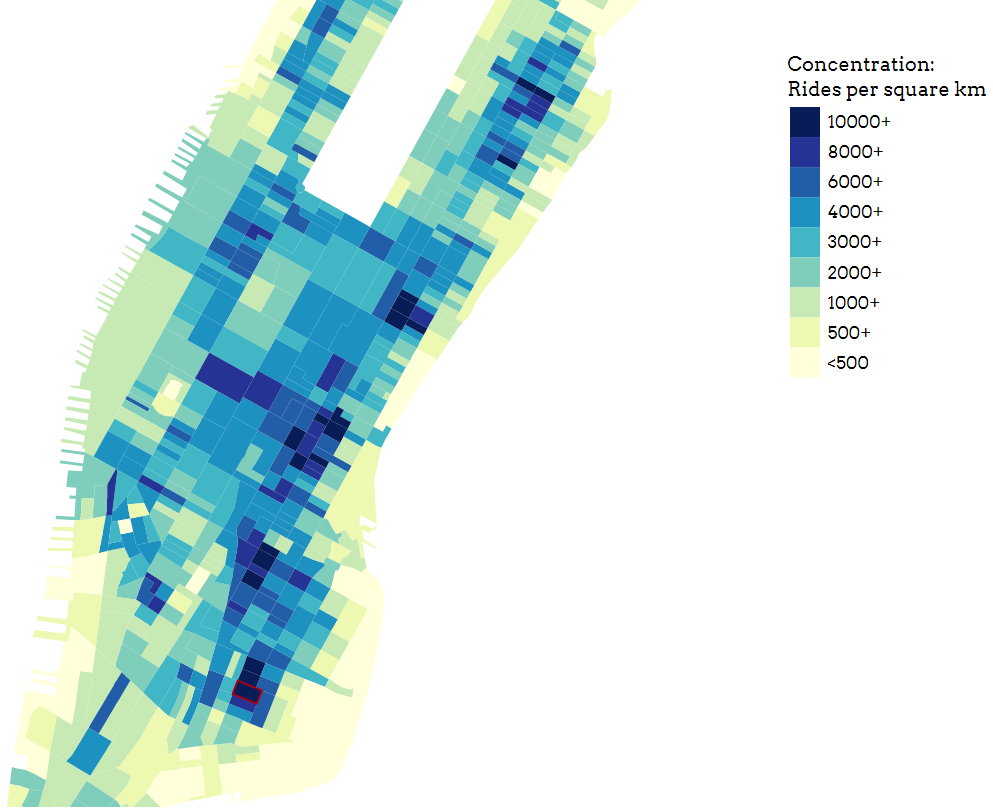
TAXI! Have you ever thought how many times you must have called a taxi, but ever wondered how the network works and most importantly how smoothly it works during peak time?
So, now let’s Visualize the network and its working in Lower Manhattan on the basis of data collected on 1/1/2016.
To make your own visualization, click the green “Clone or download” button on the page and select “Download ZIP“.
Then you will need to install Node.js. Learn how to do this for Mac here and for Windows here.
Now with Node.js installed, go ahead and unarchive the zip you just downloaded, which should then give you a folder called “taxi-master”.
Open up Terminal if you’re on Mac or Command Prompt if you’re on Windows and navigate to the taxi-master folder. A tutorial on those commands can be found for Mac here and for Windows here.
In Terminal/Command Prompt, type in
npm install
This installs dependencies that the code uses.
Finally, in Terminal/Command Prompt, launch the server that hosts the code by typing
node app.js
Now, open up your browser and in the navigation bar, type in
http://localhost:8080/
This should bring you to the same visualization found at https://evening-falls-91841.herokuapp.com/.
What we’re interested in is making our own visualization. Go to your browser and type this in the navigation bar
http://localhost:8080/html/example.html
This brings you to a base visualization without all the other stuff like the title and the carousel in the other visualization.
Let’s say you want to visualize taxi data on 1/2/16 instead of 1/1/16. To do that, open up the file “exampleBlocksToCSV.js” located in the main folder with any text editor. On line 27 of the file which says
if (day === '1') {
change the 1 to a 2 so it now says
if (day === '2') {
Now we want to execute the code. Open up a new tab or window of your Terminal/Command Prompt, make sure you’re in the taxi-master folder, and enter
node exampleBlocksToCSV
After a short wait, you should see increasing numbers being printed to your console. Once it hits 1048576, the code will end on its own. This can take up to an hour.
The code processes the data located in taxi-master/public/taxiC.csv. If you open up the taxiC.csv file located in the folder labeled “public”, you can see that it contains information of a taxi’s pickup time and location denoted by longitude and latitude.
Unfortunately, the file seems to only contain complete data for taxi rides on 1/1/16 – 1/3/16. If you have data of taxi rides for other dates, replace this file with it. It should work as long as the new file is named taxiC.csv and is in the same format.
Back to the code. exampleBlocksToCSV.js takes a taxi ride from taxiC.csv and checks which block group it is in. Block groups are the geographical subdivisions you see on the visualization. The block groups that make up Manhattan are expressed as a collection of points in a type of file called a geojson. You can view this at taxi-master/public/blocks.geojson.
So by changing the 1 to 2, we are now processing the data in taxiC.csv that corresponds to 1/2/16 instead of 1/1/16. The output is located in taxi-master/public/exampleBlockColors.json. If you open the file, you will see that each block group’s id is matched to the number of taxi pickups that occurred in the block group. This was done thanks to the code that we ran.
Finally, all you have to do to view the updated visualization is refresh the page in your browser at
http://localhost:8080/html/example.html
Behind the scenes, the javascript code located in taxi-master/js/example.js pulls the data from taxi-master/public/exampleBlockColors.json and displays it.