ARCHETYPES
Design your workflow to make it an “easy lift” to incorporate visualization into your
practice. Identify the tools and software that make it simple to create brilliant charts,
plots, maps, and diagrams.
Create templates or sample charts you can modify for different formats: presentations,
the web, and print. These templates will be helpful when you need to create a data
graphic in a jiffy.
I would like to leave you with nine archetypes to help you in building templates. The design standards are applied to each chart. The charts are in gray scale. All of the
archetypes are available for download at: “link”
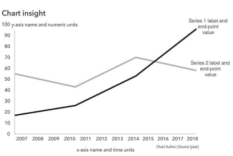
1. Line Chart
2. Stacked Area
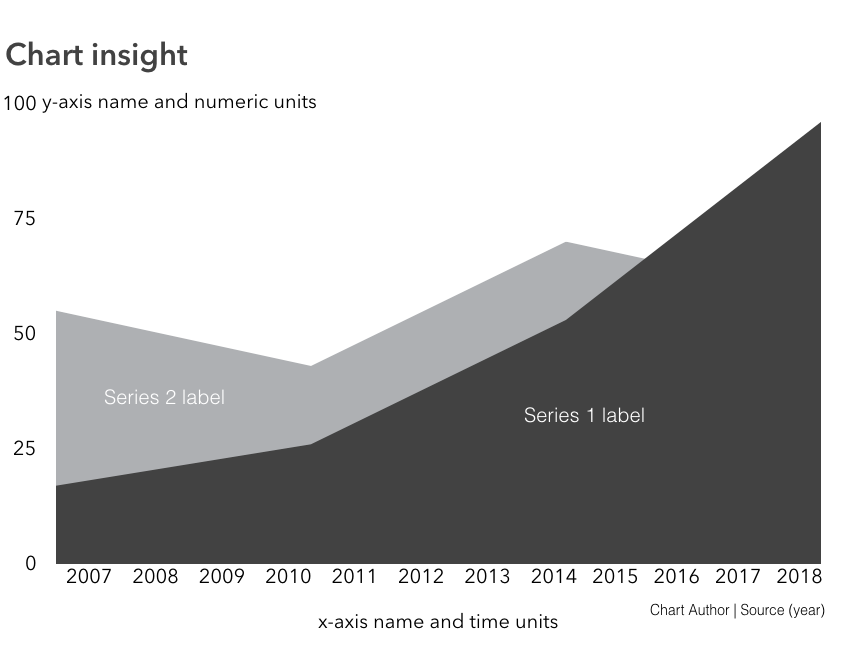
Both figures are designed for use with time series data. Use the line chart for up to four data series. The stacked area is best for comparing the relative differences between two or more series.
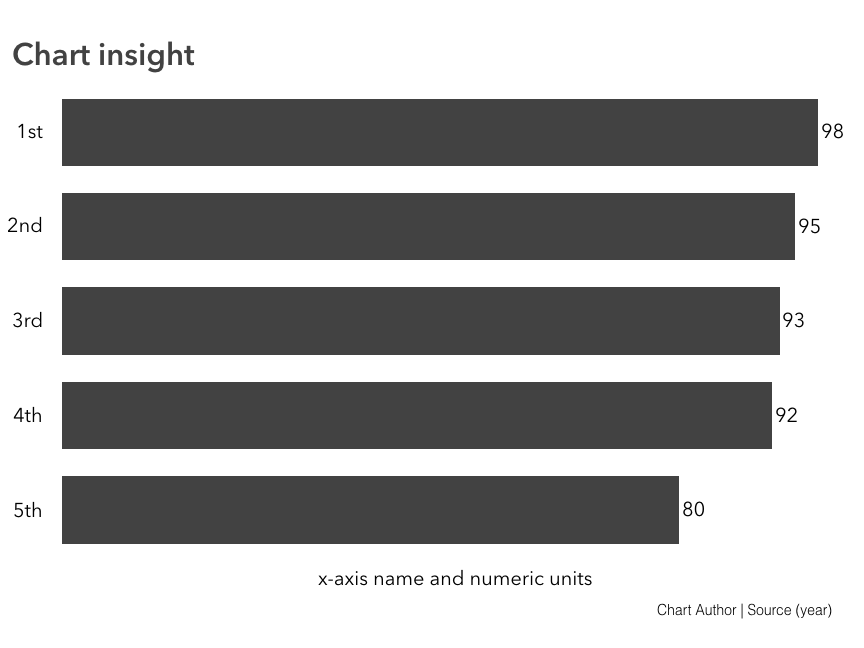
3. Horizontal Bar Chart
To show rank or ordering, such as the top five employees, use a horizontal chart as shown in Figure. Order the bars in descending order, from largest to smallest. Label the bars direct with the data values.
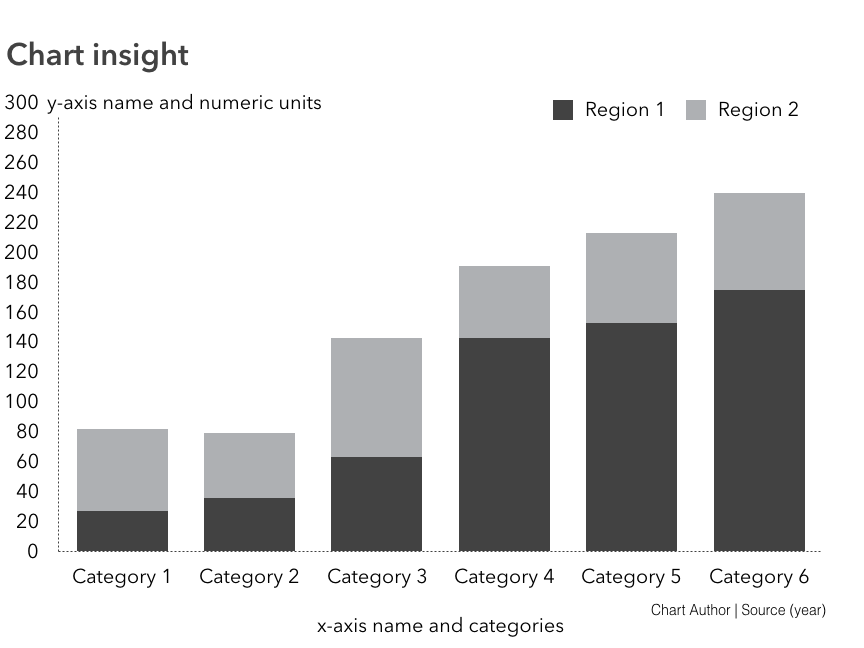
4. Stacked Column Bar Chart
For showing subcategories or portions over time or by another categorical variable use a stacked bar chart as shown in Figure. Keep the subcategories to 4 or less and include a legend that defines the subcategories by color.
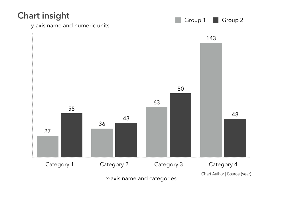
5. Vertical Column Bar Chart
For comparing two groups within a single category a vertical bar chart shows the comparisons side by side. Figure uses two vertical bars per category to show the groups or subcategories which are distinguished by color. For example, this type of chart can be used to show nominal groups such as employed or unemployed. Remove the y-axis and directly label the bars.
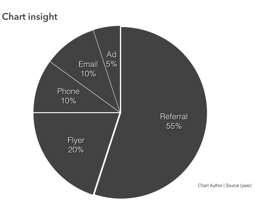
6. Basic Pie
To show a proportion of a whole, a pie chart (or bar chart) works well when there six or less parts that comprise the whole. Figure shows a pie chart with the pie slices labeled by percentages, with each slice adding up to 100%. Use the same color for the slices and use whitespace the between the slices to distinguish them from one another. Label with values and the meaning of each slice.
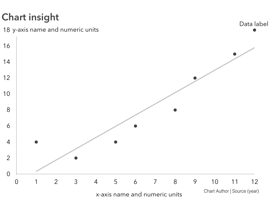
7. Scatterplot
For showing relationships between two numeric variables use a scatterplot. Following figure is an archetype for a basic scatterplot with a single data point labeled and a linear trend line.
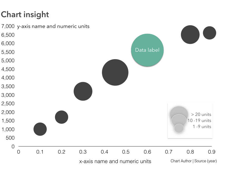
8. Bubble Chart
To show relationships between three or more numeric variables, a bubble chart allows for up to four variables to be encoded: position of x and y, and the size and color of the bubble. A legend is useful to explain the meaning of the size and color.
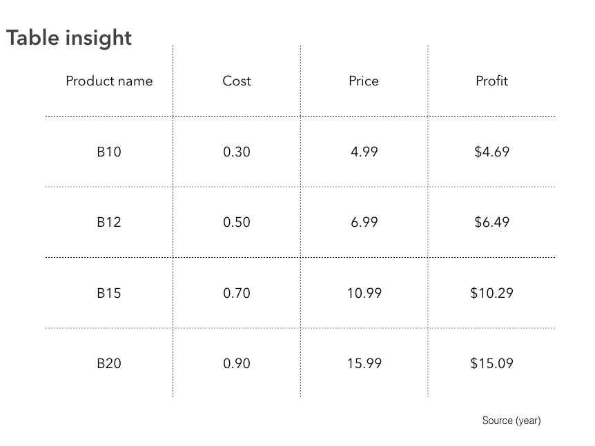
9. Basic Table
Sometimes you just want to show information organized in columns and rows. For instance, a table of numbers is all that might be needed. Figure shows a simple table that organizing products, cost, price, and profit into a 4 x 5 table. Note the minimum use of gridlines and the alignment of the numeric data.