VI
The Audience
How to optimize your data story for your audience?
COMMUNICATING WITH YOUR AUDIENCE
To begin, think about the basic information that you need to communicate through every data graphic
Five questions guide your explanation of data graphics:
1. What do the data axes mean?
Upon showing the data graphic, orient your audience by explaining the x- and y-axes (for Cartesian plots), the geographical scale (for maps), and the nodes and edges (for network diagrams).
2. What do the encodings mean (the value of the data point)?
This requires an explanation of the meaning of the circles, bubbles, bars, points, shaded regions, lines, and/or colors.
3. What level of detail is presented?
The level of detail refers to the way the data is aggregated or summarized. For instance, data such as bicycle rentals can be viewed at the yearly, monthly, daily, or hourly level of detail.
4. What data points should they be looking at?
Draw your audience’s attention to the most important part of the chart. Show the trend, pattern, anomaly, etc. that is critical to your message.
5. What is the key takeaway by my audience from the chart(s)?
Leave your audience with a question to prompt discussion, a result, conclusion, or finding for each chart.
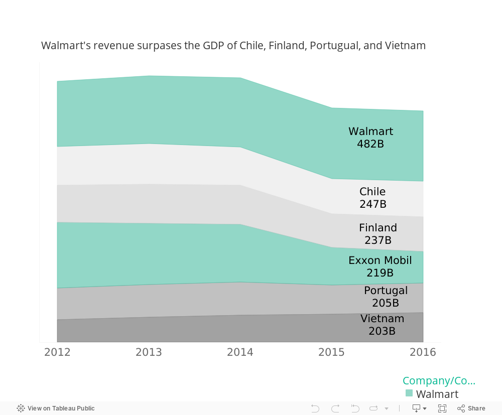
VISUAL
An example of an interactive visual