
Visualizing Free Wi-Fi Hotspots in NYC Using a Point Map
By Kristen Sosulski
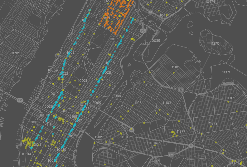
How To Make a Point Map in Tableau?
1. Download my sample file at: http://bit.ly/nyc_wifi
2. Import file into Tableau
3. Click “Sheet 1” and observe the dimensions and measures on the left-hand side
4. Right click on Long and change its Geographic Role to Longitude. Drag Lat to rows and Long to columns (not Latitude or Longitude).
5. Select “filled map” from the selection menu from Worksheet > Show Cards > Marks
6. If only one point appears, select Analysis -> and deselect Aggregate Measures.
7. Filter by type by dragging Type to the filter card. “When the menu pops up, select Free, Limited Free, and Partner Site. Click OK.”
8. Create a group by Provider. Create subgroups for Harlem, LinkNYC, and Other. (right click on Provider > Create > Group. Check ‘Include ‘Other’’, then select Harlem and press Group, next select BETA LinkNYC and press Group, now select all three groups which have the paperclip symbol next to the names, and press OK.)
9. Drag the new group to color on the Marks card
10. Drag Location T to the “Pages card” to animate the display. You can start the animation by pressing the right arrow on the right side of your screen.
11. Customize your geospatial display. Go to Map > Map layers and/or create a dashboard and add additional content