Lab 2 Categories
There are many data graphics that showcase categorical data well. These include the vertical bar, column bar, horizontal bar, stacked bar, and even the divergent bar chart.This lab will guide you in building all five chart types.
Much of the data that we analyze from surveys is categorical. For the exercises that follow use the data below:
Data: survey_technology_skills.xlsx
Download at http://becomingvisual.com/datavislab/survey_technology_skills.xlsx
| Respondent | Question 1: Excel | Question 2: Tableau | Question 3: Photoshop | Question 4: PowerPoint | Question 5: Google Charts | Question 6: JavaScript | Question 7: HTML | Question 8: CSS | Question 9: R | Question 10: Python |
|---|---|---|---|---|---|---|---|---|---|---|
| 1 | Good | Very Good | No knowledge | Good | No knowledge | No knowledge | No knowledge | No knowledge | Average | Poor |
| 2 | Good | Good | Good | Very Good | No knowledge | Poor | Very Good | Good | Average | Poor |
| 3 | Very Good | Average | No knowledge | Very Good | No knowledge | Poor | Poor | Poor | Average | Average |
| 4 | Very Good | Very Good | Poor | Very Good | Good | No knowledge | Very Poor | Very Poor | Average | Poor |
| 5 | Average | Poor | No knowledge | Average | Average | No knowledge | Very Poor | No knowledge | Average | Poor |
2.1 Vertical bar
One of the most common chart types is a vertical bar. There is one category of value options on the x-axis and the quantities measured by the length of the bar on the y-axis.
Objective: Show one category of responses - “Self Reported Skills in Excel”
Watch the demonstration and follow the steps below.
STEP 1
Create a new Tableau workbook. Save it as categorical.twbx.
STEP 2
Import the data. Go to Data > New Data Source. Select Microsoft Excel. Navigate to your data file (in this case survey_technology_skills.xlsx) and select it.
Your screen should look like Figure 2.1.
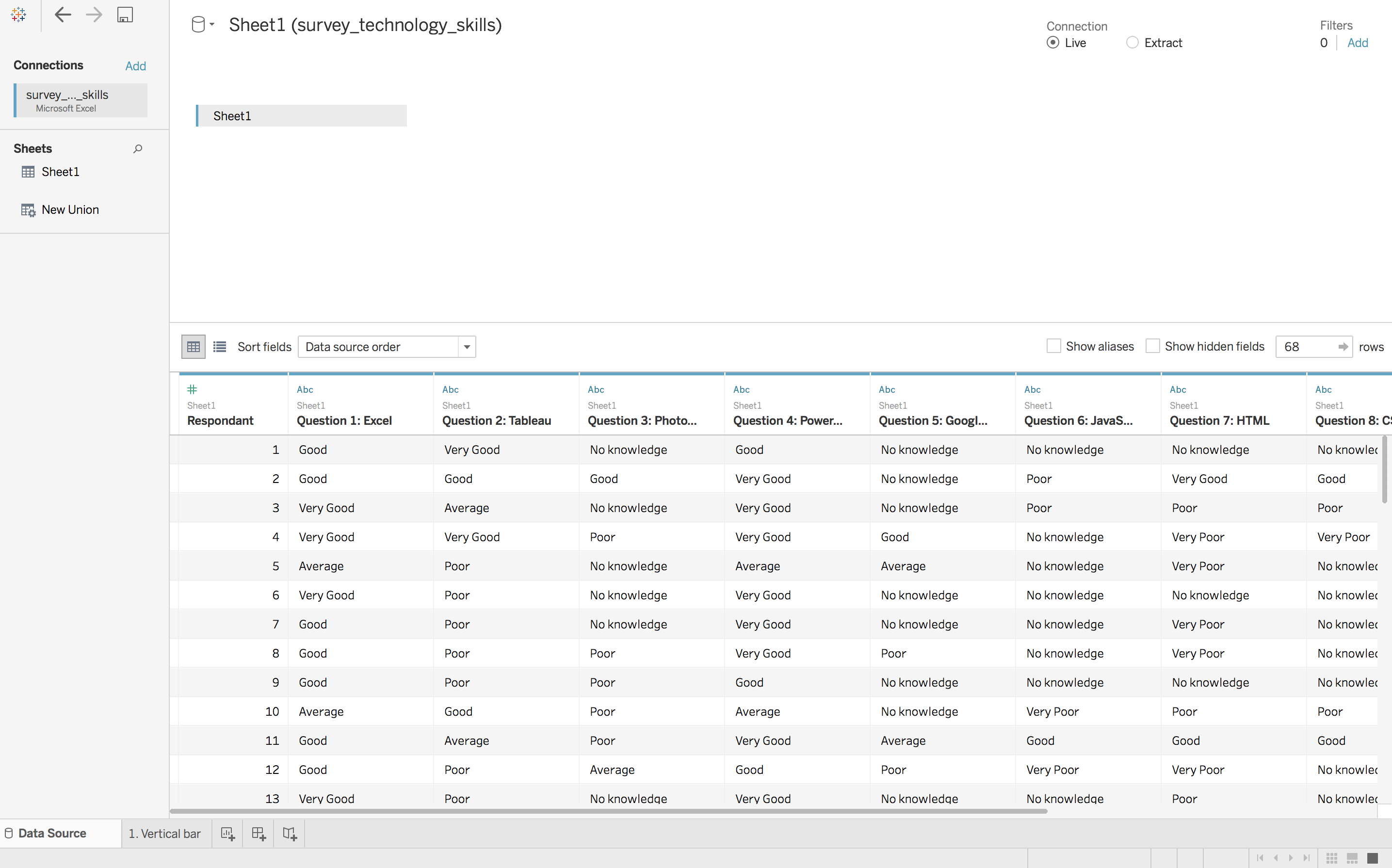
Figure 2.1: Importing Data in Tableau
Step 3
Build a vertical bar chart similar to Figure 2.2.
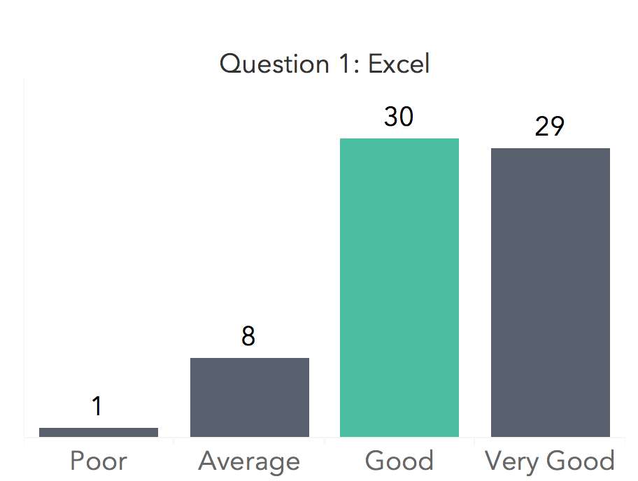
Figure 2.2: Vertical bar chart
Click on Go to Worksheet and double click on the worksheet tab and name it 1. Vertical bar.
Drag Respondant to rows and change the aggregation to
CNT(Respondant).Drag Question 1: Excel to columns
Select Bar from the Marks card. Order the bars (if needed) by dragging the category labels from the x-axis. This doesn’t work well for Mac users, so you need to temporarily swap the rows and columns and then drag the values on the y-axis to the right order Poor, Average, Good, and Very Good. Then, change the chart bar to a column by reswaping the rows and columns.
Step 4
Refine your vertical bar chart.
- Label bars directly and remove the y-axis values.
Drag CNT(Respondant) to Label on the Marks card. Right click on y-axis and un-check show header.Ensure the aggregation is correct, CNT(Respondant)
- Change the font size, color, and face
Select Format > Workbook from main menu. Change the fonts to a Sans serif font for Worksheets, Tool tips, Dashboard, and Story titles.
Increase the width of the chart by dragging the base of the x-axis to reveal the labels for each bar.
- Remove chart junk
Set grid lines to off (in the Format menu for the Workbook).
Step 5
Highlight the max value as a pre-attentive attribute using a calculated field. Right click on Measures and select Create Calculated Field. Name the field MaxValue and create the following if statement as shown below. Note that the max value here is computed using “Table (across)”.
Here is the code:
IF COUNT([Respondant])==
WINDOW_MAX(COUNT([Respondant]))
THEN "Max Value"
ELSE "No Highlight"
END
Drag the new field, Max_Value to Color on the Marks card.
Change the size and color of the encoding (the bars)
Use the Size option in the Marks card to change the width of the bars.
Use the Color option in the Marks card to change the color of the bars.
2.1.1 Exercise: Vertical bar
Build a vertical bar chart for each question (10 in total). This requires you to create 10 worksheets in your Tableau workbook. Optional: Challenge yourself to learn more about dashboards and arrange all 10 bar charts on a dashboard. See Figure 2.3 for an example.
Figure 2.3: Vertical bar charts arranged on a dashboard
2.2 Column versus Horizontal Bars
Objective: Compare two categories such as “Self Reported Skills in Excel and Python”.
This task should seem pretty straightforward. It seems like it would be an easy drag and drop to create the Figure 2.4 below.
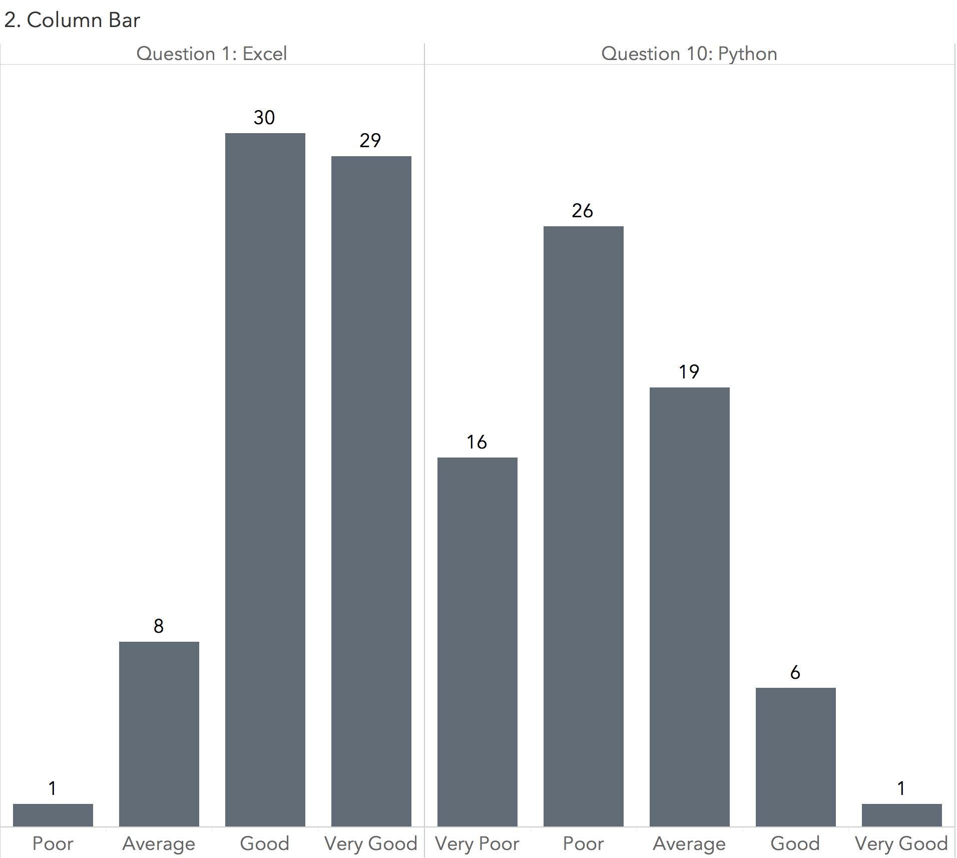
Figure 2.4: Column bar chart
You’ll notice that it is not possible to create single chart that shows 2 or more questions.
Why do you think this is the case?
The data structure limits the ways the data can be visualized.
In the Data Source menu you can restructure the data in a “long format” using the pivot function. This will create one column for Question and another for Answer as shown in Figure 2.5.
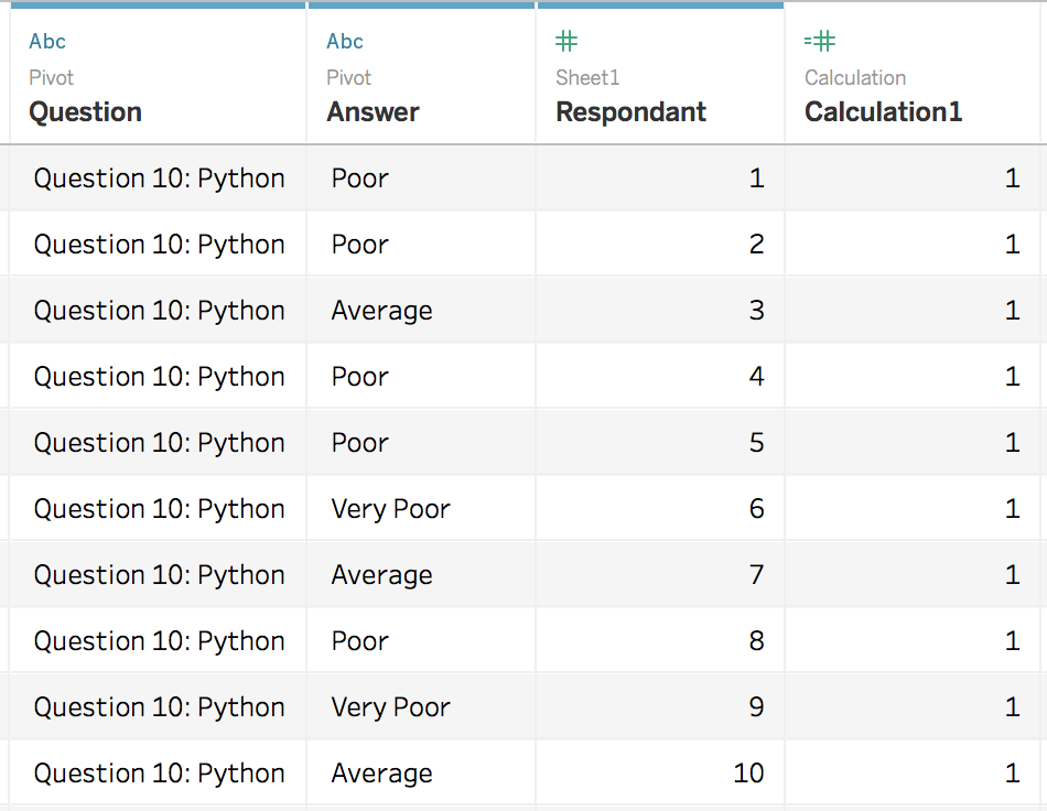
Figure 2.5: Restructured data
With the newly structured data, drag a Question to rows and Answer to columns
See the demonstration: https://www.youtube.com/embed/QbBEBTXbIt4
2.2.1 Exercise: Horizontal bar
Repeat Exercise 2.1.1 with the newly structured data as a horizontal bar chart. Horizontal bars are best reserved for ranking.
See Figure 2.6 for an example
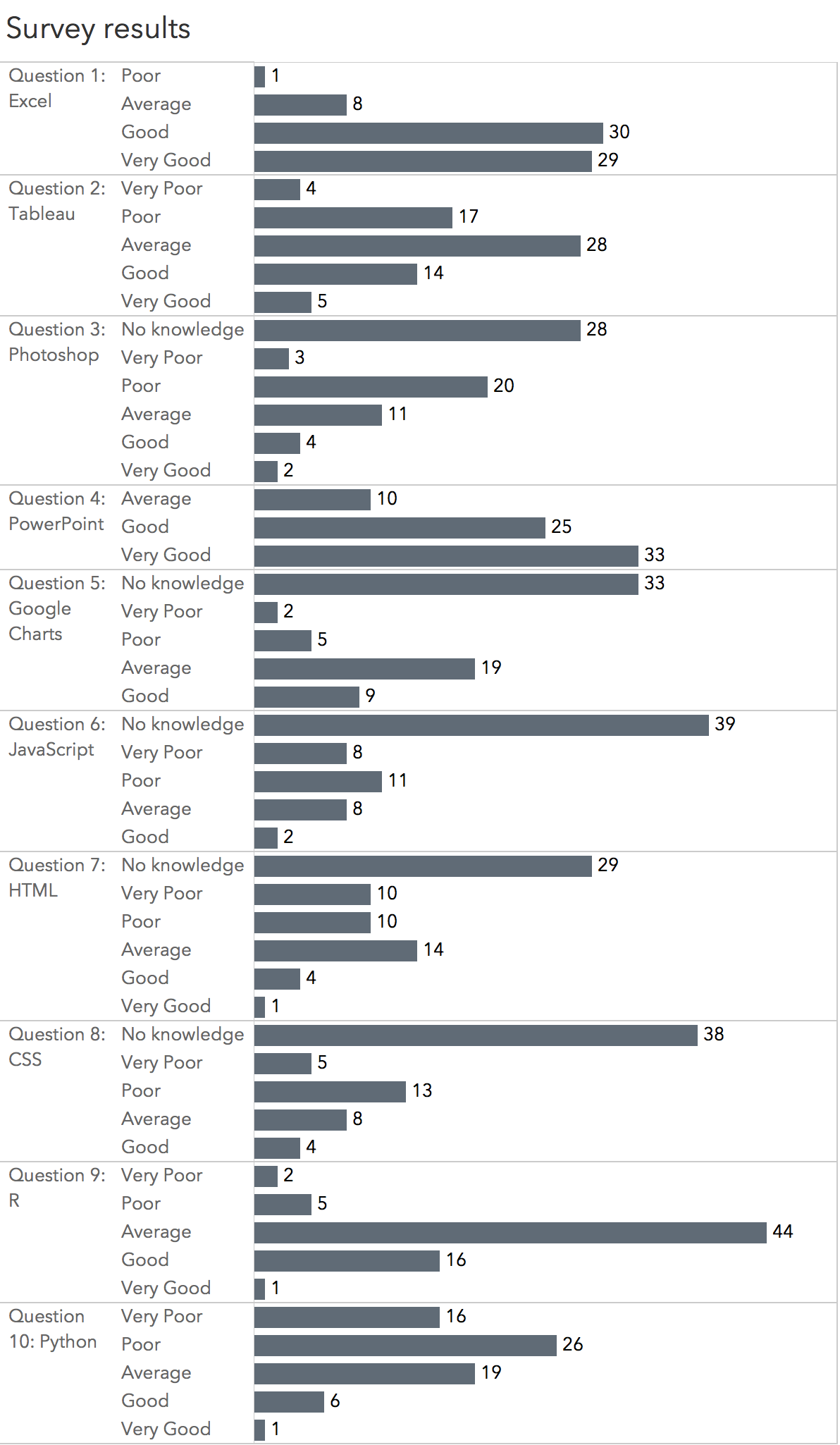
Figure 2.6: Restructured data presented as a horizontal bar
2.2.2 Exercise: Highlighting max value by question
Take Exercise 2.1 further by highlighting the max value per question. See Figure 2.7 for an example. Hint: This requires adjusting the max value calculation you created in Exercise 1 to “compute using Pane down”.
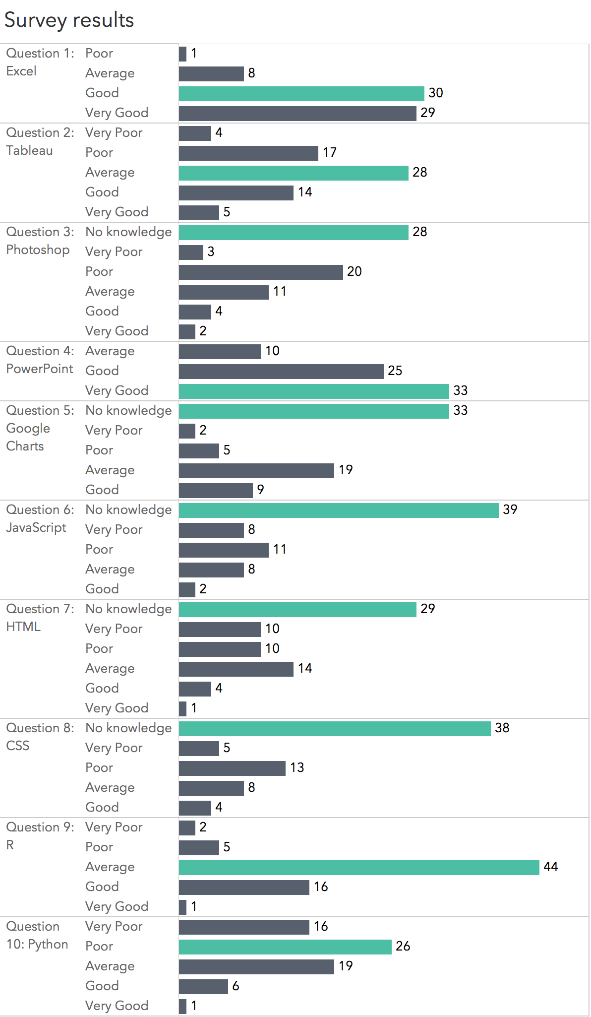
Figure 2.7: Max value highlighted
2.3 Stacked bar
Create a 100% stacked bar chart similar to Figure 2.8.
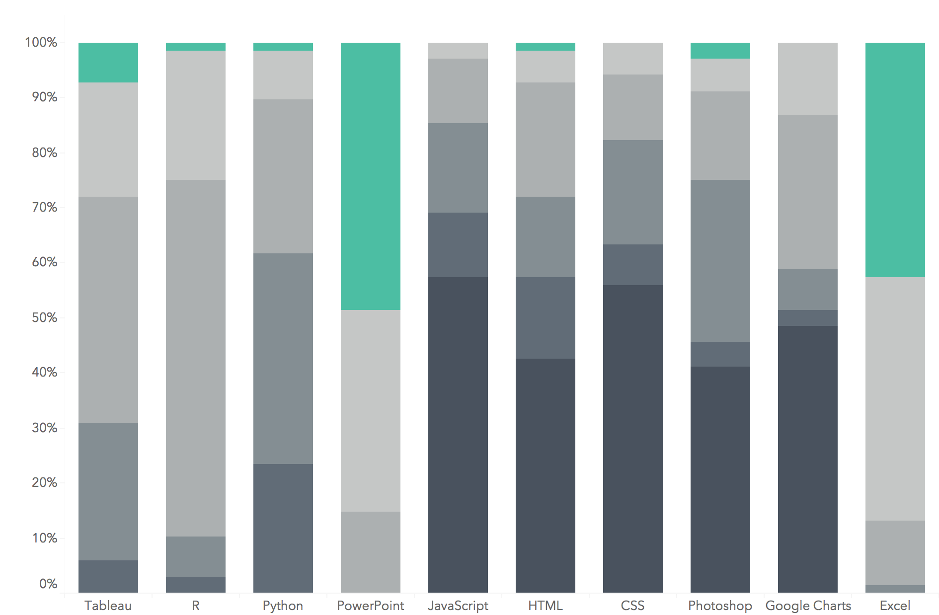
Figure 2.8: Stacked bar
STEP 1: Build the chart
- Drag Question to columns
- Drag Answer to Colors on the Marks card
- Drag Number of Records to rows.
- Select stacked bar from the Show Me window. (if needed)
STEP 2: Refine the chart
- Transform the measurement the value of Number of Records to a percentage.
Go to the Analysis menu and select Percentage Of > Column Add a table calculation to the field by clicking on the down arrow and selecting > Compute Using > Table Down.
Fix the width of the x-axis to display the full label names. Drag the lower right x-axis to make it wider, revealing the full label names. You can also reduce the font of the x-axis labels by right clicking on the axis and selecting Format.
Change the colors of the bars to a gradient gray scale and order the categories in a logical order from No Knowledge to Very Good.
See the demonstration video. https://www.youtube.com/embed/l1PCBTGd7yE
2.3.1 Exercise: Stacked bar with filter
Take your stacked bar to new levels. Rather than show all the data, consider filtering the data by question or skill level to reveal interesting insights. Create a dashboard that formats the chart and includes the legend. Give a title that highlights the key insights.
See Figure 2.9
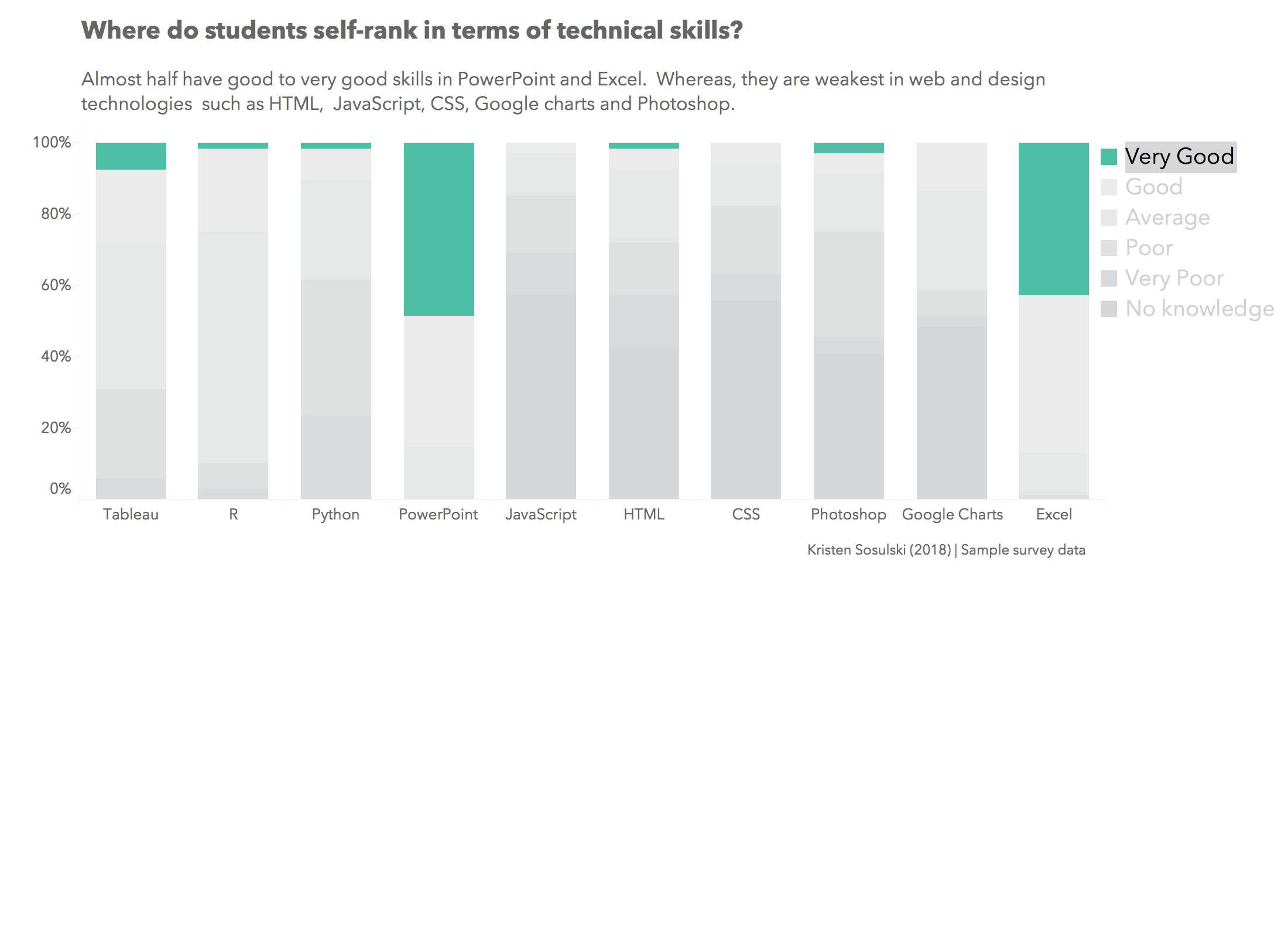
Figure 2.9: Stacked bar with filter
2.4 Divergent Bar Chart
Objective: Compare all 10 questions and responses from the survey data using a divergent bar chart. Divergent bar charts clearly show those responses that are above or below the mid point. This will require you to modify the data and use advanced calculations in Tableau.
The following tutorial will provide an example that you can apply to your own chart.
Tutorials
- Creating a divergent bar chart https://www.youtube.com/watch?v=JodWmiIxl2c
2.4.1 Exercise: Divergent bar
Create a divergent bar chart. Apply the design principles discussed in Chapter 5 of Data Visualization Made Simple.