Lab 4 Time series
In this lab, we will build a line chart, animated line chart, spark line, stacked area chart, and a stream graph with time series data.
The data that we will be using to illustate the techniques is Facebook, Amazon, and Google’s closing stock prices from May 2018.
Data:
http://becomingvisual.com/datavislab/timeseries_stockprice.xlsx
| Date | Amazon | ||
|---|---|---|---|
| 2018-05-01 | 927.800 | 901.94 | 151.74 |
| 2018-05-02 | 946.645 | 909.62 | 153.34 |
| 2018-05-03 | 946.000 | 914.86 | 153.60 |
| 2018-05-04 | 944.750 | 926.07 | 150.17 |
| 2018-05-07 | 940.520 | 933.54 | 151.45 |
4.1 Line chart
Creating a line chart in Tableau is very straightforward. Be sure your data is tidy (all observations are in rows and variables as columns). Tidy time series data must have the time element in a column, such as date.
Objective: Create a line chart that shows the changing stock price for three stocks for one month.
Step 1
Create a new Tableau workbook. Save it as timeseries.twbx.
Step 2
Import the data. Go to Data > New Data Source. Select Microsoft Excel. Navigate to your data file (in this case timeseries_stockprice.xlsx) and select it.
Your screen should look like Figure 4.1.
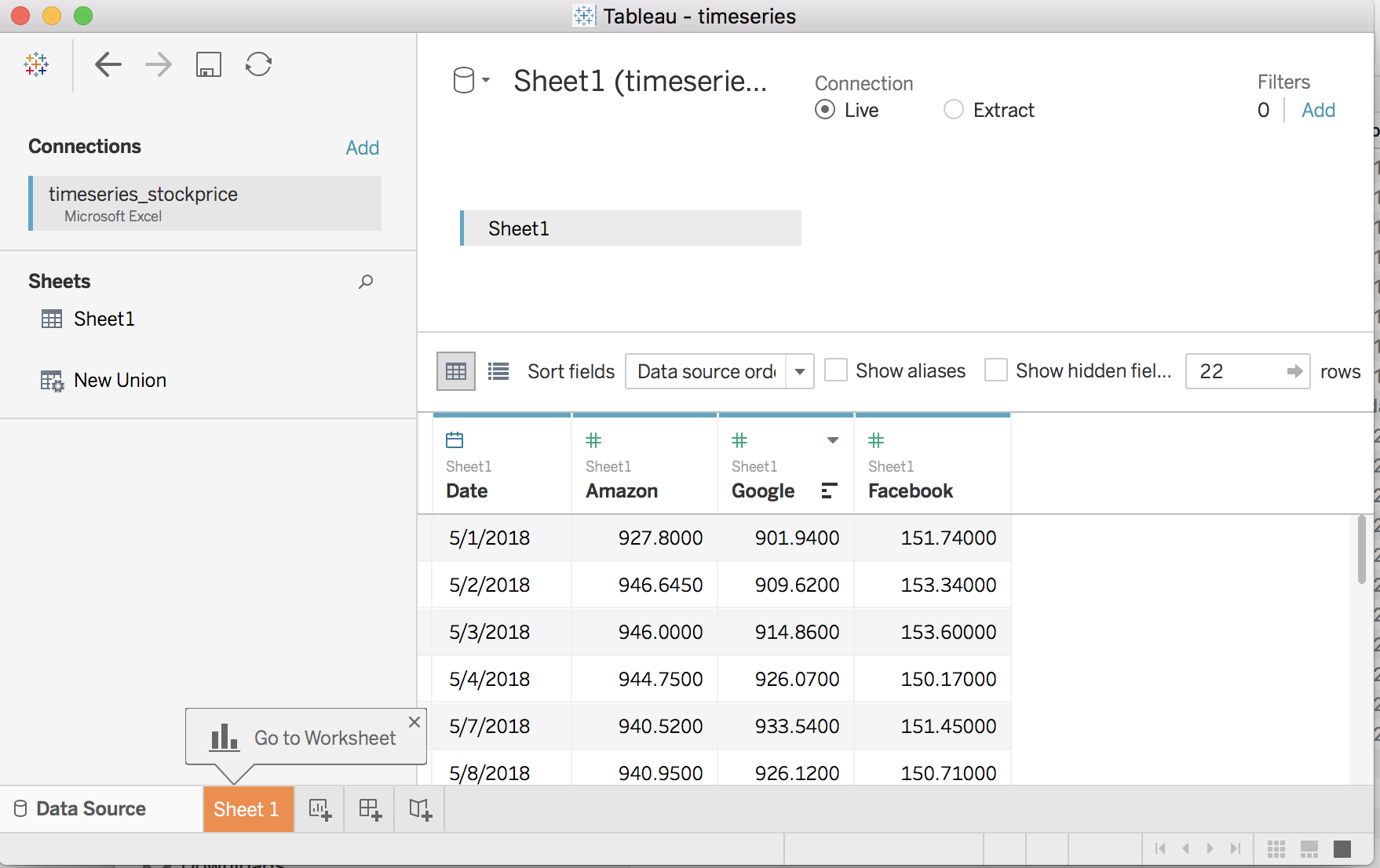
Figure 4.1: Importing Data
Step 3
Build a line chart. Click on Go to Worksheet.
Drag
Measure Valuesto rowsDrag
Measure Namesto colorDrag
Dateto columns. ExpandYEARto showDAYby clicking on the plus sign next toYEAR(Date),QUARTER(Date)andMONTH(Date).Remove
SUM(Number of Records)from theMeasure Valuescard by dragging off of it.
Video demonstration
URL: https://www.youtube.com/embed/w0abeooT6AE
Your screen should look like Figure 4.2.
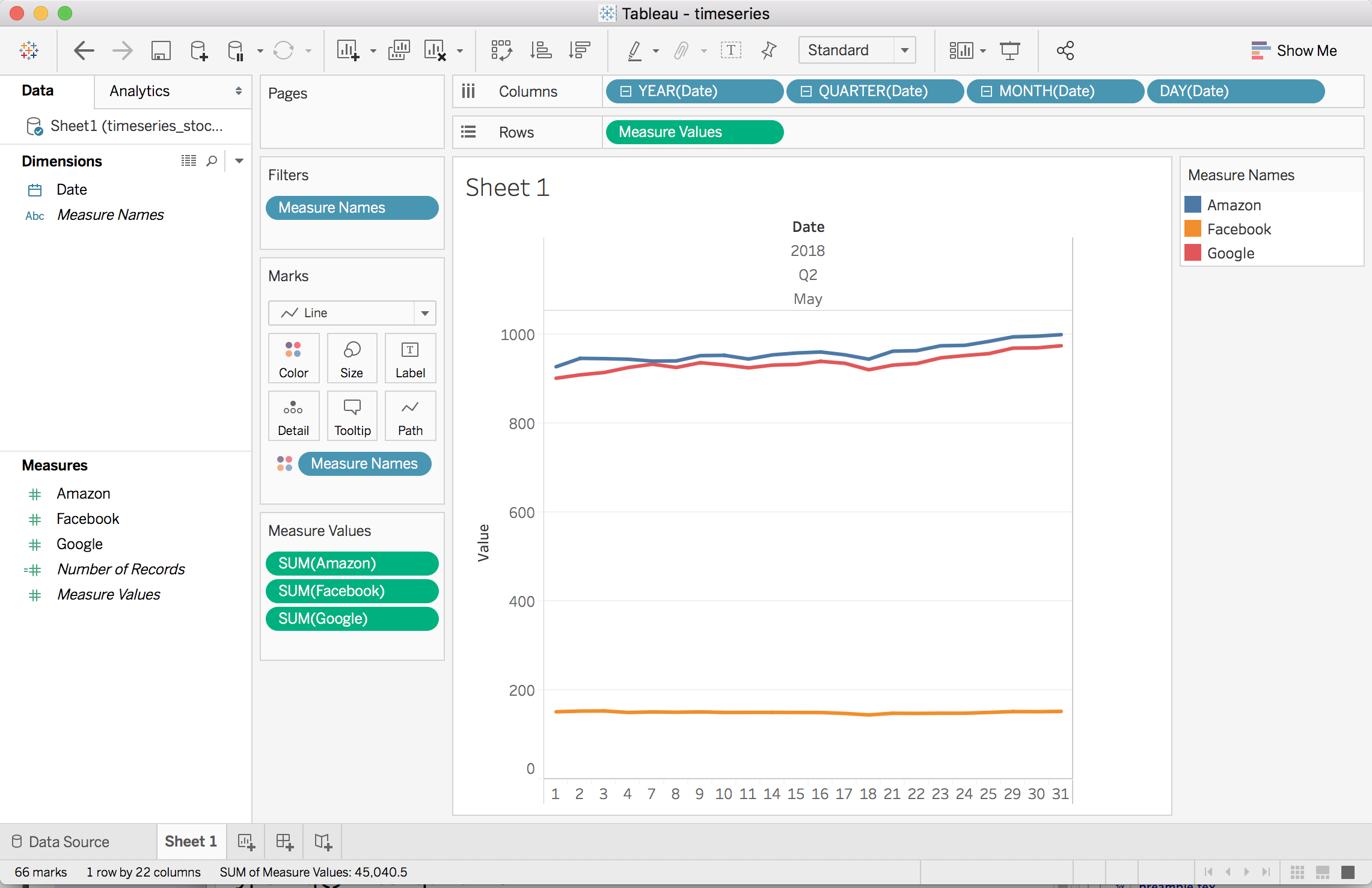
Figure 4.2: Creating a basic line chart
Step 4
Refine your line chart.
Specifically,
- Increase line thickness
- Change line color
- Remove chart junk (grid lines, tick marks)
- Add labels (title, source)
- Format Legend, and
- Add units
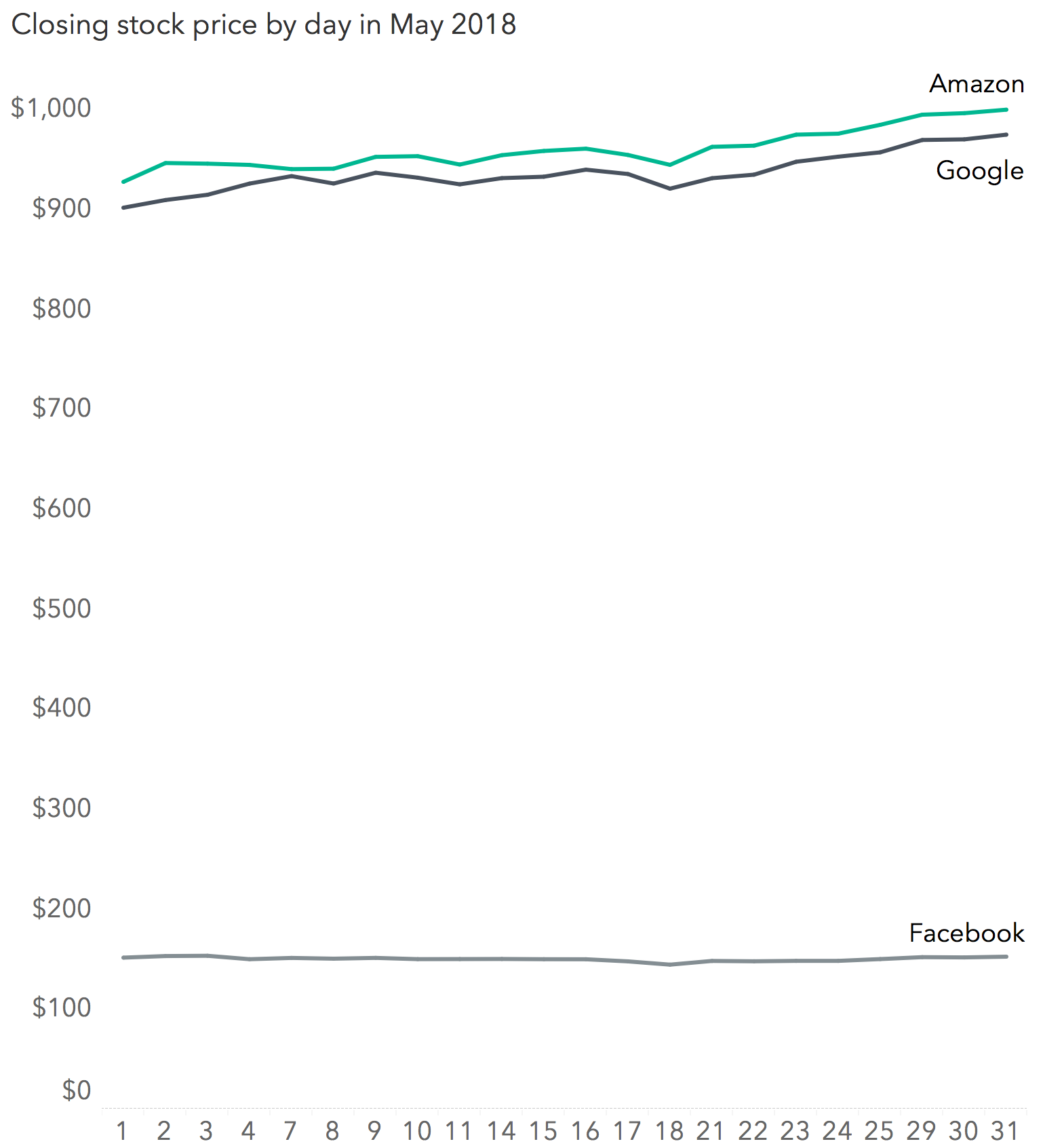
Figure 4.3: Refining your line chart
Your screen should look like Figure 4.3.
Video Demonstration
URL: https://www.youtube.com/embed/979s4e5CVBY
4.1.1 Exercise: Line
Objective: Create a line chart that shows the changing stock price for three stocks for one month.
Data: Choose three stocks to visualize using a line chart (do not use Amazon, Google, Apple or Facebook).
Find the data for the month prior to today for each company. For example, for companies on NASDAQ go to: https://www.nasdaq.com/quotes/historical-quotes.aspx.
Organize the data so that it is tidy; each observation is in a row and variables are in columns.
Display: Create your chart. Be sure to include the data source and your name. Refine it by formatting and omitting the non-data elements as appropriate.
Submit according to the assignment instructions.
Optional: Upload your workbook to your Tableau Public account. Details here: https://onlinehelp.tableau.com/current/pro/desktop/en-us/publish_workbooks_tableaupublic.htm
4.1.2 Exercise: Animating a line chart
Objective: Create a line chart that shows the changing unemployment rate.
Data: http://becomingvisual.com/datavislab/unemployment.csv
Watch the demonstration and follow the steps below.
VIDEO DEMONSTRATION
URL: https://www.youtube.com/embed/jnEAoNPBHm4?rel=0
STEP 1.
Build a basic line chart.
- Change the data type of
Monthto DATE - Map
Monthto columns - Map
Rateto rows - Select line from the Marks card
STEP 2.
Build the animation.
- Drag
Monthto the Pages card. - On the Marks card change the encoding from line to circle.
- On the Pages card (usually under the Show me window), check Show History. Then click on the down arrow and select the following:
Marks to show history for: All
Length: All
Show: Both
- Press the play button the Pages card to see the animation.
- Revise the animation to apply the design standards
4.1.3 Exercise: Transforming data
Objective: Pivot time series data
**Data:** Amazon, Google, and Facebook’s closing stock price for May 2018.
Dowload the data with the Tableau workbook at: http://becomingvisual.com/pivot_lab.twbx
Task: Follow along with the instructor demonstration in class.
4.1.4 Exercise: Moving average table calculation
Objective: Compute the five day moving average and create a dual axis chart
**Data:** Apple closing stock price for May 2018.
Dowload the data with the Tableau workbook at: http://becomingvisual.com/movingaveragelab.twbx
Task: Follow along with the instructor demonstration in class.
4.2 Spark line
Creating a spark line chart in Tableau begins by building a line chart, then removing labels, and sizing the graphic appropriately.
Objective: Create three spark line chart that shows the changing stock price for three stocks for one month.
Step 1
- Duplicate sheet 1. See Figure 4.4.
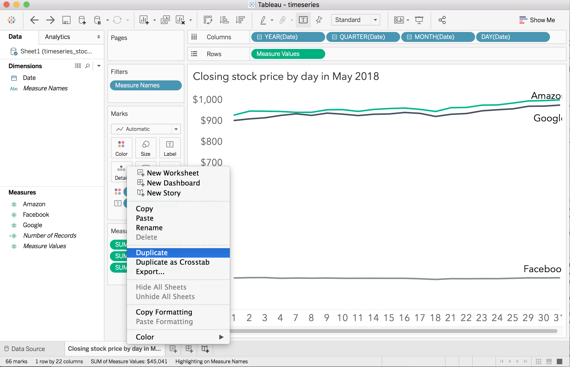
Figure 4.4: Duplicating a sheet
Remove header for x and y axes
Remove text labels for end points (Measure Names) and replace with Measure Values.
Just keep SUM(Amazon) on the rows, remove SUM(Facebook) and SUM(Google)
Change line color as you see fit.
Format SUM(Amazon) to a custom currency format with 2 decimal places.
Step 2
Repeat step one to create a Google spark line chart.
Step 3
Repeat step one to create a Facebook spark line chart
Step 4
Create a dashboard. Drag your three spark line sheets (as floating) to the dashboard. Arrange to fit.
Add a title using the Text object.
Your final data graphic should look like Figure 4.5.
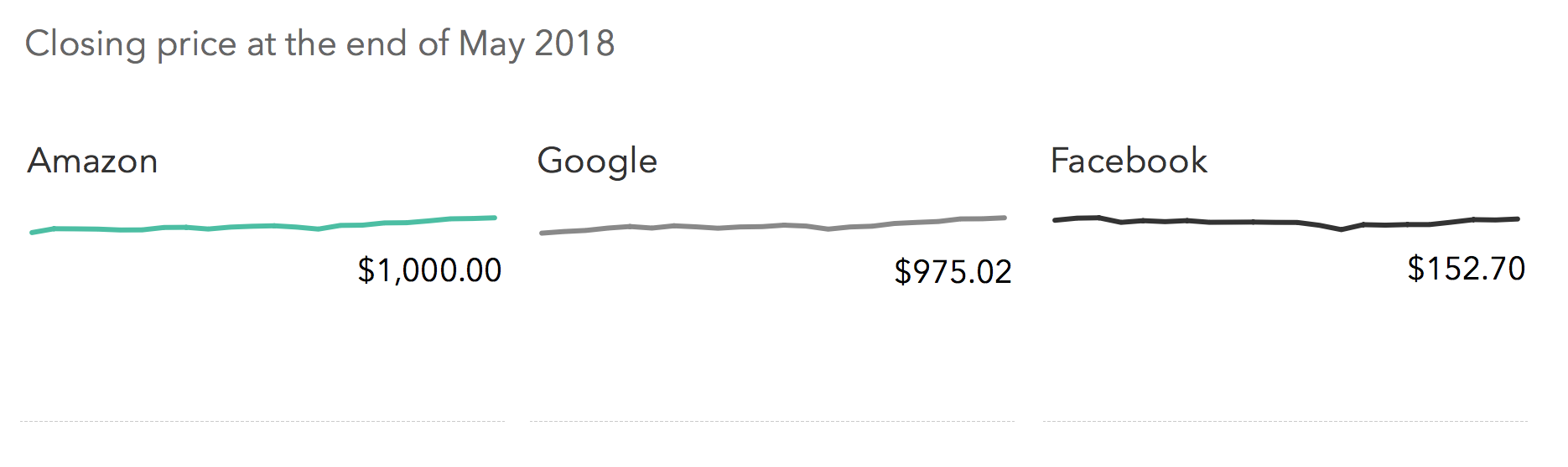
Figure 4.5: Three spark line charts
4.2.1 Exercise: Spark line
Create three spark line charts that shows the changing stock price for three stocks (you selected in Exercise 1) for one month.
4.3 Area chart
An area chart is a line chart with the area filled in below the lines.
Objective: Create a stacked area chart that shows the changing stock price for three stocks over a single month.
Step 1
Begin with the line chart created in sheet 1
Step 2
Change the marks on the Marks card to area.
Step 3
Reorder the Measures Values in the Measure Values card to place SUM(Facebook) below SUM(Google).
Step 4
Adjust labels by clicking on the label name and moving them directly.
Video demonstration
Your final stacked area chart should look like Figure 4.6.
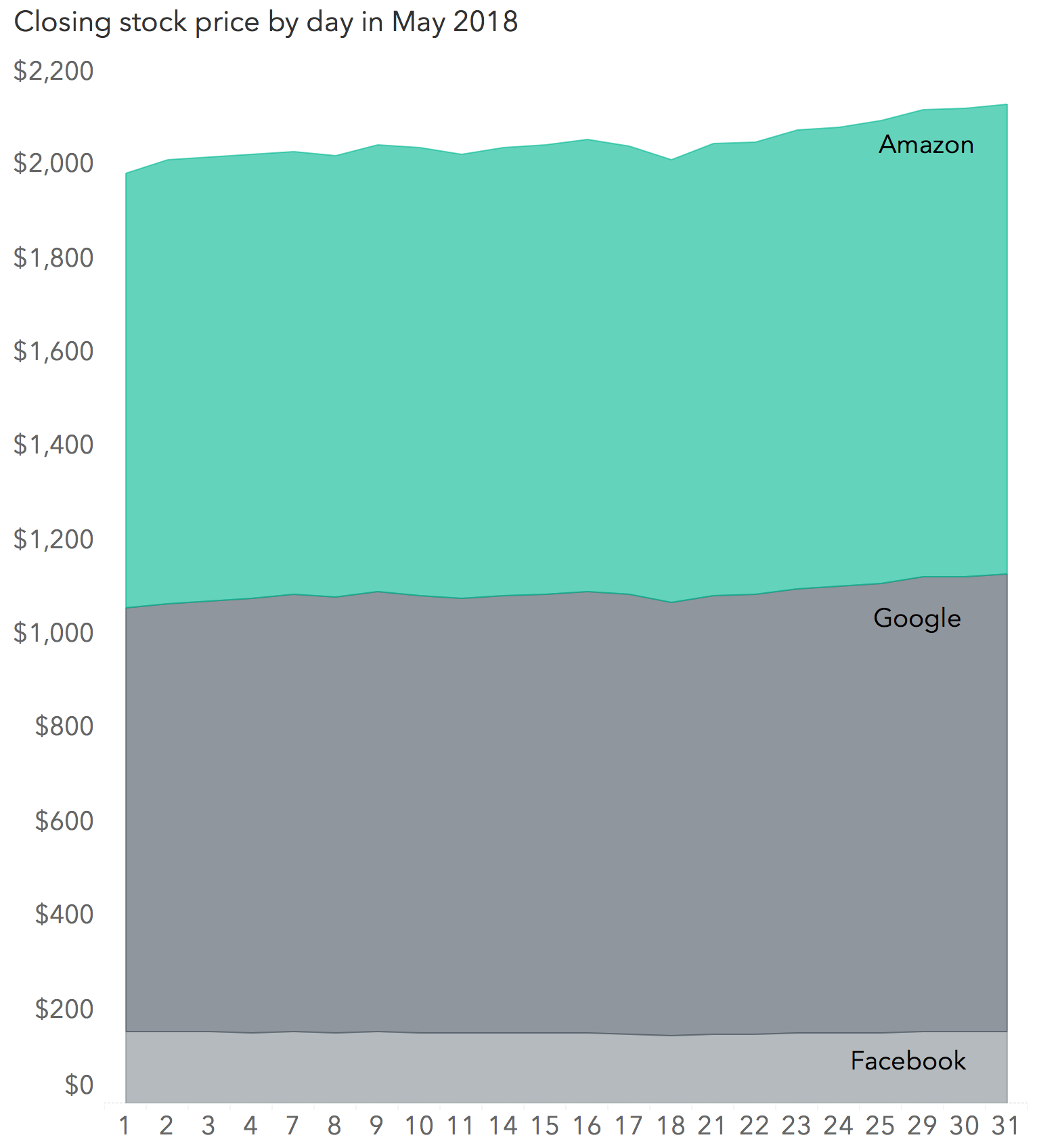
Figure 4.6: Area chart
4.3.1 Exercise: Stacked area
Create a stacked area chart that shows the changing stock price for three stocks (you selected in Exercise 1) for one month.
4.4 Stream graph
Stream graphs shows changes over time for different data series, where color or shading used to distinguish the categories. Each stream represents a single category proportional change over time. Use for large time series data.
Objective: Create a stream graph for the closing stock price by month for 4 companies over the past ten years.
Your final stream chart should look like Figure 4.7.
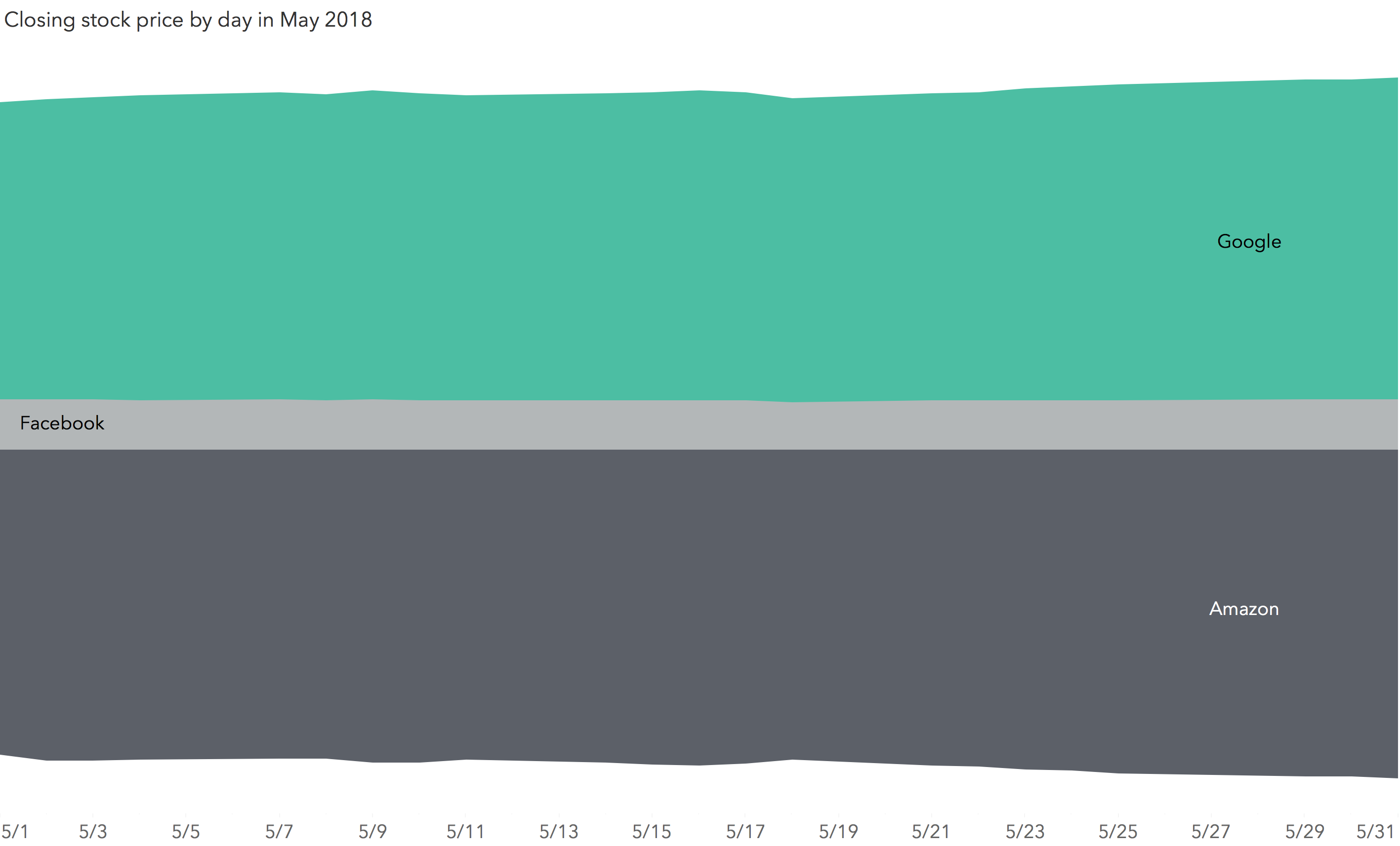
Figure 4.7: Stream graph
Typically stream graphs are used when there is quite a bit of data. For instance, the closing stock price for several stocks over a decade. As you begin to create more complex time series data graphics, you will be more concerned about the format of your data.
The data set we are using for this tutorial is organized so every company is a column in the data as shown below.
| Date | Amazon | ||
|---|---|---|---|
| 2018-05-01 | 927.800 | 901.94 | 151.74 |
| 2018-05-02 | 946.645 | 909.62 | 153.34 |
| 2018-05-03 | 946.000 | 914.86 | 153.60 |
| 2018-05-04 | 944.750 | 926.07 | 150.17 |
| 2018-05-07 | 940.520 | 933.54 | 151.45 |
While this is a neat presentation of data, most time series displays require the data in a long format. The conversion is easy to do in R or other programs (even Tableau). In R, you simple use the gather() function from tidyverse library and create two columns, “company” and “price” in which the columns “Amazon” through “Facebook” will be reorganized.
The R code is below for your reference.
library(tidyverse)
data_long <- gather(timeseries_stockprice, company, price, Amazon:Facebook, factor_key=TRUE)
Then the data is saved as .csv file that can be imported into Tableau. You should use timeseries_stockprice_long.csv for the remainder of this tutorial.
Here’s a preview of the transformed data.
| Date | company | price |
|---|---|---|
| 2018-05-01 | Amazon | 927.800 |
| 2018-05-02 | Amazon | 946.645 |
| 2018-05-03 | Amazon | 946.000 |
| 2018-05-04 | Amazon | 944.750 |
| 2018-05-07 | Amazon | 940.520 |
Step 1
Import the data. In the same workbook, go to Data > New Data Source. Select Text. Navigate to your data file (in this case timeseries_stockprice_long.csv) and select it. Be sure not to join this data set with other data file in your workbook.
Step 2
Create a stacked area chart.
Drag company to rows
Drag time to columns
Drag company to color on the marks card.
Select the stacked area chart from Show Me.
Drag company to labels
Step 3
Create a calculated field named streamdata.
Type the following into the calculated field:
case[Company] when ‘Facebook’ then [Price] when ‘Google’ then [Price] else -[Price] END
Step 4
Re visualize.
Remove price from rows
Drag streamdata to rows
See Figure 4.8.
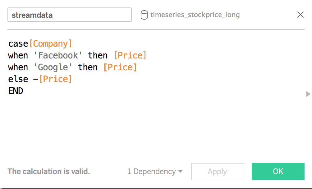
Figure 4.8: Stream graph
Step 5
Adjust as necessary.
remove the headers for the rows since you won’t want to show the actual price values, when they are represented as negative numbers.
Use exact date for the date field on the columns
Format the date to start on May 1st and end on May 31st.
4.4.1 Exercise: Stream graph
Create stream graph that shows the market cap rate OR stock price for several stocks over a 5 year period. See an example in Figure 4.9. Note: You would want to remove the y-axis in this case for the presentation to be interpreted correctly (rather than stock prices as negative values).
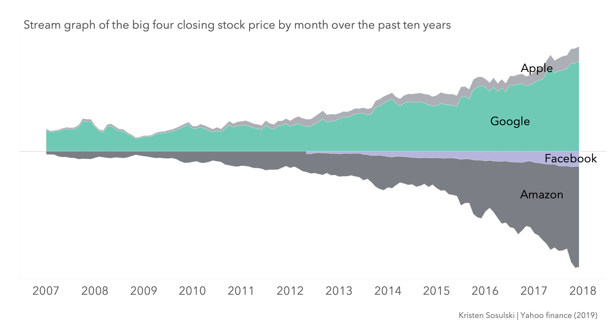
Figure 4.9: Stream graph
Examples
Stocks: stock prices of ~662 companies listed on the NASDAQ from 2005 to 2015. ~121 data points. https://streamgraphs.github.io/stocks.html
Marketcap: market capitalization of ~662 companies listed on the NASDAQ from 1995 to 2015. ~241 data points. https://streamgraphs.github.io/marketcap.html
Tutorials and further reading
https://www.thedataschool.co.uk/emily-chen/designing-a-stream-graph/
http://www.vizwiz.com/2013/01/creating-stream-graphs-in-tableau-8-in.html
Learn more about Stream graphs at: http://yifanhu.net/PUB/StreamGraph.pdf