Lab 1 Primer
This primer is designed to help you get started with the technical aspects of visualizing data with Tableau. To begin, download the latest version of Tableau Desktop at: https://www.tableau.com/tft/activation
Activate Tableau with the product key provided in the course syllabus.
Once you have installed Tableau, it is strongly recommended that you review the tutorial at: https://www.tableau.com/learn/tutorials/on-demand/getting-started?playlist=484034. This will require you to register with Tableau. You will need to have a Tableau account for some of the later labs.
The tutorial will show you how to create basic data graphics and provide an overview of working and using Tableau. Once you have reviewed the tutorial, continue on with this lab.
1.1 Navigating and Using Tableau
Tableau is filled with sophisticated features and capabilities for data visualization.
Let me show you how it works in this video: https://youtu.be/adDjc_aLYyM
Figure 1.1 shows the seven key features.
Discrete data columns are listed in this window and represented by blue “pills” when they are dragged to columns or rows in 3
Continuous data columns are listed in this window and represented by green “pills” when they are dragged to columns or rows in 3
The axes for the chart are defined by rows (y-axis) and columns (x-axis).
Show Me window displays the “possible” chart types based on the data in the rows in columns
The Marks cards also allows for the selection of different chart types in addition to the modifying the colors, size, and text details associated with the chart.
The View window is where the chart appears. The View window will be referenced through the examples and tutorials.
The Worksheet tab is for building data graphics. The Dashboard tab is for arrange multiple charts on a single view.
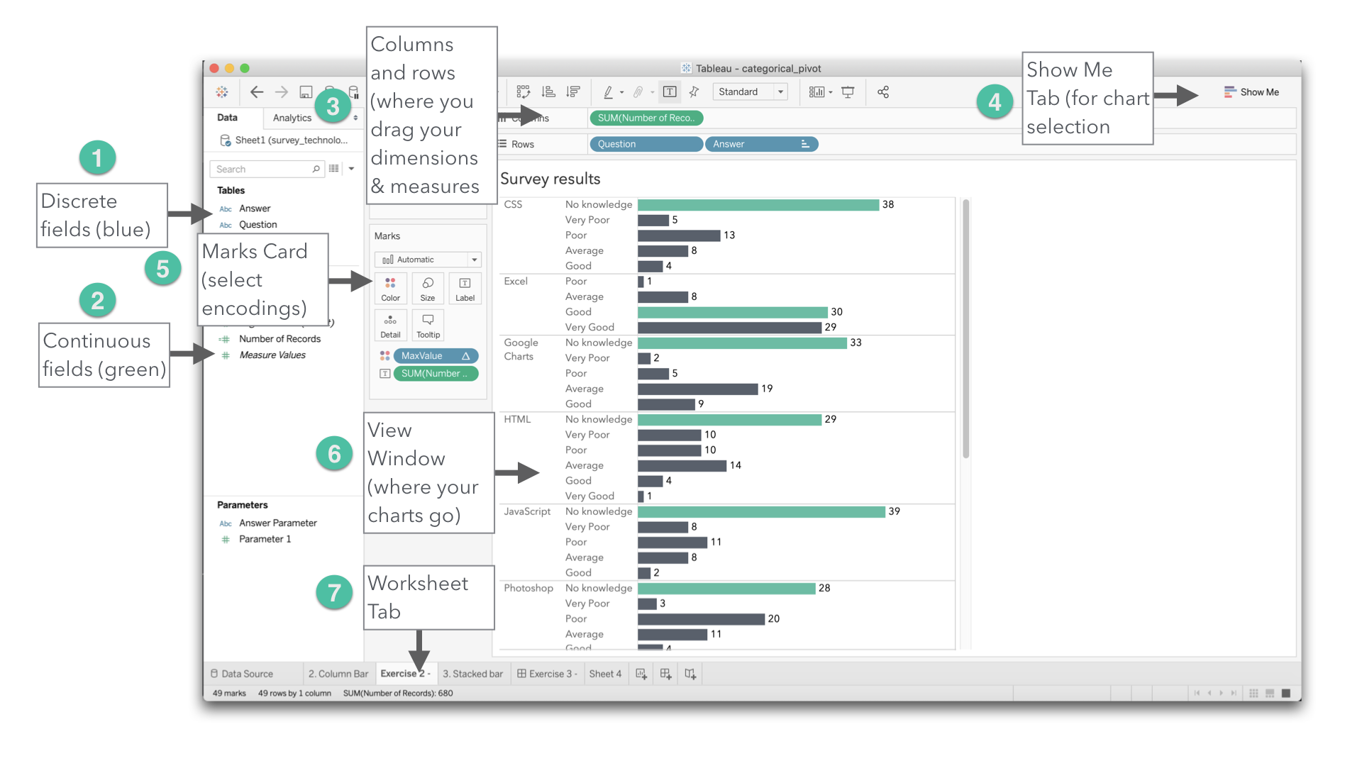
Figure 1.1: Navigating Tableau Desktop
Next, follow along with the exercise below.
1.1.1 Exercise: Basics
This activity is designed to guide you to do the following:
- Practice importing data into Tableau;
- Understand the difference between dimensions and measures;
- Create several different display types and select the most appropriate display;
- Add a chart title and caption for your audience; and
- Use the grouping feature and quick filter tool to show only the data you want to display.
Objective
Create the chart similar to Figure 1.2
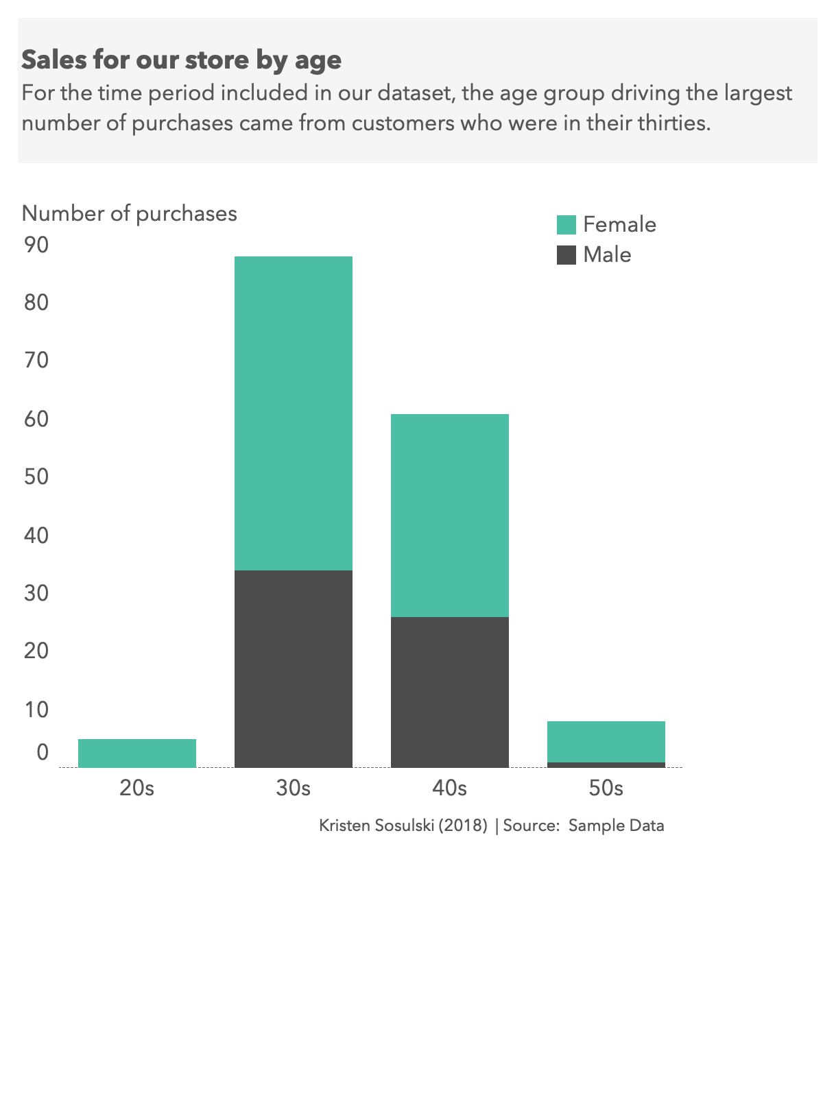
Figure 1.2: Simple stacked bar chart
Data: sales.csv Download at: http://becomingvisual.com/datavislab/sales.csv
| purchase | age | gender | income |
|---|---|---|---|
| 0 | 41 | Female | Low |
| 0 | 47 | Female | Low |
| 1 | 41 | Female | Low |
| 1 | 39 | Female | Low |
| 0 | 32 | Female | Low |
STEP 1. Go to Tableau and import the sales.csv dataset
- Open Tableau. Select connect to data > In a file > Text File
- Navigate to and select the sales.csv file from your computer
- Click on the Go to Worksheet button in orange
STEP 2. Save your Tableau workbook as a Tableau Packaged Workbook.
- Go to File > Save as >
- Enter the title Sales
- Select file type as Tableau Packaged Workbook (.twbx)
Question What’s the difference between a Tableau Workbook and a Tableau Packaged Workbook?
Answer A .twbx file saves your data together with the Tableau workbook. A .twb file points to the data, rather than saves it within the workbook.
STEP 3. Dimensions and measures
How has your data been categorized by Tableau?
You should see your data organized by dimensions and measures.
What do you remember about the difference between measures and dimensions (refer to the Tableau Interface video)?
Always check to see if Tableau encoded your data correctly. Are the right variables encoded as dimensions and measures?
STEP 4. Create a chart that displays the number of purchases by age
- What variable do you want to put on the x-axis, or on the columns?
- What variable do you want to put on the y-axis or the rows?
- What is the default output? What type of chart is this?
- Describe what is happening with the data? Are you seeing what you want to see?
STEP 5. Select another display? This can be done through the Marks Card or Show Me.
- What are the available options? Which one did you select?
STEP 6. Change Age variable from a measure to a dimension.
A measure can be changed to a dimension by right clicking on the variable name in the measures window > Convert to dimension.
Repeat STEP 4, using the age variable as a dimension. Note the options available for chart types in the Show Me window. Select the bar chart.
Note the differences among the first bar chart you graphed (in STEP 4), the histogram or table (in STEP 5) and your current bar chart?
STEP 7. Create a stacked bar
In a new tab, create a stacked bar of the purchases by age and gender.
STEP 8. Swap the x-axis and the y-axis.
Mouse over the variable on the y-axis and select the Swap rows and columns icon from the Tableau menu.
Figure 1.3: Swap rows and columns button
Which arrangement works best?
STEP 9. Order the data
Next, order the data using the sort ascending or descending icons.
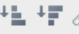
Figure 1.4: Options to order data ascending or descending order
Which order works best?
STEP 10. Change the size and color of the bars using the marks card.
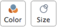
Figure 1.5: Color and size options on the marks card
On the marks card you will see icons for color and size.
Select Color > Edit Colors > Select the data item (i.e. female, male) and then select the color for that data item. Select Size > Drag the slider to the desired size.
STEP 11. Group your data.
Create a third worksheet in your workbook. Group your data by age by right clicking on the Age dimension. Then, select Create > Group. Create your groupings.
Chart your group.
STEP 12. Exclude all men and women under 30 years old from your chart.
This can be done using the quick filter on Age and un-checking the ages you would like to exclude from the display.
STEP 13. Add a title and caption for each worksheet
Go to Worksheet > Show Title. Revise the title in the title box.
STEP 14. Save your chart Save your chart as a .png file as lastname_firstname_ex_1_1_1.png
- Go to Worksheet > Export > Image
- Select Title and View as shown in Figure 1.6.
- Title your image lastname_firstname_ex_1_1_1.png

Figure 1.6: Image settings
TAKEAWAYS
- Save all workbooks as .twbx, not .twb files
- Store you data and .twbx files in the same directory
- Always ensure that Tableau encoded your data correctly by examining the variables stored as dimensions versus measures.
- Consider grouping your data into logical categories as appropriate.
1.1.2 Exercise: Bullet chart
Task
- Create a bullet chart to show annual sales by item versus target sales
- Create a bullet chart to show actual sales by customer contact method versus the target sales
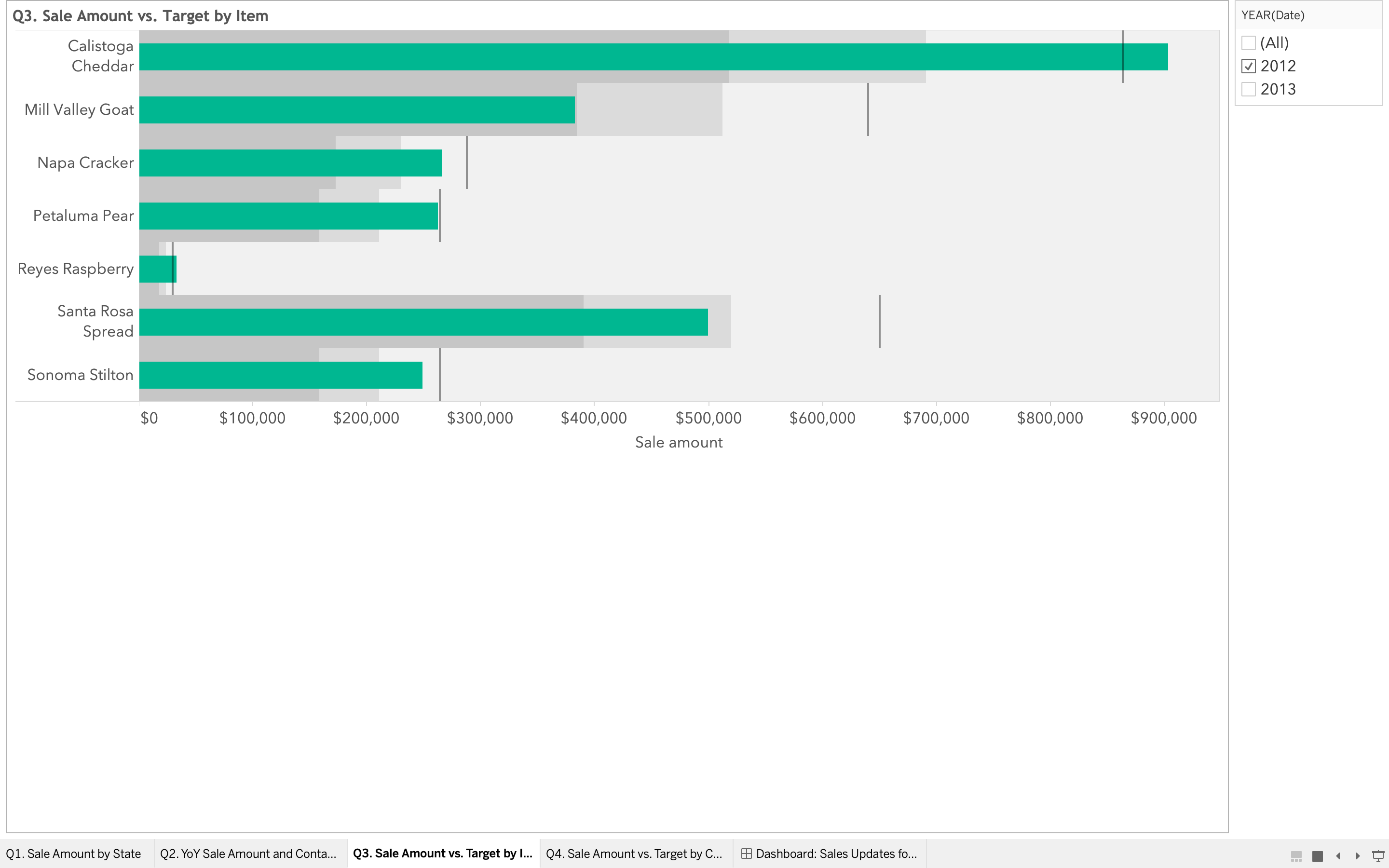
Figure 1.7: Bullet Chart in Tableau
Data Download and use the cheesemakers_student_exercise.twbx (the data is included in the workbook). http://becomingvisual.com/datavislab/cheesemakers_student_exercise.twbx
See a brief video demonstration.
STEP 1
- Open the workbook and begin on the Q3 worksheet
- Drag SUM (Sales Amount) to columns
STEP 2
Drag Item Name to rows
STEP 3
Drag SUM (Sales Target) to the view (center of the screen)
STEP 4
Select bullet graph from Show me.
STEP 5
Edit the qualitative ranges of the bullet chart
- Mouse over the qualitative range (in gray behind the Sales Amount bar).
- Right click and select > Edit qualitative ranges > right click on range and select edit. Changes the changes from the default range of 60% and 80%.
- Double check the time dimension of your data. Do you want to show one or two years at a time?
1.1.3 Exercise: Multiple charts types arranged on a dashboard
Overview
In this lab, you will be asked to answer several questions with data visualizations. You should create 4 worksheets and then assemble those graphs onto a single dashboard in Tableau. Finally, be sure to design the charts so they are readable and are visually appealing.
Data Download and use the cheesemakers_student_exercise.twbx (the data is included in the workbook). http://becomingvisual.com/datavislab/cheesemakers_student_exercise.twbx
Audience VP of Sales at Cheesemaker’s Inc. who sells to the public and gourmet retailers.
Task Provide an update for review by the VP of Sales. Create a data graphic to addresses each of the following questions:
- What are the sales by state? (Hint: Try creating a map)
- What were the sales by customer contact method in 2013 compared to 2012? (Hint: Try creating a bar or line chart)
- What are the annual sales by item versus target sales? (Hint: try creating a bullet chart. See Exercise 1.1.2)
- What are the actual sales by customer contact method versus the target sales? (Hint: try creating a bullet chart)
Then, combine each graphic on a dashboard in Tableau to have a single view of the answers to each of the questions.
Resource
Creating dashboards in Tableau
http://onlinehelp.tableau.com/current/pro/desktop/en-us/help.htm#dashboards_create.html
1.1.4 Exercise: Highlight and filter
Task
- Create set to highlight Washington’s sales
- Annotate a data point
- Contact method: Use as quick filter
STEP 1. Create a set based on State. It is assumed that you have created a bubble/symbol map of sales based on state. If not, create that first.
- Click on State in Dimensions. Select Create > Set See Figure 1.8.
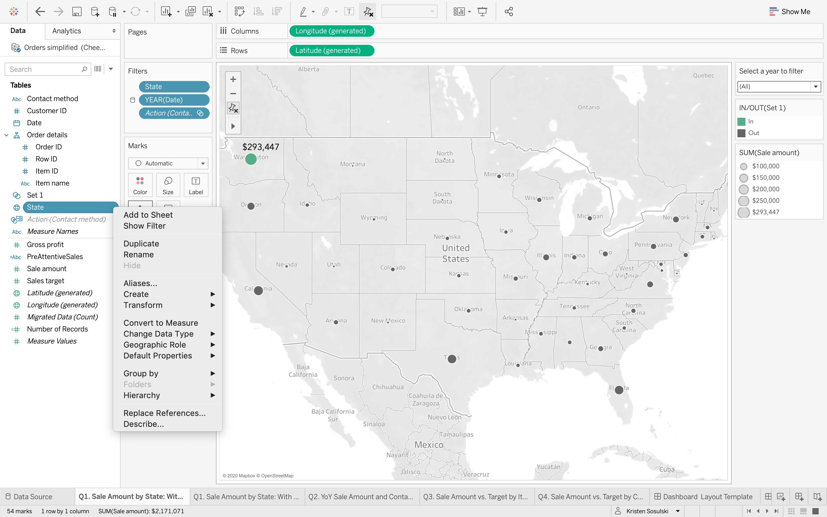
Figure 1.8: Creating a set
- Name the set Washington_Highlighted.
- Check WA from the list of states. See Figure 1.9
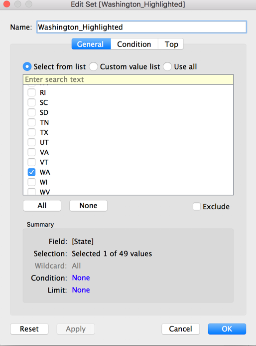
Figure 1.9: Creating a set
STEP 2. Drag the set Washington_Highlighted to colors.
- Select Edit Colors to change the color for Washington (In versus Out).
See Figure 1.10
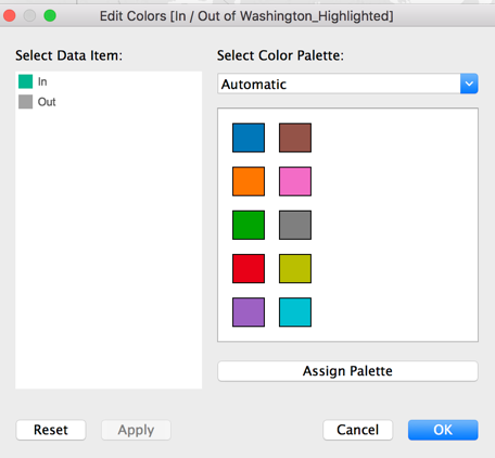
Figure 1.10: Highlighting a data point
STEP 3. Annotate the mark.
- Click on the bubble in Washington. Select Annotate > Mark
- Add
See Figure 1.11
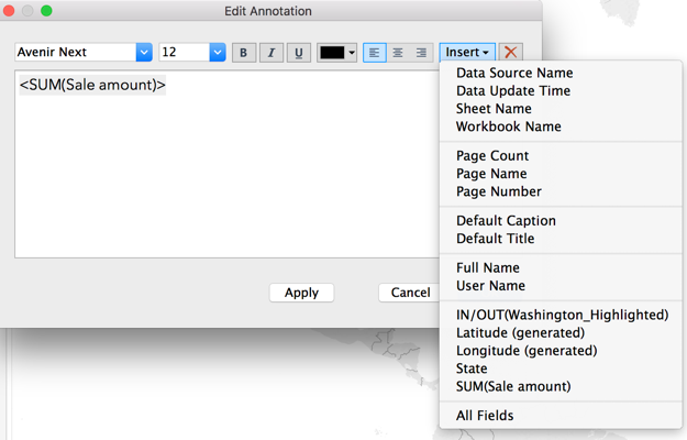
Figure 1.11: Annotating a data point
Your map should look like Figure 1.12
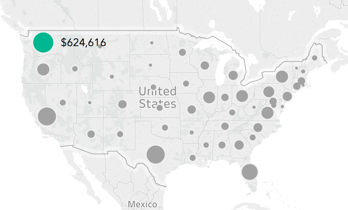
Figure 1.12: Geospatial display with an annotated data point
STEP 4. Use contact method as a quick filter.
Go to your dashboard. Use the contact method sheet as a quick filter, see Figure 1.13
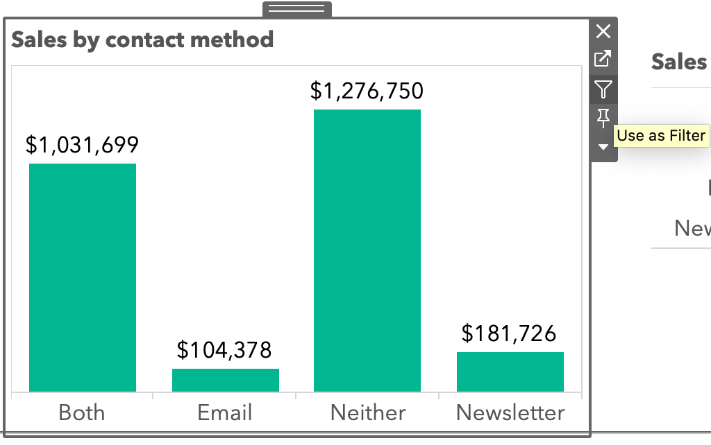
Figure 1.13: Creating a quick filter
Click on a contact method type such as email, newsletter, both, or neither and you should see the results appear in the map and other charts on your dashboard, see Figure 1.14.
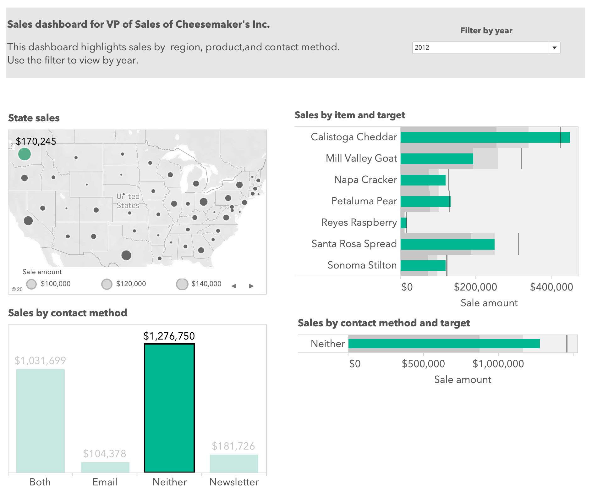
Figure 1.14: A dashboard with a quick filter
1.1.5 Exercise: Dynamic highlighting
Task: Use your cheesemakers workbook to learn how to apply filtering and highlighting techniques.
STEP 1. Create a calculated field called PreAttentiveSales.
Go to the Analysis menu > Create Calculated Field. Name the calculated field PreAttentiveSales
STEP 2. Enter in the conditional statement below
IF SUM([Sale amount]) = WINDOW_MAX(SUM([Sale amount])) THEN "Max State" ELSEIF SUM([Sale amount]) = WINDOW_MIN(SUM([Sale amount])) THEN "Min State" ELSE "Neither" END
STEP 3. Drag PreAttentiveSales to color on the Marks card.
Notice that you only see MaxState as an option. However, you should see Max State, Min State and Neither as options for the PreAttentiveSales field, see Figure 1.15.
The calculation computation is incorrect by default.
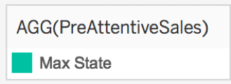
Figure 1.15: Note Max State is only shown
STEP 4. Adjust the calcuation
Set the calculation type Compute using State.
Click on the down arrow on the PreAttentiveSales field in the marks card and select Compute Using > State, see Figure 1.16.
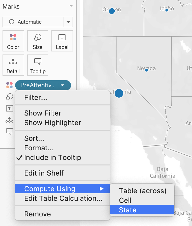
Figure 1.16: Adjusting the computation based on State
Now you will see the three options available for PreAttentiveSales, see Figure 1.17
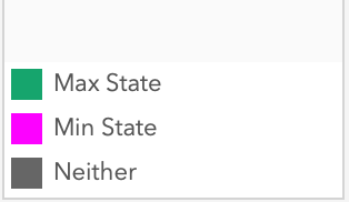
Figure 1.17: Correct legend with Max State highlighted
STEP 5. Change the colors on the marks card
Set the colors for each option by selecting Colors (from the marks card) > Edit colors, , see Figure 1.18
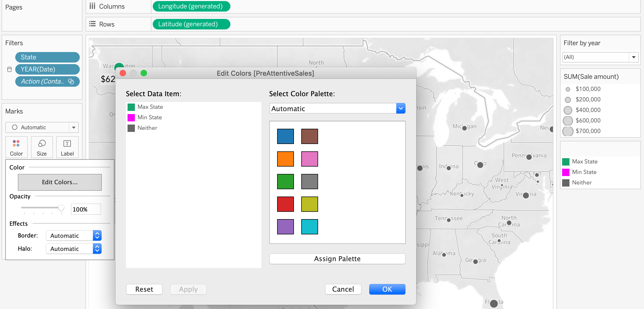
Figure 1.18: Editing colors
STEP 6. Set filter by contact method, then by max value.
- Add
Contact Methodto filter (if it is not there already) by dragging it to the filters card.
- Click on
Contact Methodin the filter and select > Apply to Context, see Figure 1.19.
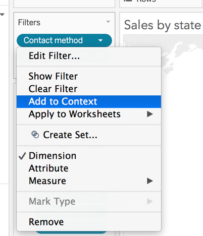
Figure 1.19: Applying the filter to context
STEP 7. Add max value label
For the Sales amount label to appear on the max value bubble, drag Sales to Marks > Label. Then modify the Label by setting the parameters as shown in Figure 1.20.
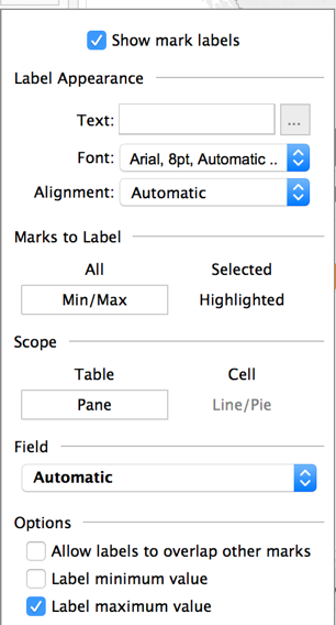
Figure 1.20: Adding labels
STEP 8. Test calculated field with a filter
- Go to the dashboard use the Sales by Contact Method sheet as a filter.
- Test the filter. For example, if you filter by
Neitheryou should see the bubble in Texas highlighted with the sales amount annotated, see Figure 1.21.
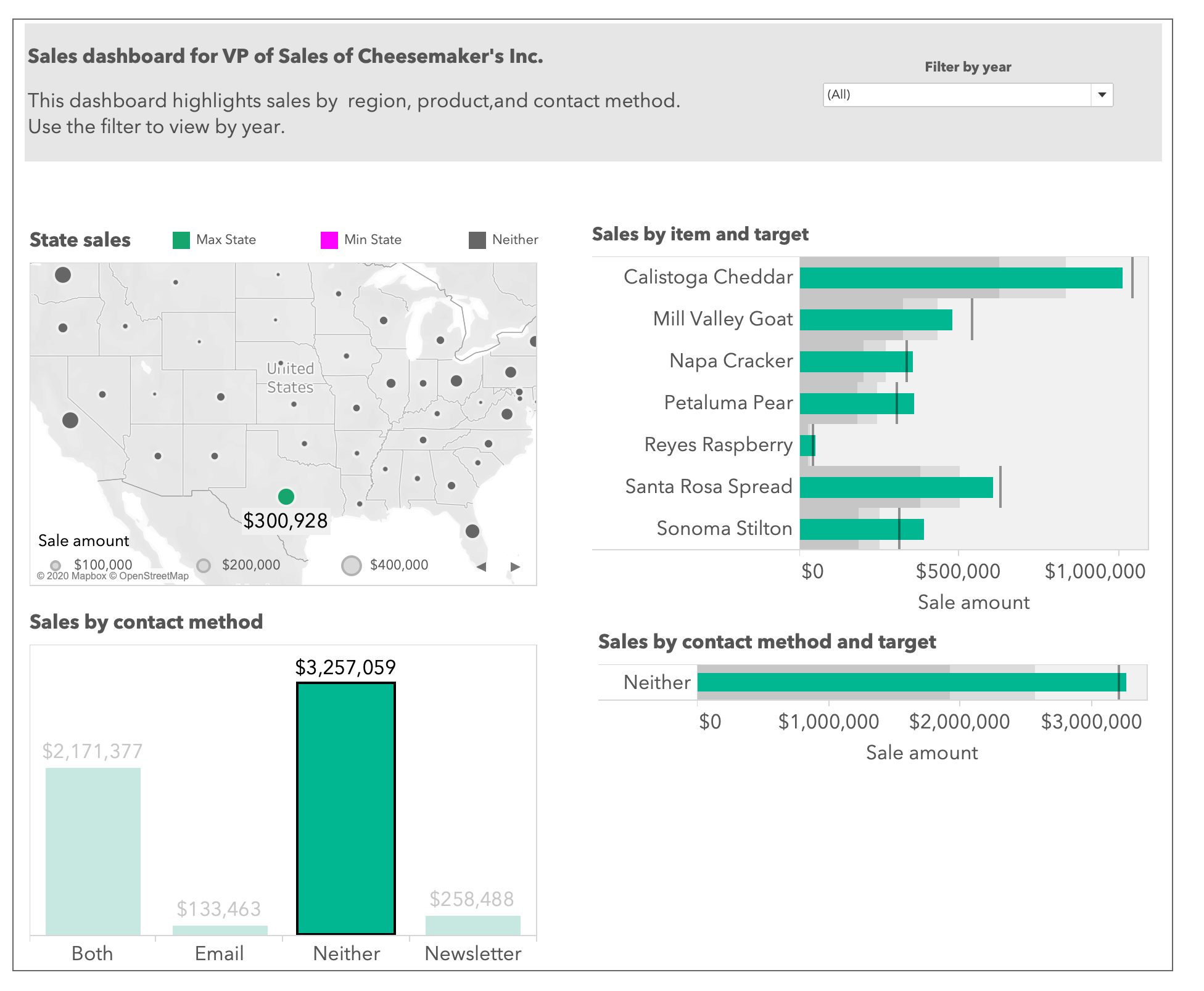
Figure 1.21: Testing the calculated field