Lab 3 Geospatial
In this lesson, we will build a filled map and point map with geospatial data.
Tableau automatically assigns geographic roles to fields with common geographical names, such as Country, State/Province, City, etc. Fields with a geographic role will automatically generate longitude and latitude coordinates on a map view. Geographic roles can also be manually assigned to fields that are not automatically recognized. Fields with assigned geographic roles will have a globe icon next to them.
3.1 Filled Map
Filled maps are useful for comparing regions. In this example we will create a filled map that shows the those state that had the most aviation accidents. The data is from the National Transportation Safety Board (NTSB) aviation accident database. This database contains information from 1962 and later about civil aviation accidents and selected incidents within the United States, its territories and possessions, and in international water.
Objective: Show the aggregation of the individual observations as a filled region on a map projection.
Data: aviation.csv http://becomingvisual.com/datavislab/aviation.csv
Data dictionary https://www.ntsb.gov/_layouts/ntsb.aviation/AviationDownloadDataDictionary.aspx
Watch the demonstration and follow the steps below.
https://www.youtube.com/embed/XSuL5d_EXtw
STEP 1
Understanding geographic data
To create a basic filled map of aviation accidents by state in Tableau we cannot simply drag longitude to columns and latitude to rows and select the filled map from the Show Me menu. Rather, you have to study the data available and identify a geographical state variable. As the data is currently coded, there is not a state variable. However, there is a variable called Location in which state is available.
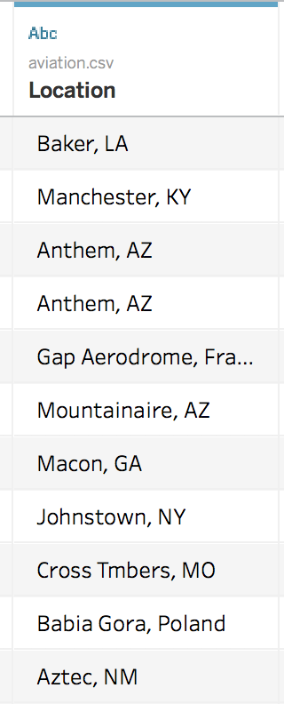
Figure 3.1: Location field
Upon review of the data you can easily see that the state abbreviation is given for all U.S. states, in addition to other location data. The state is the last element of each value, separated by a comma. Therefore, we can create a new field or variable from the Location field that only contains the state.
STEP 2
Create a new field called State by splitting the Location field.
- Right click on the Location field in the dimensions window, click the down arrow, and select Transform > Custom Split
- Select comma as the separator and choose Split off:last by 1 column.
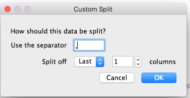
Figure 3.2: Splitting a field
- Rename the new field to State by clicking on the down arrow and selecting Rename
- Change the data of type of State by clicking on the down arrow and selecting Geographical Role > State / Province
STEP 3
- Filter by state (choose all U.S. states) by dragging _state to the Filters card
- Drag state to Detail on the Marks card
- Drag Number of Records to Color on the Marks Card.
- Select filled map from Show Me.
- Adjust the gradient and min and max values by editing the legend.
3.1.1 Exercise: Filled Map
Build a filled map a fatal injuries for each year from 2010-2013 (4 in total). This requires you to create 4 worksheets in your Tableau workbook and arrange them in a dashboard as a small multiples display.
See Figure 3.3 for an example.
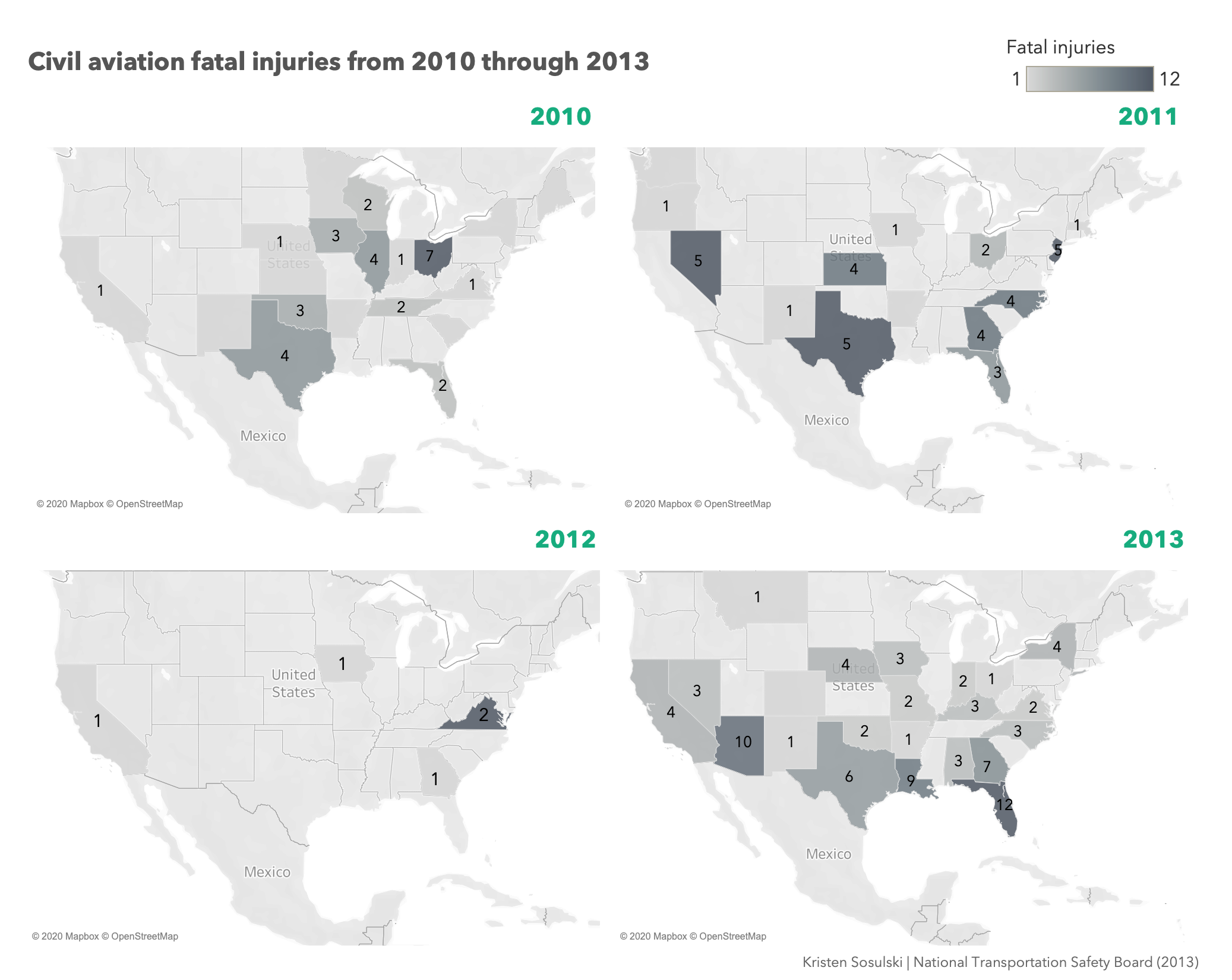
Figure 3.3: Four filled maps arranged on a dashboard
3.2 Point Map
Objective: Show the each individual observation as a point on a map projection.
Data aviation.csv http://becomingvisual.com/datavislab/aviation.csv
Task Create a geospatial display that show the plane crashes in the US for 2013
Watch the demonstration and follow the steps below.
https://www.youtube.com/embed/xZb1cKxWPZI
SHEET 1 - 1. Basic Map
STEP 1.
To create a basic point map in Tableau (using the aviation data) drag longitude to columns and latitude to rows and select the symbol map from the Show Me menu.
See Figure 3.4.
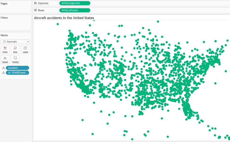
Figure 3.4: Simple point map
STEP 2. Next, create a group for fatal vs. non-fatal crashes. Filter out unknowns.
- Right click on Injury Severity > Create > Group.
- Name the group Injury Severity (group)
3.5.
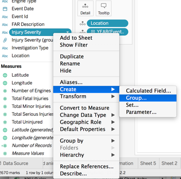
Figure 3.5: Creating a group
- Group the fatal crashes (fatal1, fatal2, etc.) together in a grouping call Fatal.
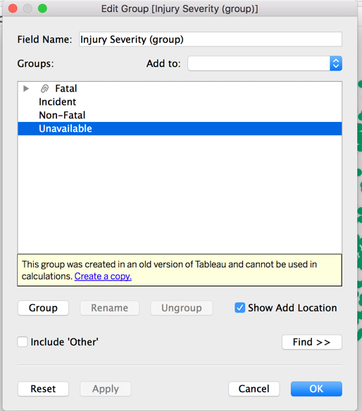
Figure 3.6: Editing a group
- Drag Injury Severity (group) to filter. Filter by fatal versus non-fatal crashes.
- Drag Injury Severity (group) to color. Assign colors as appropriate.
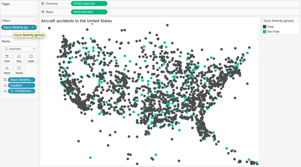
Figure 3.7: Injury severity grouped on the map by fatal and non-fatal
STEP 3.
- Set basic map layers. Go to Map > Map Layers
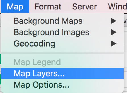
Figure 3.8: Creating a group
- Set the Map background Style > Normal and Washout to 0%.
- Select the Map Layers > Coastline, State / Province Borders, State / Province Names. Set to Make Default.
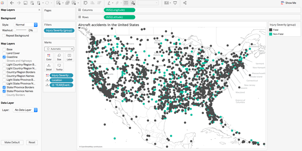
Figure 3.9: Setting the map background and style
STEP 4.
Set the filter. Click on the Injury Severity (group) in the filters card > Show Filter
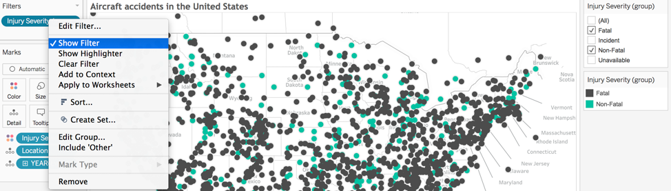
Figure 3.10: Setting a filter
STEP 5.
Customize the filter. Select the Multiple Values (drop-down) option. Format the text and text size of the drop-down menu and the legend by clicking on the down arrow and selecting > Format Filters (for the filter) and Format Legend to format the legend.
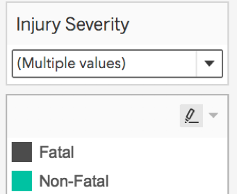
Figure 3.11: Customizing the filter
3.3 Basic Map - AK
SHEET 2 - 2. Basic Map - AK
Create a duplicate of the map from sheet 1.
- Click on sheet 1 > Duplicate
- Rename the sheet 2. Basic Map - AK
- Zoom into Alaska
- Hide Legend by clicking and selecting > Hide Card
3.4 Basic Map - HI
SHEET 3 - 3. Basic Map - HI
Create a duplicate of the map from sheet 2.
- Click on sheet 2 > Duplicate
- Rename the sheet 3. Basic Map - HI
- Zoom into Hawaii
- Hide Legend by clicking and selecting > Hide Card
3.4.1 Exercise: Build an embedded map
DASHBOARD 1 - 1, 2 & 3 - Embedded Map
Create a dashboard.
- Name the dashboard 1, 2 & 3. Embedded Map
- Drag 1. Basic Map, 2. Basic Map - AK, and 3. Basic Map - HI on to the dashboard as floating.
- Arrange AK and HI in the left corner of the map.
- Label AK and HI (with the state name) using the text label tool (be sure to go back to Sheet 2 and Sheet 3 and remove State / Province Names from Map Layers.
- Link the Injury Severity Group filter to All worksheets to ensure accurate filtering.
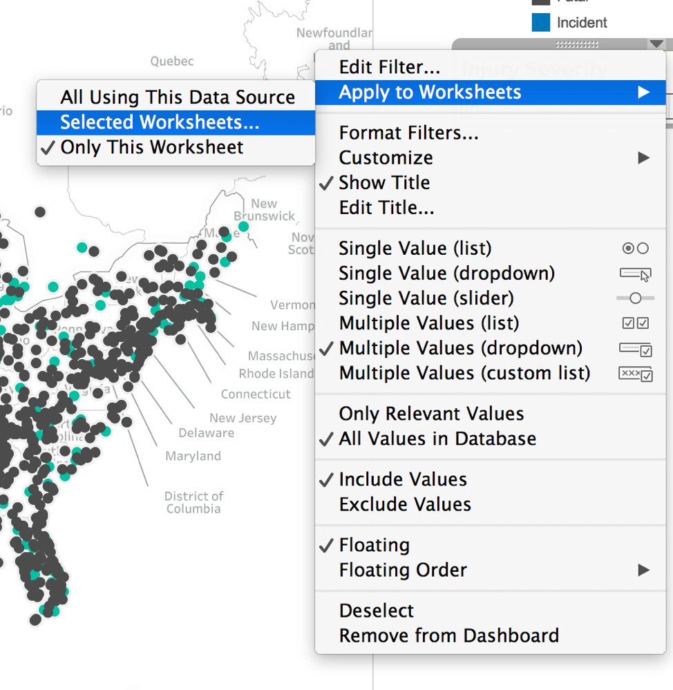
Figure 3.12: Applying the filter to all sheets
3.4.2 Exercise: Build an interactive and animated map
Objective: Create a map that shows change in accidents over time through an animation.
See Figure 3.13
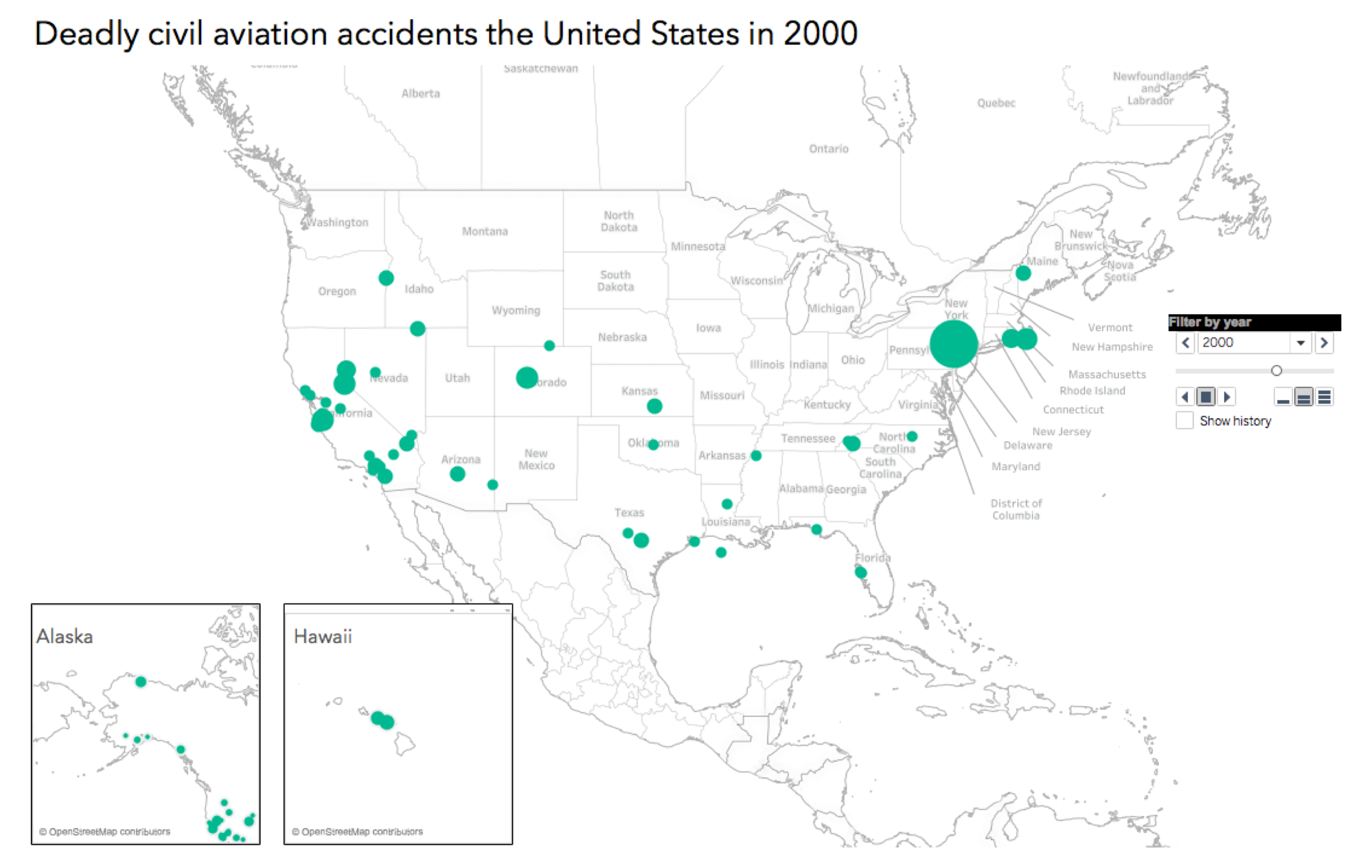
Figure 3.13: An interactive and animated map
STEP 1.
Go to Sheet 1- Basic Map and size the points by the number of fatalities.
- Drag Total Fatal Injuries to size on the Marks card.
STEP 2.
Use the pages card. Drag Event Date to the pages card.
STEP 3.
Determine the speed (slow, normal, or fast)
STEP 4.
Click on the Show history down arrow from Pages card (do not check show history). Select Show Marks and select the color and check the Fade box for Marks.
NOTE: Selecting color and transparency for the marks will not take affect for trend animations. This is a feature for trace animation.
STEP 5 Repeat STEPS 2-4 for the sheets AK and HI.
STEP 6 Create new dashboard that with AK and HI embedded with the basic point map.
STEP 7 Ensure that the slider from the pages card has been placed on your dashboard. Click the down arrow on the slider and check synchronized. This enables the slider to control the output of all three sheets.
Figure 3.14.
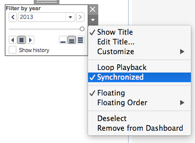
Figure 3.14: Option to synchronize the worksheets
STEP 8 Finally, change the title of the Basic map to include the
Figure 3.15.
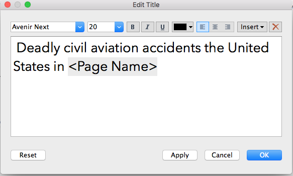
Figure 3.15: Changing the title of the worksheet to dynamically reflect changes in the graphic
STEP 9
Press play on the pages slide on your dashboard and it should look similar to the video below.
https://www.youtube.com/embed/251rYgYBQc4
Watch video
3.5 Geocoding
Geocoding is the process of converting street addresses or other locations (ZIP codes, postal codes, city & state, airport codes, etc.) to latitude and longitude, which can be entered into a GPS device or geographical software.
Let’s say that your data set contains the address of each Starbucks and Dunkin Donuts in NYC. However, the location is given in the form of street number, street, city, state, zip.
Many software programs are unable to plot these data. Instead you will need to convert these address fields to standard address fields, and then translate those standard addresses into latitude and longitude.
There are free geocoding apps in addition to JavaScript, R and Python libraries for geocoding.
These resources will be helpful if you need to geocode your data in advance of importing into R, python or Tableau.
3.5.1 Exercise: Geocoding in Geocodio
Objective: Geocode data to convert addresses to coordinates. Plot locations as a point map.
Data: coffeeshops.csv http://becomingvisual.com/datavislab/coffeeshops.csv
Task: Use the free Geocodio app to geocode the locations of every Starbucks and Dunkin’ Donuts below Central Park. https://www.geocod.io/. Then, use Tableau to build a point map similar to the one shown in Figure 3.16.

Figure 3.16: A map showing the locations of Starbucks and Dunkin below central park
Watch the demonstration and follow the steps below. https://www.youtube.com/embed/cIRHOLJ1qx8