Lab 5 Multivariate
In this lab, we will build scatter plot, scatter plot matrix, a bubble chart, and heat map with multivariate data.
5.1 Scatter plot
Objective: Plot a chart to see if there is a relationship between two crimes: Murders and Burglaries by city.
Data
The data that we will be using is a snapshot from Massachusetts Police Department (for one year), where each row represents a crime. Download from http://becomingvisual.com/datavislab/crime.csv
STEP 1
- Import the crime.csv file into a new Tableau workbook. Take a look at the data and observe the variables.
STEP 2
Which variables should you plot on the x-axis and y-axis? You’re goal is to have one point for each city that is plotted at the intersection based on the number of robberies and burglaries. The point will be plotted at the intersection of these two variables.
Drag
Robberiesto Rows andBurglariesto columns. DragCityto label.
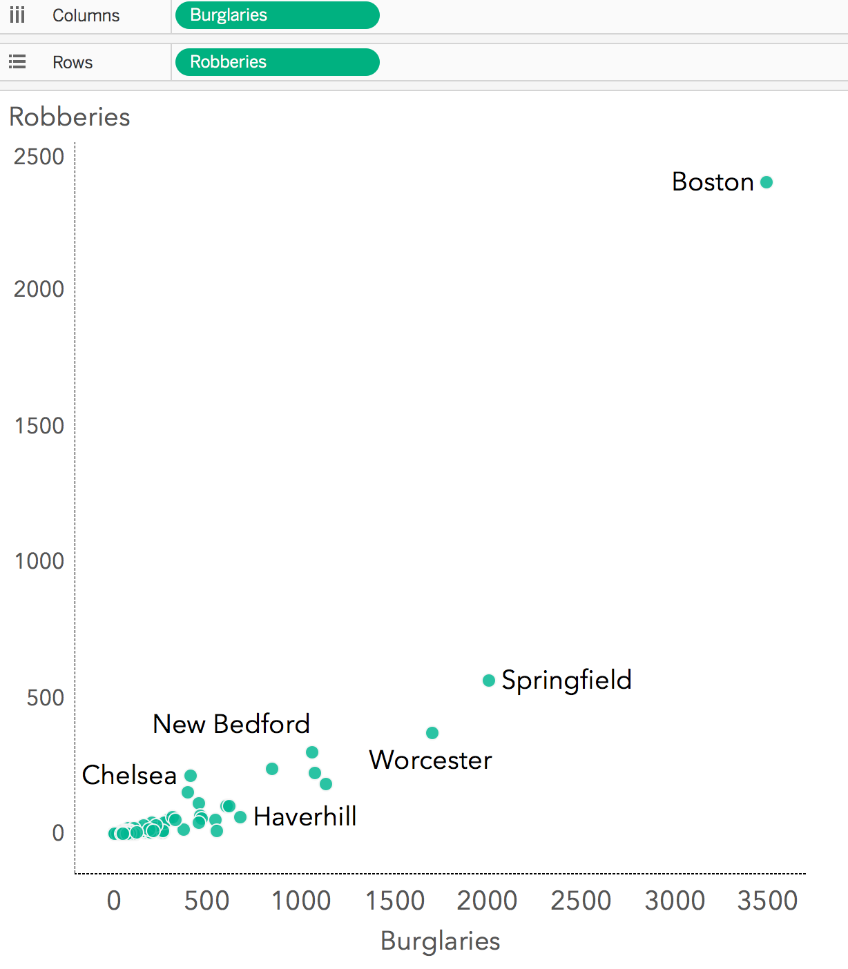
Figure 5.1: Basic scatter plot
STEP 3
Observe your results. You may notice a clustering of points at the lower end of the x and y scales. What do you notice about Boston? Boston appears to have a high level of burglaries and robberies. Logically this makes sense given the high population. Are there just more crimes in Boston or are there more crimes because there are more people?
It’s important to normalize your data based on population or by a standard metric such as Robberies per 10,000 people. To do this we need to 1) create a new calculated field or 2) see if our data already contains these normalized values.
In fact, our data does have a column for each crime per 10,000 people. This variable is computed using the following formula: (Number of Crimes / Population) x 10,000 = Crime Rate Per 10,000
Let’s use those variables instead.
5.1.1 Exercise: Scatter plot with normalized data
STEP 1
Re visualize these data (from the example above) based on the normalized variables: Buglaries per 10,000 and Robberies per 10,000. See Figure 5.2.
STEP 2
Format your chart based on the 10 design standards (refer to chapter 5).
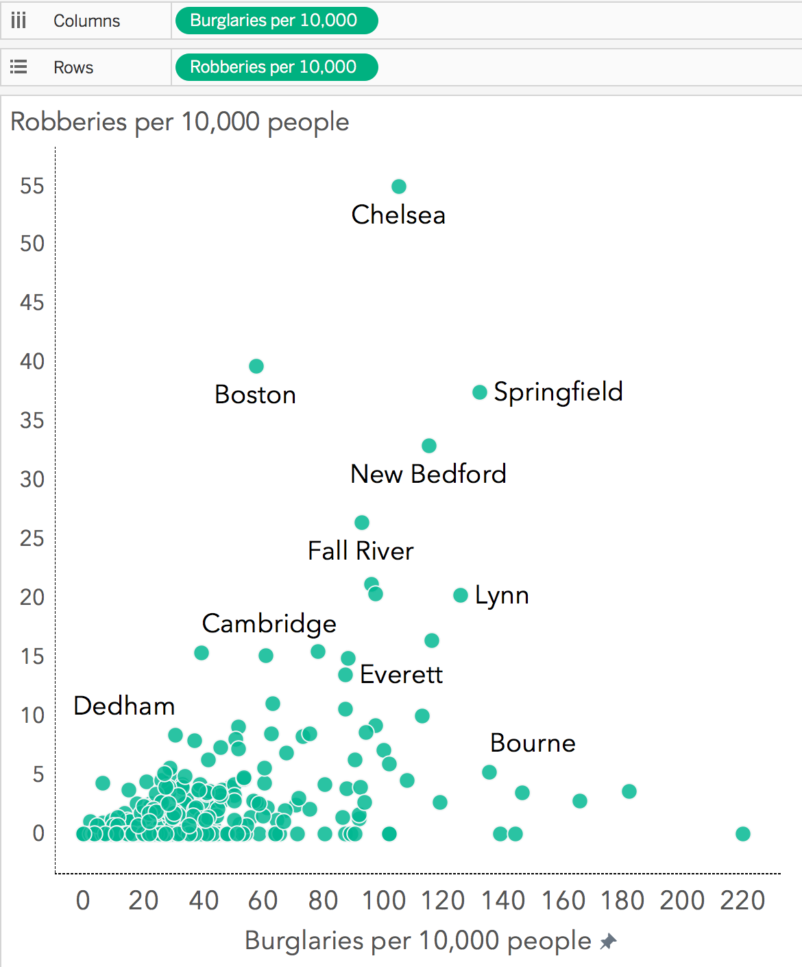
Figure 5.2: Visualizing the crime data using the normamlized variables
5.1.2 Exercise: Scatter plots and simple linear regression
Objective: Plot a chart to see if there is a relationship between YouTube advertisement dollars and units sold.
Your chart should look something like Figure 5.3.
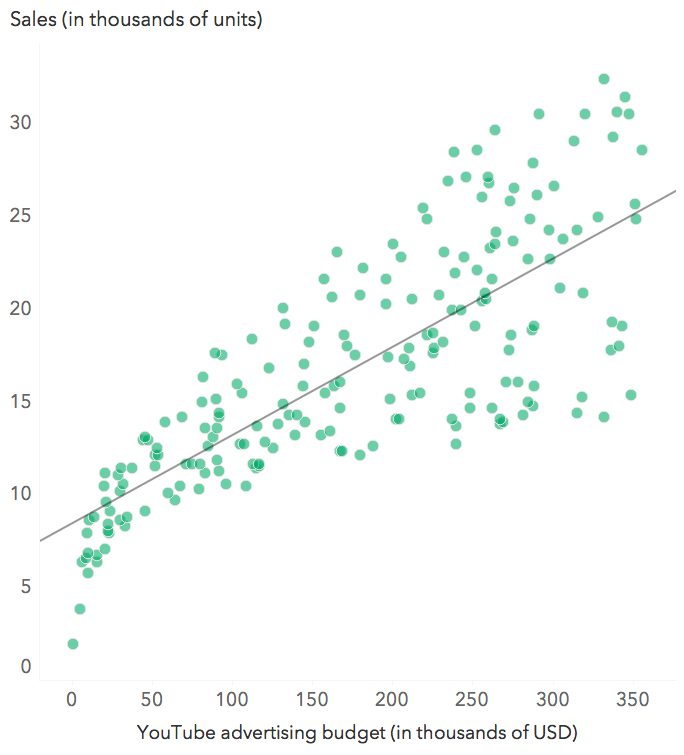
Figure 5.3: Basic scatter plot
Data
The data that we will be using is sample marketing data. This is data contains the impact of three advertising media (YouTube, Facebook and newspaper) on sales. Data are the advertising budget in thousands of dollars along with the sales. The advertising experiment has been repeated 200 times. The goal is to predict a quantitative outcome y on the basis of one single predictor variable x. Download the sample data at: http://becomingvisual.com/datavislab/marketing.csv
5.2 Scatter plot matrix
Objective: Plot a chart to see if there is a relationship between the various crime types.
- Use the crime.csv data, simply drag each variable to both rows and columns in the same order.
See Figure 5.4.
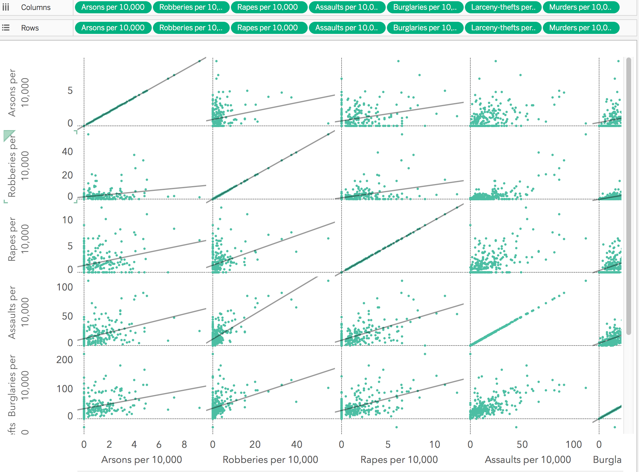
Figure 5.4: Basic scatter plot matrix
- Check to ensure that each variable is plotted in the same order. Note the intersection of the each variable along the diagonal.
5.2.1 Exercise: Scatter plot matrix
STEP 1
- Using the scatter plot matrix that you created in 5.2, add trend lines by going to the Analysis menu and selecting > Trend lines > Show trend lines.
- Format the display to ensure you apply the 10 design standards.
STEP 2
- Create a new dashboard and drag your scatter plot matrix (as floating) to the dashboard.
- From the Dashboard tab, drag the Blank object from the objects panel to cover the first plot of the matrix (upper left hand corner)
- From the Layout tab, fill the background of that Blank object with the color white. This should cover the graphic completely. Adjust the width and height (and write down the width and height you settled on for the Blank object)
- Repeat the previous action for those graphs along the diagonal that show the same variable on both the x and y axes, e.g.
Buglaries per 10,000andBuglaries per 10,000. Ensure the Blank objects are all the same size. The size can be adjusted using the Layout tab and altering the size width and height.
- Label each of the the Blank objects on your dashboard with the name of variable it represents, e.g.
Buglaries per 10,000. From the dashboard tab, select the Text object and drag it to the Blank object and name it accordingly.
STEP 3
Make any additional adjustments, such as a adding attribution, a title that communicates an insight, and re-sizing the graph as needed.
5.2.2 Exercise: Scatter plot matrix for prediction
Objective: Plot a scatter plot matrix chart to see the is a relationship between YouTube, Facebook, and Newspaper advertisement dollars and number of units sold using the data from exercise 5.1.2.
Your chart should look something like Figure 5.5.
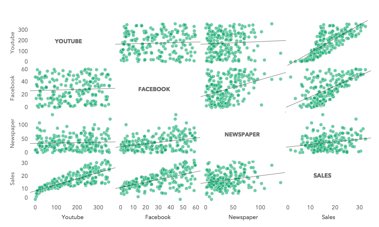
Figure 5.5: Scatter plot matrix using the marketing data
5.3 Bubble chart
A bubble chart is a scatter plot that shows relationships between three or four variables. The position of the bubble shows the relationship between the x and y variables. The bubble size is based upon a numerical variable, such as population, or sales. The bubble color is best reserved for categorical data, such as region.
Objective: Create a bubble chart that shows Buglaries per 10,000 and Robberies per 10,000 sized by population. Encode population by size or color. Determine the encoding that best displays the relationship.
STEP 1
- Build a basic scatter plot, similar to Figure 5.2.
STEP 2
- Next, drag
Populationto size on the marks card.
See 5.6.
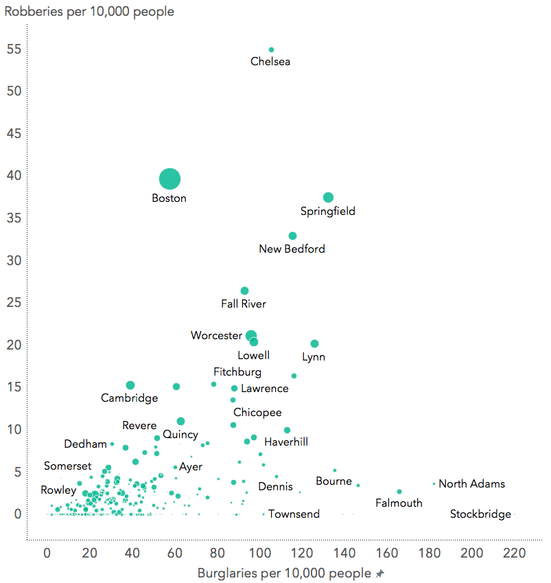
Figure 5.6: Basic bubble chart
5.3.1 Exercise: Bubble chart
- Refine the bubble chart created in 5.3 to apply the 10 design standards.
- Modify the ToolTip text (see Marks card) to improve readability of data values when the user mouses over a city
- Add text labels (see Marks card) as you see appropriate. Decide if labels should overlap or not.
- Create a new dashboard and add your bubble chart (as a floating object).
- Arrange the legend to fit within the dashboard window.
- Format the legend to adjust the size of the bubbles and scale range.
- Take a screenshot of your dashboard with your mouse hovering over Boston to reveal the tool tip. Submit this as your exercise. See Figure 5.7 for an example.
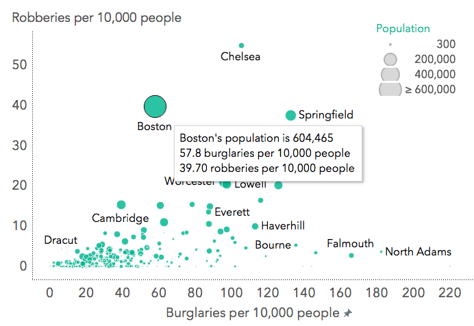
Figure 5.7: Bubble chart with tool tip
5.4 Heat map
A heat map in Tableau is simple a table of numbers filled with color using diverging or sequential shading. With sequential shading the darker shade indicates higher values. With Diverging shading this is typically the case as well. However, the colors are usually on different sides of the spectrum.
STEP 1
- Drag
Measure Namesto Columns - Drag
Cityto rows - Drag
Measure Valuesto color on the Marks card
This will show you every continuous variable (or measure) in the data set.
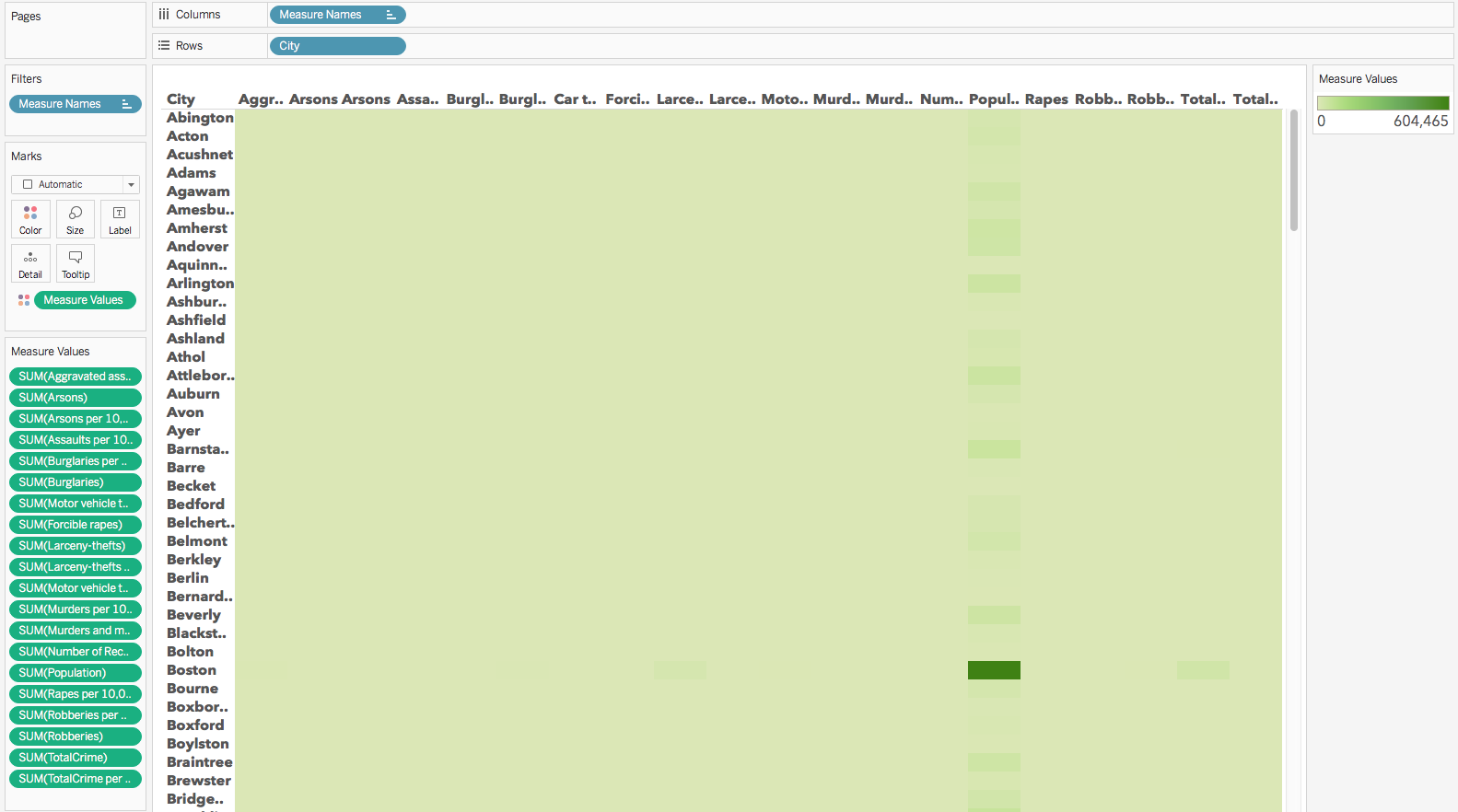
Figure 5.8: Basic heatmap without modifications
STEP 2
- To show a given crime per 10,000 per city, remove all others from the Measure Values card by dragging them off the card. For example, remove
SUM(Arsons), but keepSUM(Arsons per 10,000). - This should leave you with 8 remaining variables.
STEP 3
- Adjust the colors used and the scale. Go to the legend card (it is probably labeled
Measure Valuesunder Show Me). Select the down arrow > Edit Colors. Choose it to Blue-Green Sequential palette from the list of options.
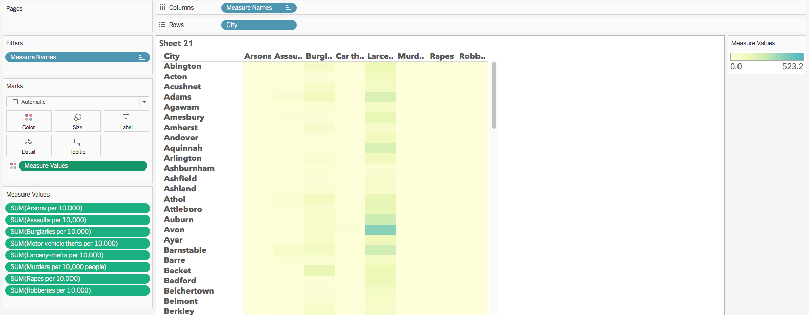
Figure 5.9: Basic heatmap reduced to 8 variables and changes in sequential colors
- Since each variable has its own range of minimum and maximum values, a single sequential range shows the higher values clearly, but not the range per variable. On the marks card, select
Measure Valuesand select Use Separate Legends. See 5.10. This shows the variation by variable for each city, rather than across variables.
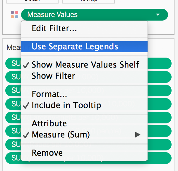
Figure 5.10: Showing separate legends
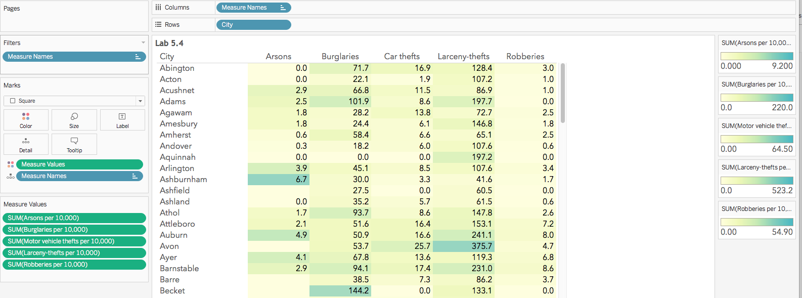
Figure 5.11: Basic heatmap reduced to 8 variables and changes in sequential colors
5.4.1 Exercise: Heatmap
- Show a individual legends per variable
- Adjust the colors and scales for the legend
- Edit the aliases for the variable name. For example change Robberies per 10,000 to just Robberies.Right click on the each column in the heat map and select Edit Alias. Change the names for each column.
- Adjust the city column width to reveal the full city names.
- Build a new dashboard that includes the legends arranged close to the heatmap and format those legend titles.
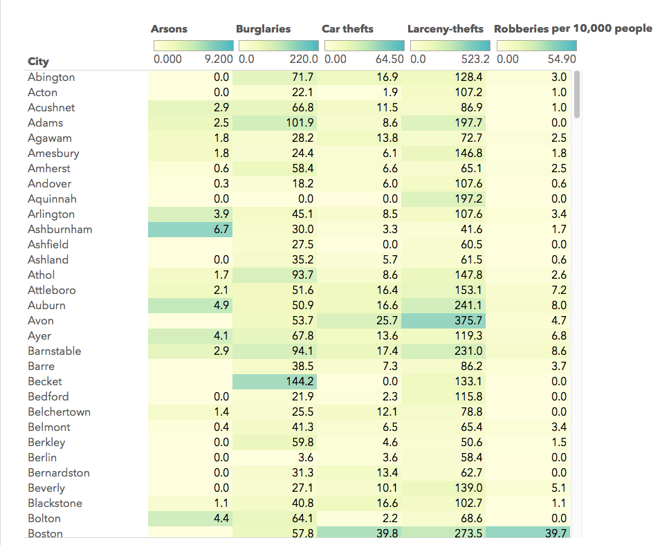
Figure 5.12: Basic heatmap revised with individual legends added to the columns positions