Chapter 4 Descriptive Statistics
Now that we have some experience working with data in R, the next step is to learn more about our data. In this lesson, we’ll learn about descriptive statistics and how it can help you summarize and derive meaning from your data. This lesson introduces you to the R functions to compute statistical measures of central tendency, variability, and correlation.
Lesson 4 Outline
- Measures of central tendency
- Measures of variability
- Skewness and kurtosis
- Summary functions, describe functions, and descriptive statistics by group
- Correlations
- Identifying NA values and formatting data
- Summary
Watch introductory video
Let’s begin by looking at a simple example with a dataset that comes pre-loaded in your version of R, called cars by (Ezekiel?). These data give the speed of cars and the distances taken to stop.
To view the data type:
or
##    speed dist
## 1      4    2
## 2      4   10
## 3      7    4
## 4      7   22
## 5      8   16
## 6      9   10
## 7     10   18
## 8     10   26
## 9     10   34
## 10    11   17
## 11    11   28
## 12    12   14
## 13    12   20
## 14    12   24
## 15    12   28
## 16    13   26
## 17    13   34
## 18    13   34
## 19    13   46
## 20    14   26
## 21    14   36
## 22    14   60
## 23    14   80
## 24    15   20
## 25    15   26
## 26    15   54
## 27    16   32
## 28    16   40
## 29    17   32
## 30    17   40
## 31    17   50
## 32    18   42
## 33    18   56
## 34    18   76
## 35    18   84
## 36    19   36
## 37    19   46
## 38    19   68
## 39    20   32
## 40    20   48
## 41    20   52
## 42    20   56
## 43    20   64
## 44    22   66
## 45    23   54
## 46    24   70
## 47    24   92
## 48    24   93
## 49    24  120
## 50    25   85
As you can see this data is quite simple. When we just look at the data, it may not make much sense. Just looking at the data is not a particularly effective way of understanding data. To better understand our data we need to calculate some descriptive statistics and visualize our data (in the next lesson).
1. Measures of central tendency
With any new dataset, the first thing you may want to calculate is a measure of central tendency. That is, you’d like to know something about the average or middle of your data. The most commonly used measures are the mean, median, and mode, in addition to the trimmed mean.
The mean
In lesson 3, we computed the mean for a single variable, square footage, in the sidewalk cafes dataset. However, we didn’t go into much detail about it. The mean of a set of observations is just an average. You simply add up all the values and then divide them by the total number of values. If we were to compute the mean for cars$speed (or the variable speed our dataset called cars) we would simply sum the values in the column for speed and divide by 50.
(4 + 4 + 7 + 7 + 8 + 9 + 10 + 10 + 10 + 11 + 11 + 12 + 12 + 12 + 12 + 13 + 13 + 13 + 13 + 14 + 14 + 14 + 14 + 15 + 15 + 15 + 16 + 16 + 17 + 17 + 17 + 18 + 18 + 18 + 18 + 19 + 19 + 19 + 20 + 20 + 20 + 20 + 20 + 22 + 23 + 24 + 24 + 24 + 24 + 25) / 50
Or quite simply: 770/50 = 15.4
In R, we can compute the mean in several ways:
## [1] 15.4or
## [1] 15.4or simply using the mean( ) function
## [1] 15.4Computing the mean for the cars data worked out nicely because there were no missing values or NAs. If there were NAs we would be able to omit those from our calculations. For example,
## [1] 15.4While the mean is not a new concept to you, some notation is important for you to understand.
n. Used to refer to the sample size. The number of samples of observations (rows) that we are averaging. In the above example n=50
x. Used to refer to the sample elements. x is used as a label for the individual observations themselves. We will use subscripts for each observation. x1 is used for the first observation (row 1), x2 for the second, and so on through xn for the last observation or xi to refer to the i-th observation. The formula for the sample mean is below.
\(\bar{x} = \frac{x_{1} + x_{2}~ + ... + x_{n-1} + x_{n}}{n}\)
We use the summation symbol to shorten the equation to:
\(\sum_{i=1}^{50} x_i\)
This reads as the sum taken over all i values from 1 to 50, of the value xi. This just simply translates to: add up the first 50 observations. We can then use this notation to write out the formula for the mean:
\(\bar{x} = \frac{1}{n}\sum_{i=1}^{n} x_1\)
The formula for the mean simply states to add all the values up and divide by the number of total items.
The mean is highly sensitive to extreme values. Therefore, other measures are more robust such as the median or the trimmed mean. The trimmed mean is a computation that discards the most extreme observations on both ends of the spectrum and then we can compute the mean of the remaining values. Generally, the trimmed mean is described in terms of the percentage of observations that have been discarded.
For example, if we were to compute a 10% trimmed mean, we would discard 10% of the high values and 10% of the low values and compute the mean from the remaining 80% of values.
The median
The median is another measure of central tendency. The middle value in a set of observations is the median. For cars$speed, we can sort our variables in ascending order using the sort( ) function. This can help us identify the median.
##  [1]  4  4  7  7  8  9 10 10 10 11 11 12 12 12 12 13 13 13 13 14 14 14 14 15 15
## [26] 15 16 16 17 17 17 18 18 18 18 19 19 19 20 20 20 20 20 22 23 24 24 24 24 25
In this case, the middle value is at positions 25 and 26. The middle value is 15. If the value of position 25 was 14 and the value of position 26 was 15 we’d take the average of the two values and the median would be 14.5.
An easier way to compute the median is to use the median( ) function:
## [1] 15The Mode
The mode of a set of observations is the value that occurs most frequently. There’s not a standard function in R that computes the mode. However, you can create a simple frequency table to tally the number of times each value occurs.
##
##  4  7  8  9 10 11 12 13 14 15 16 17 18 19 20 22 23 24 25
##  2  2  1  1  3  2  4  4  4  3  2  3  4  3  5  1  1  4  1
Here we see that the value 20 occurs 5 times.
You can also compute the mode using the following algorithm:
## [1] 20Carefully review the computation for the mode. Try to run each line of code and ensure you understand how the mode is computed.
Trimmed mean
More likely than not, in your daily life you’ll be working with data that is messy. For example, you may have a dataset that looks something like
-100, 2, 4, 6, 8, 10, 12, 14, 16
Just by looking at this data, you can tell that something may be wrong with it. The -100 values look off. Chances are that -100 is probably an outlier. An outlier is a value that lies well outside most of the other values in a set of data. In this case, you may want to remove the value from your set of data entirely.
## [1] 9However, even this example is an oversimplification of what you may experience. There may be cases where you may have data that looks just a little off. In the set of data below, -15 could be a legitimate value or it could be a typo or outlier.
Take this set of data:
-15, 2, 3, 4, 5, 6, 7, 8, 9, 12
## [1] "The mean is: 4.1"## [1] "The trimmed mean is: 5.5"By trimming the upper and lower 10% of values, you can see the difference in the mean from 4.1 (without trimming) to 5.5 (with trimming).
2. Measures of variability
In addition to computing measures of central tendency, another summary statistic we’d like to compute is variability. How spread out are the data? How far from the mean and median do the observed values tend to be?
Range
The range of a variable is the largest value minus the smallest value. We can compute the largest value using the max( ) function and the smallest value using the min( ) function. In the case of cars$speed, the range is 25 – 4 or 21.
## [1] 4## [1] 25range() returns the minimum and maximum as a two-element vector. To calculate the numerical width from the smallest to the largest value, use diff(range(x)).
## [1] 4 25Interquartile range
The interquartile range is similar to the range, but instead of calculating the difference between the biggest and smallest value, you calculate the difference between the 25th quantile and the 75th quantile.
We can calculate the interquartile range (IQR) using the IQR( ) function. This is the range spanned by the middle half of the data. For example, this is the 75th quantile minus the 25th quantile.
## [1] 7We can see all quantiles by typing the following:
##   0%  25%  50%  75% 100%
##    4   12   15   19   25
Or just to see the 25% and 75% we can type:
## 25% 75%
##  12  19
Therefore, you can see the IQR is simply 19 – 12.
Variance
The variance is a numerical measure of how the data values are dispersed around the mean. The variance measures how far a set of numbers are spread out. (A variance of zero indicates that all the values are identical.) A non-zero variance is always positive: A small variance indicates that the data points tend to be very close to the mean (expected value). A high variance indicates that the data points are very spread out from the mean and each other.
The variance of a dataset measures squared distance from the mean. For a sample, it is commonly denoted by s². R’s var() and sd() functions use the sample formulas, dividing by n - 1:
\(s^2 = \frac{1}{n-1} \sum_{i=1}^n(x_i-\bar{x})^2\)
To compute the sample variance in R we would type the following:
## [1] 27.95918Standard deviation
The square root of the variance is the standard deviation. Below is the formula for the sample standard deviation.
\(s = \sqrt{s^2}\)
To compute the sample standard deviation in R, type the following:
## [1] 5.287644or you can use the sd() function
## [1] 5.2876443. Skew and kurtosis
Skew and kurtosis are two more descriptive statistics that you may encounter.
Skew
Skewness describes the asymmetry of a distribution. A long right tail indicates positive (right) skew, while a long left tail indicates negative (left) skew. In many unimodal distributions, positive skew pulls the mean above the median and negative skew pulls it below the median, but this is a useful tendency rather than a universal rule. See Figure 4.1 for an illustration.
We can compute sample skewness with psych::skew():
## [1] -0.1105533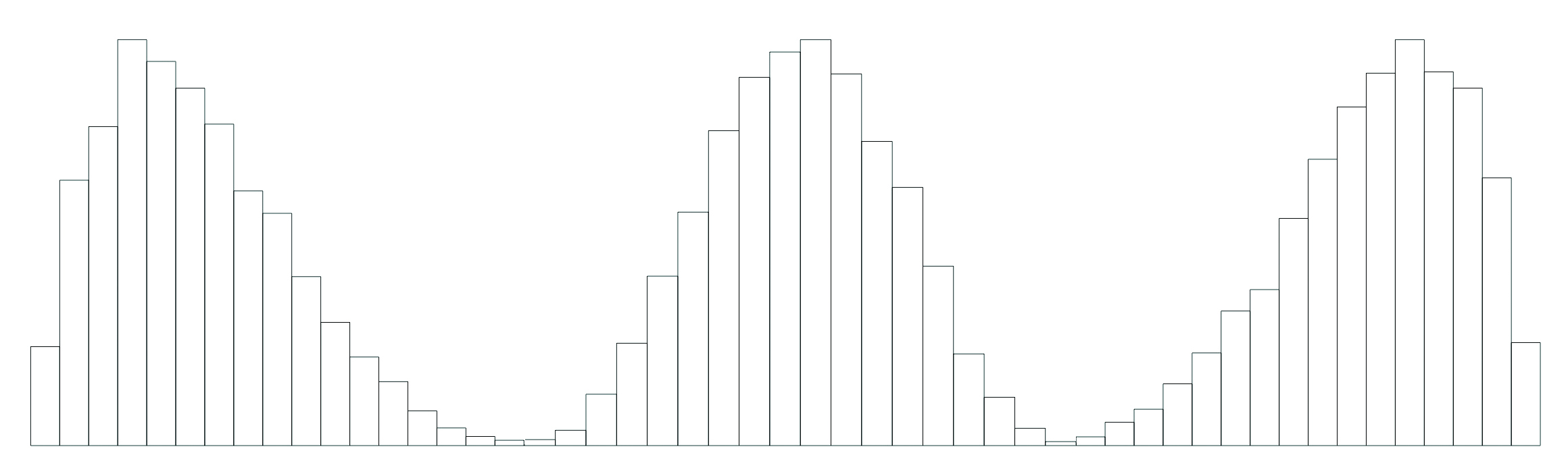
Figure 4.1: From left to right: Positive skew, no skew, and negative skew.
Kurtosis
Kurtosis describes the weight of a distribution’s tails and therefore its tendency to produce extreme observations. The psych::kurtosi() function reports excess kurtosis, for which a normal distribution has a value of 0. Positive values indicate heavier tails and greater outlier propensity than a normal distribution; negative values indicate lighter tails. Kurtosis should not be interpreted simply as the “pointiness” of a distribution.
We can compute excess kurtosis with psych::kurtosi():
## [1] -0.6730924What does the distribution of cars$speed look like? Let’s plot it and interpret the shape alongside its skewness and kurtosis. See Figure 4.2.
cardensity <- density(cars$speed)
plot(cardensity, xlab="Speed (mph)", col="purple", lwd = 3, main="Density plot")
Figure 4.2: Density plot of cars$speed. Its negative excess kurtosis indicates lighter tails than a normal distribution.
4. Describe and summary functions.
summary() provides a quick descriptive overview: the minimum, first quartile, median, mean, third quartile, and maximum. Use it as a starting point, then choose statistics that answer the business question. For a single variable:
##    Min. 1st Qu.  Median    Mean 3rd Qu.    Max.
##     4.0    12.0    15.0    15.4    19.0    25.0
To summarize a data frame, type:
##      speed           dist
##  Min.   : 4.0   Min.   :  2.00
##  1st Qu.:12.0   1st Qu.: 26.00
##  Median :15.0   Median : 36.00
##  Mean   :15.4   Mean   : 42.98
##  3rd Qu.:19.0   3rd Qu.: 56.00
##  Max.   :25.0   Max.   :120.00
Describing a data frame
psych::describe() provides a more detailed summary of numeric variables, including the trimmed mean (10% by default), skewness, excess kurtosis, and range. Here, n is the number of non-missing observations. Do not apply numeric summaries mechanically to identifiers or categorical codes; first decide whether the statistic has a meaningful business interpretation.
##       vars  n  mean    sd median trimmed   mad min max range  skew kurtosis
## speed    1 50 15.40  5.29     15   15.47  5.93   4  25    21 -0.11    -0.67
## dist     2 50 42.98 25.77     36   40.88 23.72   2 120   118  0.76     0.12
##         se
## speed 0.75
## dist  3.64
Note: We haven’t discussed se or mad as of yet.
There are more advanced functions to compute descriptive statistics by group using the psych package. One such function is describeBy(). You can specify a grouping variable. Let’s say we wanted to obtain descriptive statistics separately for each grouping of data. For example, we could group our data by the different speeds in cars. We could use speed as our grouping variable as follows:
##
##  Descriptive statistics by group
## group: 4
##       vars n mean   sd median trimmed  mad min max range skew kurtosis se
## speed    1 2    4 0.00      4       4 0.00   4   4     0  NaN      NaN  0
## dist     2 2    6 5.66      6       6 5.93   2  10     8    0    -2.75  4
## ------------------------------------------------------------
## group: 7
##       vars n mean    sd median trimmed   mad min max range skew kurtosis se
## speed    1 2    7  0.00      7       7  0.00   7   7     0  NaN      NaN  0
## dist     2 2   13 12.73     13      13 13.34   4  22    18    0    -2.75  9
## ------------------------------------------------------------
## group: 8
##       vars n mean sd median trimmed mad min max range skew kurtosis se
## speed    1 1    8 NA      8       8   0   8   8     0   NA       NA NA
## dist     2 1   16 NA     16      16   0  16  16     0   NA       NA NA
## ------------------------------------------------------------
## group: 9
##       vars n mean sd median trimmed mad min max range skew kurtosis se
## speed    1 1    9 NA      9       9   0   9   9     0   NA       NA NA
## dist     2 1   10 NA     10      10   0  10  10     0   NA       NA NA
## ------------------------------------------------------------
## group: 10
##       vars n mean sd median trimmed   mad min max range skew kurtosis   se
## speed    1 3   10  0     10      10  0.00  10  10     0  NaN      NaN 0.00
## dist     2 3   26  8     26      26 11.86  18  34    16    0    -2.33 4.62
## ------------------------------------------------------------
## group: 11
##       vars n mean   sd median trimmed  mad min max range skew kurtosis  se
## speed    1 2 11.0 0.00   11.0    11.0 0.00  11  11     0  NaN      NaN 0.0
## dist     2 2 22.5 7.78   22.5    22.5 8.15  17  28    11    0    -2.75 5.5
## ------------------------------------------------------------
## group: 12
##       vars n mean   sd median trimmed  mad min max range  skew kurtosis   se
## speed    1 4 12.0 0.00     12    12.0 0.00  12  12     0   NaN      NaN 0.00
## dist     2 4 21.5 5.97     22    21.5 5.93  14  28    14 -0.16    -2.02 2.99
## ------------------------------------------------------------
## group: 13
##       vars n mean   sd median trimmed  mad min max range skew kurtosis   se
## speed    1 4   13 0.00     13      13 0.00  13  13     0  NaN      NaN 0.00
## dist     2 4   35 8.25     34      35 5.93  26  46    20 0.27    -1.85 4.12
## ------------------------------------------------------------
## group: 14
##       vars n mean   sd median trimmed  mad min max range skew kurtosis    se
## speed    1 4 14.0  0.0     14    14.0  0.0  14  14     0  NaN      NaN  0.00
## dist     2 4 50.5 24.3     48    50.5 25.2  26  80    54 0.15    -2.16 12.15
## ------------------------------------------------------------
## group: 15
##       vars n  mean    sd median trimmed mad min max range skew kurtosis    se
## speed    1 3 15.00  0.00     15   15.00 0.0  15  15     0  NaN      NaN  0.00
## dist     2 3 33.33 18.15     26   33.33 8.9  20  54    34 0.34    -2.33 10.48
## ------------------------------------------------------------
## group: 16
##       vars n mean   sd median trimmed  mad min max range skew kurtosis se
## speed    1 2   16 0.00     16      16 0.00  16  16     0  NaN      NaN  0
## dist     2 2   36 5.66     36      36 5.93  32  40     8    0    -2.75  4
## ------------------------------------------------------------
## group: 17
##       vars n  mean   sd median trimmed   mad min max range skew kurtosis   se
## speed    1 3 17.00 0.00     17   17.00  0.00  17  17     0  NaN      NaN 0.00
## dist     2 3 40.67 9.02     40   40.67 11.86  32  50    18 0.07    -2.33 5.21
## ------------------------------------------------------------
## group: 18
##       vars n mean    sd median trimmed   mad min max range  skew kurtosis   se
## speed    1 4 18.0  0.00     18    18.0  0.00  18  18     0   NaN      NaN 0.00
## dist     2 4 64.5 19.07     66    64.5 20.76  42  84    42 -0.11     -2.2 9.54
## ------------------------------------------------------------
## group: 19
##       vars n mean    sd median trimmed   mad min max range skew kurtosis   se
## speed    1 3   19  0.00     19      19  0.00  19  19     0  NaN      NaN 0.00
## dist     2 3   50 16.37     46      50 14.83  36  68    32 0.23    -2.33 9.45
## ------------------------------------------------------------
## group: 20
##       vars n mean    sd median trimmed  mad min max range  skew kurtosis   se
## speed    1 5 20.0  0.00     20    20.0 0.00  20  20     0   NaN      NaN 0.00
## dist     2 5 50.4 11.87     52    50.4 5.93  32  64    32 -0.42    -1.49 5.31
## ------------------------------------------------------------
## group: 22
##       vars n mean sd median trimmed mad min max range skew kurtosis se
## speed    1 1   22 NA     22      22   0  22  22     0   NA       NA NA
## dist     2 1   66 NA     66      66   0  66  66     0   NA       NA NA
## ------------------------------------------------------------
## group: 23
##       vars n mean sd median trimmed mad min max range skew kurtosis se
## speed    1 1   23 NA     23      23   0  23  23     0   NA       NA NA
## dist     2 1   54 NA     54      54   0  54  54     0   NA       NA NA
## ------------------------------------------------------------
## group: 24
##       vars n  mean    sd median trimmed   mad min max range skew kurtosis    se
## speed    1 4 24.00  0.00   24.0   24.00  0.00  24  24     0  NaN      NaN  0.00
## dist     2 4 93.75 20.47   92.5   93.75 17.05  70 120    50 0.14    -1.87 10.23
## ------------------------------------------------------------
## group: 25
##       vars n mean sd median trimmed mad min max range skew kurtosis se
## speed    1 1   25 NA     25      25   0  25  25     0   NA       NA NA
## dist     2 1   85 NA     85      85   0  85  85     0   NA       NA NA
For more information type:
5. Correlations
Aside from looking at the characteristics of our variables, we may want to see if there is a relationship between our variables in our data or correlation.
We can draw scatterplots to give us a sense of how closely related two variables are, see Figure 4.3 for an example. We’ll learn how to do this later in lesson 5.
plot(x=cars$speed, y=cars$dist, type="p", xlab="Speed (mph)", ylab="Stopping distance(ft)", main="Cars: Speed and stopping distance", frame.plot=FALSE)
Figure 4.3: A scatterplot that shows the relationship between speed and stopping distance.
Pearson’s correlation coefficient, denoted by r, measures the direction and strength of a linear association and ranges from -1 to 1. Values near -1 indicate a strong negative linear relationship, values near 1 indicate a strong positive linear relationship, and values near 0 indicate little linear relationship. A correlation does not establish causation, and a value near 0 does not rule out a nonlinear relationship.
Calculating correlations in R for Pearson’s correlation coefficient:
## [1] 0.8068949You can also use the cor( ) function to calculate a complete correlation matrix between all pairs of variables in the data frame.
##           speed      dist
## speed 1.0000000 0.8068949
## dist  0.8068949 1.0000000
This is less interesting for our dataset which contains only 2 variables.
For ordinal data, monotonic relationships, or data strongly affected by outliers, Spearman’s rank correlation may be more appropriate:
When missing values are present, specify a strategy such as use = "complete.obs". Always inspect a scatterplot and interpret the magnitude in its business context.
6. Identifying NA values and formatting data
In this section, we will delve into the CEO salary data, focusing on two main tasks: determine which rows have NA values and formatting salary values in dollar terms.
If you haven’t already, import the CEO data set.
Preview the data
Check which entries are missing
| AGE | SALARY |
|---|---|
| FALSE | FALSE |
| FALSE | FALSE |
| FALSE | FALSE |
| FALSE | FALSE |
| FALSE | FALSE |
| FALSE | FALSE |
| FALSE | FALSE |
| FALSE | FALSE |
| FALSE | FALSE |
| FALSE | FALSE |
| FALSE | FALSE |
| FALSE | FALSE |
| FALSE | FALSE |
| FALSE | FALSE |
| FALSE | FALSE |
| FALSE | FALSE |
| FALSE | FALSE |
| FALSE | FALSE |
| FALSE | FALSE |
| FALSE | FALSE |
| FALSE | FALSE |
| FALSE | FALSE |
| FALSE | FALSE |
| FALSE | FALSE |
| FALSE | FALSE |
| FALSE | FALSE |
| FALSE | FALSE |
| FALSE | FALSE |
| FALSE | FALSE |
| FALSE | TRUE |
| FALSE | FALSE |
| FALSE | FALSE |
| FALSE | FALSE |
| FALSE | FALSE |
| FALSE | FALSE |
| FALSE | FALSE |
| FALSE | FALSE |
| FALSE | FALSE |
| FALSE | FALSE |
| FALSE | FALSE |
| FALSE | FALSE |
| FALSE | FALSE |
| FALSE | FALSE |
| FALSE | FALSE |
| FALSE | FALSE |
| FALSE | FALSE |
| FALSE | FALSE |
| FALSE | FALSE |
| FALSE | FALSE |
| FALSE | FALSE |
| FALSE | FALSE |
| FALSE | FALSE |
| FALSE | FALSE |
| FALSE | FALSE |
| FALSE | FALSE |
| FALSE | FALSE |
| FALSE | FALSE |
| FALSE | FALSE |
| FALSE | FALSE |
| FALSE | FALSE |
Use explicit column references such as ceo$SALARY. This makes the source of each variable clear and avoids the name conflicts that attach() can create.
Count the number of observations
Determine how many rows (observations) are in the dataset
## [1] 60Calculate the Mean Salary
Compute the average (mean) salary of the CEOs in the dataset
## [1] 404169.5Count missing values per column
Count the number of missing values in each column
##    AGE SALARY
##      0      1
Identify Columns with Missing Values
List the column names that have missing values
##    AGE SALARY
## FALSE TRUE## [1] "SALARY"Identify the rows with missing salary values
Use tibble::rowid_to_column() to add row identifiers and dplyr::filter() to retain rows where salary is missing.
## # A tibble: 1 × 3
##   rowid   AGE SALARY
##   <int> <dbl>  <dbl>
## 1    30    47     NA
Calculate and Format the Mean Salary
Compute the mean salary, excluding missing values, and format it using dollar_format
ceosalary <- mean(ceo$SALARY, na.rm = TRUE) * 1000
paste("The mean salary for the", sum(!is.na(ceo$SALARY)),
      "CEOs with reported salaries is:", scales::dollar(ceosalary))
## [1] "The mean salary for the 59 CEOs with reported salaries is: $404,169"This result reports the mean among CEOs with non-missing salary values. Because salaries are commonly right-skewed, compare the mean with the median before presenting a typical salary.
Calculate and format the median salary
Compute the median salary and format it in dollars for a better understanding of the central tendency:
ceomedian <- median(ceo$SALARY, na.rm = TRUE)
paste("The median salary for the", sum(!is.na(ceo$SALARY)),
      "CEOs with reported salaries is:", scales::dollar(ceomedian * 1000))
## [1] "The median salary for the 59 CEOs with reported salaries is: $350,000"The median is often a more representative measure of a typical salary when a few unusually high salaries pull the mean upward.
Calculate the standard deviation of the salary column
To measure the amount of variation in CEO salaries
sd_salary <- sd(ceo$SALARY * 1000, na.rm = TRUE)
paste("The standard deviation of CEO salaries is:", scales::dollar(sd_salary))
## [1] "The standard deviation of CEO salaries is: $220,534"In this, we’ve identified rows with missing salary data and calculated key statistics, including the mean, median and standard deviation of the salaries, formatted in dollar terms.
7. Summary
- The most commonly used measures of central tendency are the mean, median, and mode, in addition to the trimmed mean.
- The mean of a set of observations is just an average.
- The median in a set of observations is the middle value.
- The mode of a set of observations is the value that occurs most frequently.
- The range of a variable is the larger value minus the smallest value.
- The variance is a numerical measure of how the data values are dispersed around the mean.
- The square root of the variance is the standard deviation
- Interquartile range is the difference between the 75th and 25th percentiles.
- Skewness is a measure of symmetry.
- Kurtosis is a measure of the peakedness of the data distribution
- Correlations are used to determine the relationship between the variables in our data
R commands and syntax
- mean( ) computes the arithmetic mean for a set of observations
- sort( ) sorts your data in ascending order
- median( ) computes the middle value in a set of values
- table( ) is used to create a frequency table
- max( ) and min( ) are used to compute the range of a variable
- mean(x, trim=) pass in the trim parameter to trim the mean( )
- range( ) outputs the minimum and maximum value in a vector
- quantile( ) produces sample quantiles corresponding to the given probabilities.
- IRQ( ) is the range spanned by the middle half of the data.
- var( ) is used to compute the variance of a sample
- sd( ) is used to compute the standard deviation of a sample
- summary( ) produces summary statistics for a variable or data frame.
- describe( ) produces detailed summary statistics for a variable or data frame
- describeBy( ) is used for grouping summary statistics by a variable
na.rm = TRUEignores missing values for that calculation; it does not delete them from the data.- cor( ) for the correlation between two variables that outputs Pearson’s correlation coefficient. cor( ) is also used for calculating a correlation matrix amongst all numeric values in a data frame.
- cor(x,y, method = “spearman”) for Spearman’s rank correlation
4.1 Exercise 4.1
Create an R Markdown (.Rmd) document that addresses the following requirements.
- Getting to know the data:
- Import the data (https://becomingvisual.com/rfundamentals/winter_olympic.csv)
- View the data
- Look at column names
- Look at dimension of data (rows and columns)
Data is currently sorted by Rank. Sort data by total medals and country. Assign sorted data to a new data frame. Call it sort_total.
Use
psych::describe()to examine the numeric variables. Install thepsychpackage first if it is not already installed.Look at some statistics
- What is median of number of gold, silver, bronze and total medals?
- Also look at the mean and total number of G, S, B and T medals
- More statistics
- For Gold, look at summary stats, including: IQR, min, max, mean, var, sd, skew
- Use summary() and describe(). (May need to install library(psych) )
- More statistics - subset
- Redo above statistics, this time group by Region
- Which region won the highest total medals?
- How many countries are in this Geographic Region?
- How many countries are in the EUROPE group?
- What is the max number of medals won? What country won the max?
- More statistics - correlations
- explore correlations between Total medals and number of Gold and Bronze
- What is the correlation between Rank and Total medals? Is this expected or surprising?
4.2 Exercise 4.2
Create an R Markdown (.Rmd) document that addresses the following requirements.
Problem 1: Import the GDP dataset and compute the measures of central tendency for 2017. (Divide by a trillion, and use na.rm = TRUE when computing the measures.)
Task:
Problem 2:
Find the mean
Find the median
Find the range
Find the quantile
4.3 Assignment 4a
For this assignment use a pre-loaded dataset in R named attitude.
This is from a survey of the clerical employees of a large financial organization, the data are aggregated from the questionnaires of the approximately 35 employees for each of 30 (randomly selected) departments. The numbers give the percent proportion of favorable responses to seven questions in each department. attitude is already pre-loaded in R. To view the data in RStudio, type:
> View(attitude). Remember: View() is an interactive RStudio Console command. Do not include it in code chunks that must run while rendering your R Markdown document.
Create an RMarkdown that computes the measures of central tendency and measures of variability and the relationships for each of the seven variables in the attitude dataset. Use the functions below:
mean, median, mode, max, min, range, quantile, IQR, var( ), sd( ), and cor( )
Check your work by using the summary and/or describe functions.
4.4 Assignment 4b
Answer the following questions using an RMarkdown document.
Download the BankChurners.csv dataset in CSV format from: https://www.kaggle.com/sakshigoyal7/credit-card-customers
Organize your code using the RMarkdown headers for each question and add descriptions to explain your code for each question.
Use the the
formattable::currency()function to present the currency values with dollar signs, thousand separators,and rounded to two decimal places.All questions should be answered as a nicely formatted sentence using print statements, rather than as a single numeric value.
Import the downloaded CSV file into a tibble data frame. Print the number of rows and columns using the appropriate functions.
Clean the data by checking for missing values and removing any rows with missing values. Print the number of rows that were omitted.
Calculate the mean and median credit limit of the customers
Calculate the 25th and 75th percentile of the credit limit of the customers.
Calculate the range of the credit limit of the customers
Calculate the variance and standard deviation of the credit limit of the customers
Calculate the correlation between the customer age and their credit limit. Print the result to the console.
Subset the data to only include customers with a credit limit greater than $10,000. Store the result in a new tibble data frame. Print the number of rows.
Calculate the mean and standard deviation of the age of the customers that you identified in question 8.