Chapter 5 Statistical Graphs & Messy Data
In lesson 4, we saw an example of a scatter plot and density plot. In this lesson, we are going to learn how to create several types of statistical visualizations. Visualizations are helpful both to you as a data analyst and your audience. Well-designed data visualizations present your data to your audience in a way that is easy to comprehend.
Building graphics in R is relatively simple. In this lesson, we’ll learn a few useful graphic functions. These include the scatter plot, histogram, boxplot, and bar graph. For now, we’ll focus on the purpose and the mechanics of data visualizations. You are encouraged to explore and learn more about each function by using the help menu in R.
R includes a capable base graphics system, and many extension packages are also available. In this lesson, we use base R graphics plus one example from the car package.
Lesson 5 Outline
- Overview
- Scatter Plots
- Box Plots
- Scatter Plots and Box-and-Whisker Plots Together
- Histograms
- Density plots
- Messy Data
- Renaming Columns (Variable Names)
- Referencing Data-Frame Columns
- Tabulating Data and Creating Bar Charts
- Ordering Factor Variables
- Summary
Watch introductory video
1. Overview
When using RStudio, all of your visualizations will appear in the lower right quadrant in the plots tab, see Figure 5.1.
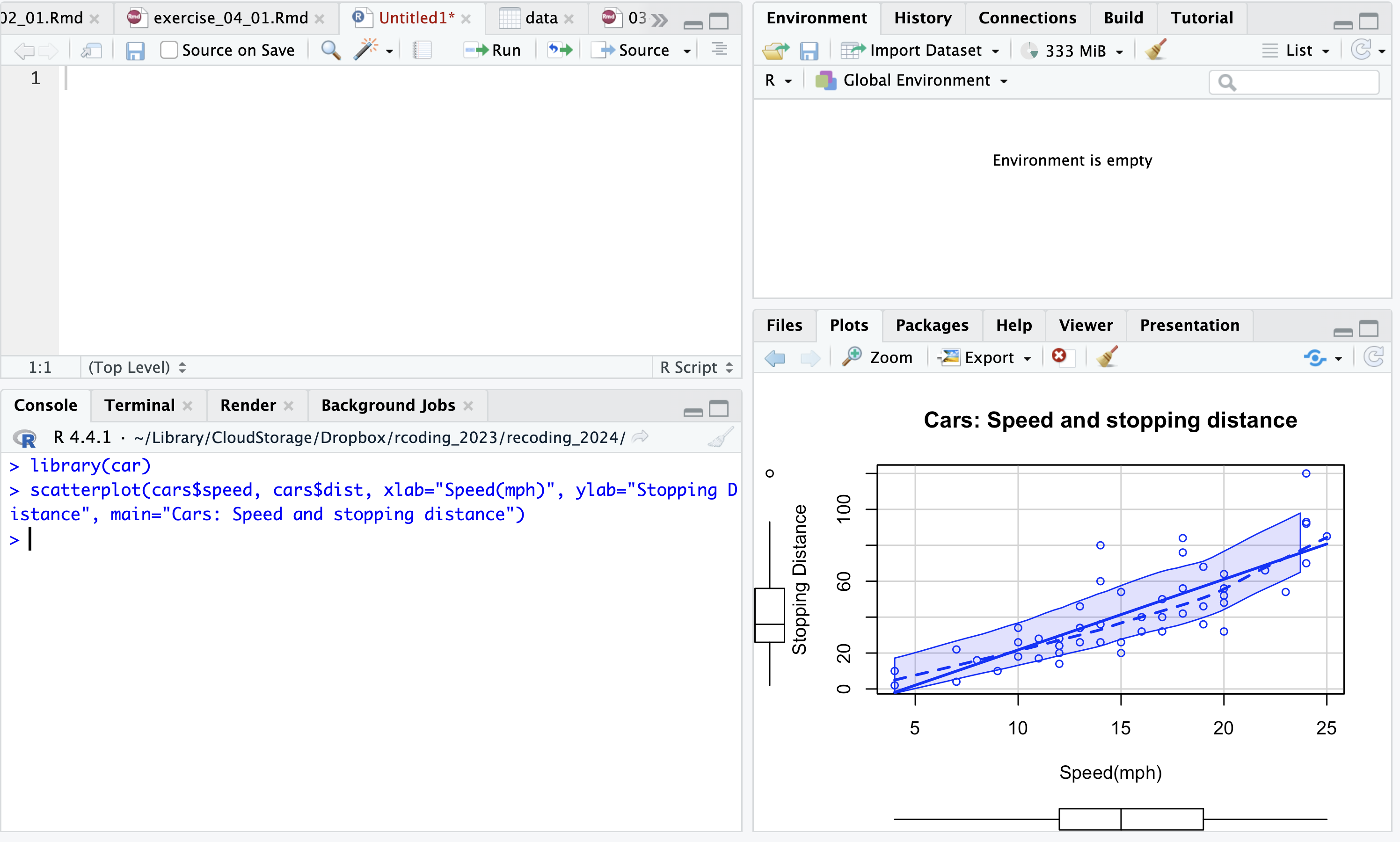
Figure 5.1: RStudio interface. Plots appear in the lower quadrant in the plots tab.
You can see your plots more clearly by selecting the zoom button

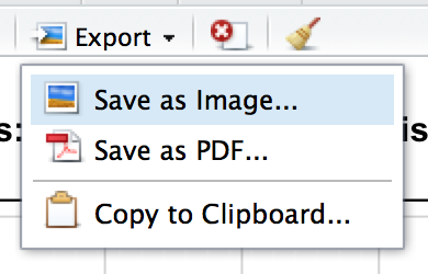
To save a plot from RStudio, select Export in the Plots pane. You can save it as an image or PDF, or copy it to the clipboard for use in an application such as Microsoft Word.
2. Scatter Plots
In lesson 4, we discussed correlation. A scatter plot is a useful display that helps us see how well two variables are correlated. To create a simple scatter plot, we can use the plot( ) function from the graphics package.
The usage is plot(x, y, …) where x is the value you want to plot on the x (horizontal) axis and y is the value you want to plot on the y (vertical) axis.
For example, the following code yields the chart in Figure 5.2. Here we are plotting the cars data set. We set the cars$speed as the x variable, cars$dist as the y variable.

Figure 5.2: A simple scatter plot created using the plot( ) function.
The plot() function takes some additional parameters. For example, you can specify the labels for the chart title, x-axis and y-axis labels, and use the plot() function to create other types of charts, aside from the scatter plot. The scatter plot is the default display for the plot() function. Moreover, to remove the box around the chart (a general rule of mine), use the frame.plot parameter and set it to FALSE. This will remove the box around your plot.

Here is the usage for the plot( ) function.
The most used parameters include:
- x. The x-variable to be plotted
- y. The y-variable to be plotted
- type. This is the type of chart. The p=point is used for scatter plots and is the default plot type (therefore you do not need to explicitly include it as a parameter). Some other plot options include:
- “l” for lines,
- “b” for both lines and points,
- “h” for ‘histogram’ like (or ‘high-density’) vertical lines,
- “s” for stair steps,
- “n” for no plotting.
- xlab. Label for the x-axis
- ylab. Label for the y-axis
- main. The chart title
Let’s refine our initial scatter plot from Figure 5.2 and add more descriptive axes a plot title, and remove the box around the plot, see Figure 5.3. In addition, we’ve explicitly included the type=”p” for the scatter plot type of chart (even though we didn’t need to).
plot(x=cars$speed, y=cars$dist, type="p", xlab="Speed (mph)", ylab="Stopping distance(ft)", main="Cars: Speed and stopping distance", frame.plot=FALSE)
Figure 5.3: A simple scatter plot using the plot( ) function with the title and axes labeled.
3. Box-and-whisker plot
We can produce box-and-whisker plot(s) of the given (grouped) values using the boxplot( ) function. A box-and-whisker plot displays the median and interquartile range. By default, the whiskers extend to the most extreme observations within 1.5 times the IQR from the box; observations beyond the whiskers are plotted individually as potential outliers. The spacing among these elements helps reveal spread and asymmetry. Boxplots can be drawn horizontally or vertically. Let’s create a box-and-whisker plot with the cars data set. To do this we use the function boxplot. The usage is boxplot(x, …), where x is the data from which the boxplots are to be produced. See Figure 5.4.

Figure 5.4: A vertical box-and-whisker plot created using the boxplot( ) function.
To create a horizontal box-and-whisker plot you can use the horizontal=TRUE argument, see Figure 5.5. The vertical box-and-whisker plot is the default.

Figure 5.5: A horizontal box-and-whisker plot created using the boxplot( ) function.
4. Scatter Plots & Box-and-Whisker Plots Together
You can also create more sophisticated scatterplots with boxplots in the margins, a nonparametric regression smooth, smoothed conditional spread, outlier identification, and a regression line. Use the scatterplot( ) function from the car (companion to applied regression) package (not to be confused with our data set named cars). You will need to have installed the car package before running this code in your verison of RStudio.
car::scatterplot(x = cars$speed, y = cars$dist,
                 xlab = "Speed (mph)", ylab = "Stopping distance (ft)",
                 main = "Cars: Speed and stopping distance", smooth = FALSE)
Figure 5.6: A scatterplot created using the scatterplot() function from the car package.
The output from the example (see Figure 5.6), displays the same scatter plot you plotted earlier, but with a simple box-and-whisker plot for each variable, speed and dist. There is also a simple line of best fit showing the relationship between the two variables.
5. Histograms
Histograms are a very simple and useful way to visualize data. Histograms are widely used for displaying values for one variable. This will give you an overall impression of the data. See Figure 5.7 for an example.
With a histogram, you divide the possible values into bins, then count the number of observations that fall within each bin. This count is referred to as the frequency of the bin, and is displayed as a bar. To draw a histogram use the hist( ) function from the graphics package. The usage is hist(x, …), where x is the single variable you want to plot. For example,

Figure 5.7: Default histogram in R.
Determining number of bins or breaks
When drawing histograms you need to determine where the breaks that separate the bins should be located and how many breaks there should be.
There are two ways you can specify breaks:
- How many breaks you want (e.g. breaks=3)
- Provide a vector that tells R exactly where the breaks should be placed
When breaks is a single number, R treats it as a suggested number of cells and chooses convenient breakpoints. The resulting number of bins may therefore differ slightly from the requested number. You can instead provide an explicit vector of boundaries when exact bins matter. To suggest 10 breaks, write:

In Figure 5.8, R uses convenient boundaries, so the displayed bin count may not be exactly 10.

Figure 5.8: A histogram in R with breaks specified.
In Figure 5.9, we can see the full range of possible breaks specified, 4 through 25.

or

Figure 5.9: A histogram with the full range of bins using min and max values.
This narrow-bin histogram shows that the interval around 20 mph has the highest frequency. Remember that the most frequent bin is not necessarily the exact statistical mode, and its appearance can change when the bin boundaries change.
Labeling the bars
You can also specify the labels for each bar using the labels argument. You can do this by setting labels=TRUE. See Figure 5.10.

Figure 5.10: A histogram with the bars labeled with frequency values.
6. Density plots
A kernel density plot estimates a continuous distribution from observed numeric values. It avoids histogram bins, but its appearance depends on another modeling choice: the bandwidth. Use density plots to examine shape, while remembering that different bandwidths can reveal or conceal features.
The function used to build a density plot is density(x) where x: is the data from which the estimate is to be computed.
Let’s build one. First, we need to compute the kernel density.
##
## Call:
##  density.default(x = cars$speed)
##
## Data: cars$speed (50 obs.);  Bandwidth 'bw' = 2.15
##
##        x                y
##  Min.   :-2.450   Min.   :7.999e-05
##  1st Qu.: 6.025   1st Qu.:5.918e-03
##  Median :14.500   Median :2.570e-02
##  Mean   :14.500   Mean   :2.944e-02
##  3rd Qu.:22.975   3rd Qu.:5.442e-02
##  Max.   :31.450   Max.   :6.575e-02
We can assign that to a variable that we then can plot.

Figure 5.11: A density plot.
Try it

Figure 5.12: A density plot.
We can plot a density curve over a histogram of the same data.
hist(x=cars$speed, prob=TRUE, main="Car speed", col="purple", border="white", xlab="Speed (mph)")
lines(density(cars$speed), lwd=3, col="black")
Figure 5.13: A density plot.
Try it
hist(x=cars$speed, prob=TRUE, main="Car speed", col="purple", border="white")
lines(density(cars$speed), lwd=3, col="black")
Figure 5.14: A density plot.
7. Working with Messy Data
Real-world data are messy. Very often the data file that you start out with doesn’t have the variables stored in the right format for the analysis you want to do. This can range from the way they are named to how they are coded. At times there might be some missing values in your dataset. We learned how to remove missing values or NAs from our data in lesson 3. In addition, there maybe a time where you only want to analyze a subset of your data. We learned how to subset a dataset in lesson 3. In summary, when working with real world data you’ll have to do some data manipulation to get it in the format that you need it. In this lesson we’ll work with some messy data to learn how to format and properly code variables, create simple frequency tables, and review a few graphing techniques to help us better analyze our data.
Watch introductory video
Messy Data
Let’s look at a survey questionnaire administered to undergraduate students aimed to understand their preferences for learning specific technologies as part of their education.
View the survey here: https://drive.google.com/file/d/0B3q79e49m3riTGFwU2h6S01NSEk/edit?usp=sharing
Surveys with closed-ended questions often produce structured results, but inconsistent coding, long column names, and missing responses can still make the data difficult to analyze.
Let’s take a closer look.
Download the dataset of results from: https://becomingvisual.com/rfundamentals/undergrad.csv
Then import undergrad.csv. Because readr::read_csv() returns a tibble, no additional conversion to a data frame is necessary:
Next, preview the dataset.
Carefully review the data. You’ll notice that it has 39 observations and 11 variables. Take note of what you see as messy with this data. Lots of text? The long column names? The missing data? Also, review the columns that correspond to the responses for questions 1 through 4. The questions use a seven-point Likert scale. Question 1 is stored as text, whereas questions 2, 3, and 4 use numeric codes. Both representations require metadata: the analyst must know the intended category order and what each label or code means.
8. Renaming columns (variable names)
As you view the data, you probably noticed that the column names are very long, see Figure 5.15.
Imagine having to type The.following.tool.are.important.to.my.future.career… as a variable name!
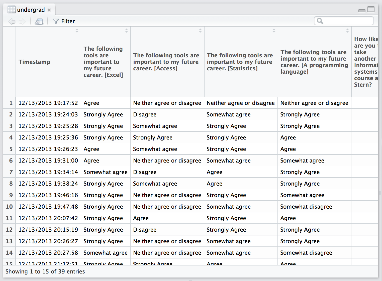
Figure 5.15: Viewing the undergrad.csv dataset. Note the long variable names.
It’s difficult to work with a dataset that has long names for variables. Let’s begin with recoding the 11 variable names. We can use the names( ) function to rename each of the columns in undergrad. Just be sure the variable name you type in corresponds to the correct variable. The names need to be written in the order as the columns appear in the data frame.
Create an RScript. Begin by creating an RScript for this lesson. This will help you keep track of your work and repeat commands as necessary. Note: The examples in this lesson will still include the > to indicate an R prompt.
- Go to File > New > RScript.
- Next, save your RScript as undergrad.R
- Rename the undergrad data frame using the names( ) function as described above.
#renaming columns in the undergrad data frame
names(undergrad) <- c("timestamp","excel","access", "statistics", "programming", "iscourse", "cscourse", "topics", "istopics", "onlinecourse", "concentration")- Run your undergrad.R script.
- Now, view the undergrad data frame to check to see if the column names were changed.
You should see your columns renamed (see Figure 5.16).
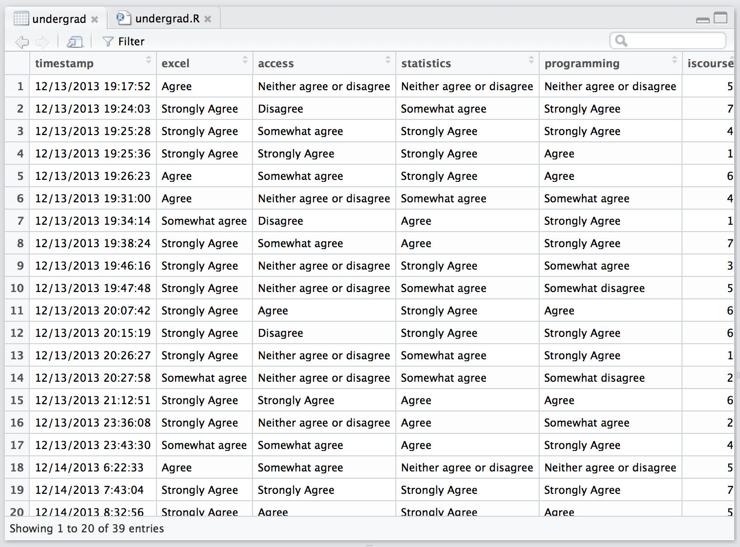
Figure 5.16: Columns of the undergrad dataset renamed.
9. Referencing data-frame columns
Use explicit column references so that readers—and R—can see which data frame supplies each variable. The $ operator selects one column:
##  [1] "Agree"          "Strongly Agree" "Strongly Agree" "Strongly Agree"
##  [5] "Agree"          "Agree"          "Somewhat agree" "Strongly Agree"
##  [9] "Strongly Agree" "Strongly Agree" "Strongly Agree" "Strongly Agree"
## [13] "Strongly Agree" "Somewhat agree" "Strongly Agree" "Strongly Agree"
## [17] "Somewhat agree" "Agree"          "Strongly Agree" "Strongly Agree"
## [21] "Agree"          "Strongly Agree" "Strongly Agree" "Strongly Agree"
## [25] "Agree"          "Agree"          "Strongly Agree" "Strongly Agree"
## [29] "Strongly Agree" "Strongly Agree" "Agree"          "Strongly Agree"
## [33] "Strongly Agree" "Strongly Agree" "Agree"          "Strongly Agree"
## [37] "Strongly Agree" "Strongly Agree" "Strongly Agree"
Explicit references prevent name conflicts and make scripts easier to rerun and debug. Another useful form, especially inside functions, is undergrad[["excel"]]. Avoid attach(), which adds column names to R’s search path and can silently select the wrong object when names overlap.
10. Tabulating data and creating bar charts
A typical data-analysis task is to construct a frequency table for one categorical variable or a cross-tabulation for two categorical variables. We begin with iscourse and cscourse, which record respondents’ likelihood of taking another Information Systems or Computer Science course on a seven-point ordered scale.
To be sure we can check the data type of each variable using the class( ) function.
## [1] "numeric"## [1] "numeric"R stores these responses as integers, but their meaning is ordinal: higher values indicate greater likelihood. Storage type and measurement type are not the same thing.
Frequency counts.
A simple frequency count of the number of respondents per response category will help us analyze the results. We can use the table( ) function to tabulate the results of each variable:
##
##  1  2  3  4  5  6  7
## 6 3 1 8 5 10 6##
## 1 2 3 4 5 6 7
## 3 5 2 6 5 7 11To interpret the results, look at the first row for each response type. This is a scale that includes the integers 1 through 7 which represents likelihood that respondents will take a course in either computer science or information systems. A response of 1 is extremely unlikely, whereas a response of 7 is extremely likely.
Visualizing the results.
Because these values represent ordered response categories, display their frequency tables with bar charts. Histograms are intended for continuous numeric measurements.
is_counts <- table(factor(undergrad$iscourse, levels = 1:7))
barplot(is_counts, main = "Likelihood of taking another IS course",
        xlab = "Likelihood (1 = extremely unlikely, 7 = extremely likely)",
        ylab = "Number of students", col = "#4cbea3", border = NA)
Figure 5.17: Bar chart of students’ likelihood of taking another Information Systems course.
cs_counts <- table(factor(undergrad$cscourse, levels = 1:7))
barplot(cs_counts, main = "Likelihood of taking a CS course",
        xlab = "Likelihood (1 = extremely unlikely, 7 = extremely likely)",
        ylab = "Number of students", col = "#4cbea3", border = NA)
Figure 5.18: Bar chart of students’ likelihood of taking a Computer Science course.
Compare the complete response distributions rather than relying only on an average. The median category provides a compact summary while respecting the ordering of the scale:
## [1] 5## [1] 5Here we can see that it’s relatively trivial to do this type of analysis on numeric data.
Let’s return to our survey and look at the first four questions from the survey questionnaire as displayed in Figure 5.19.
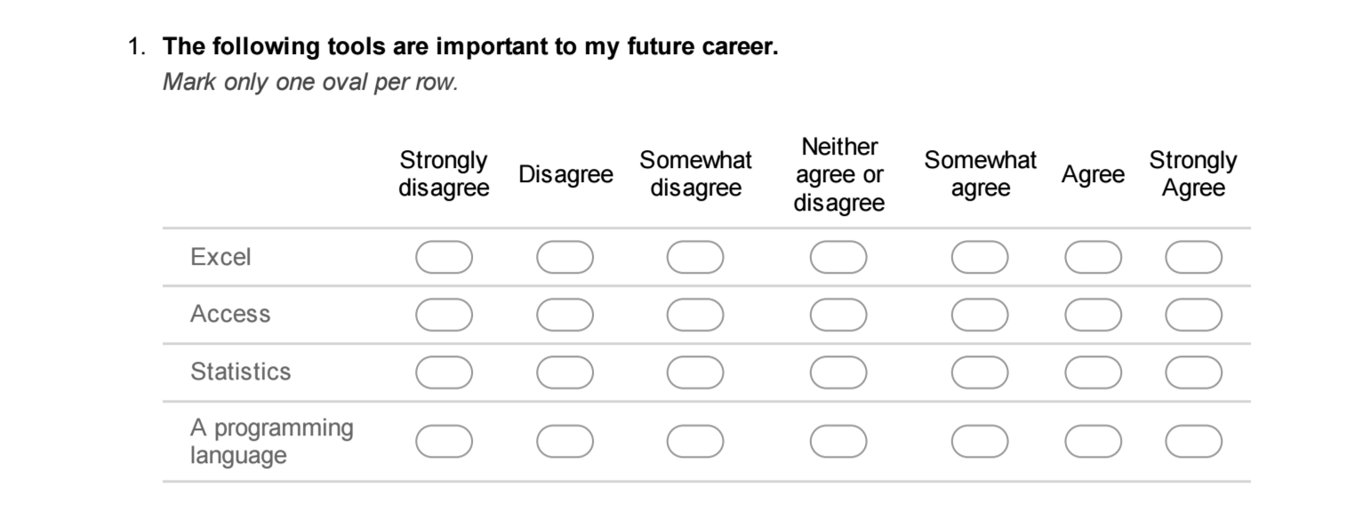
Figure 5.19: An excerpt from the survey questionnaire.
Suppose we want to understand if students’ attitude toward specific technologies was important to their career. Specifically we want to look at the variables excel, access, statistics, and programming in the undergrad dataset.
Let’s examine the second column of data, excel. The data represents the responses from 39 participants to the question:
The following tool is important to my career: Excel
Here you may want to simply know the frequency count of the number of respondents per response category:
Strongly disagree
Disagree
Somewhat disagree
Neither agree or disagree
Somewhat agree
Agree
Strongly agree
We can use the table( ) function to construct a simple frequency table as we did earlier.
##
##          Agree Somewhat agree Strongly Agree
##              9              3             27
Did you notice that the output of the responses only fall within the categories of Agree, Somewhat agree, or Strongly agree? Also, note that the ordering of the table is in alphabetical order. However, it would be easier to interpret the results if we could see them in an order from Strongly Agree to Strongly Disagree.
The data is presented unordered. Check the data type using the class( ) function.
## [1] "character"You’ll notice that excel is stored as character data. To preserve the meaningful order of its response categories and display every possible category, convert it to an ordered factor.
Refer back to lesson 2 for more details on factor variables and ordered factor variables.
Look above at the output of the table(excel) command. Did you notice that there were only three response types given, even though respondent of the survey had seven to select from? This is because there were no values for Strongly Disagree, Disagree, Somewhat Disagree, and Neutral. This means that every student who completed only selected Agree, Somewhat Agree, or Strongly Agree.
Let’s examine the remaining three variables (access, statistics, and programming) and construct frequency tables each of them.
##
##                     Agree                  Disagree Neither agree or disagree
##                         5                         5                         9
##            Somewhat agree         Somewhat disagree            Strongly Agree
## 10 2 8##
## Agree Disagree Neither agree or disagree
## 13 1 2
## Somewhat agree Strongly Agree <NA>
## 7 15 1##
## Agree Disagree Neither agree or disagree
## 12 1 5
## Somewhat agree Somewhat disagree Strongly Agree
## 6 2 13Next, let’s first show what happens when character responses are tabulated without defining their order. R displays the categories alphabetically rather than in the order of the Likert scale.
access_unordered <- factor(undergrad$access)
barplot(table(access_unordered),
        main = "Importance of learning Microsoft Access",
        xlab = "Response category", ylab = "Number of students",
        col = "#4cbea3", border = NA, las = 2, cex.names = 0.7)
Figure 5.20: An unordered bar chart of the access responses. Alphabetical ordering obscures the Likert scale.
Figure 5.20 is difficult to interpret because alphabetical order does not represent increasing agreement. The solution is to define the response levels explicitly.
11. Ordering factor variables
An ordinal variable has categories with a meaningful sequence. For this seven-point Likert scale, define the levels from least agreement to greatest agreement:
likert_levels <- c(
  "Strongly disagree",
  "Disagree",
  "Somewhat disagree",
  "Neither agree or disagree",
  "Somewhat agree",
  "Agree",
  "Strongly agree"
)

access_ordered <- factor(
  undergrad$access,
  levels = likert_levels,
  ordered = TRUE
)
Inspect the factor and its attributes:
##  [1] Neither agree or disagree Disagree
##  [3] Somewhat agree            <NA>
##  [5] Somewhat agree            Neither agree or disagree
##  [7] Disagree                  Somewhat agree
##  [9] Neither agree or disagree Neither agree or disagree
## [11] Agree                     Disagree
## [13] Neither agree or disagree Neither agree or disagree
## [15] <NA>                      Neither agree or disagree
## [17] Somewhat agree            Somewhat agree
## [19] <NA>                      Agree
## [21] Somewhat agree            <NA>
## [23] Somewhat agree            Somewhat agree
## [25] Somewhat agree            Agree
## [27] Somewhat disagree         <NA>
## [29] Somewhat disagree         Disagree
## [31] Neither agree or disagree <NA>
## [33] <NA>                      Agree
## [35] Neither agree or disagree Somewhat agree
## [37] Agree                     Disagree
## [39] <NA>
## 7 Levels: Strongly disagree < Disagree < ... < Strongly agree## $levels
## [1] "Strongly disagree" "Disagree"
## [3] "Somewhat disagree" "Neither agree or disagree"
## [5] "Somewhat agree" "Agree"
## [7] "Strongly agree"
##
## $class
## [1] "ordered" "factor"A frequency table now includes all seven response options—even categories with zero responses—and displays them in their intended order:
## access_ordered
##         Strongly disagree                  Disagree         Somewhat disagree
##                         0                         5                         2
## Neither agree or disagree            Somewhat agree                     Agree
##                         9                        10                         5
##            Strongly agree                      <NA>
##                         0                         8
Use a bar chart for these ordered categorical responses:
barplot(table(access_ordered),
        main = "Importance of learning Microsoft Access",
        xlab = "Response category", ylab = "Number of students",
        col = "#4cbea3", border = NA, las = 2, cex.names = 0.7)
Figure 5.21: Bar chart of Microsoft Access responses in the intended Likert-scale order.
The side-by-side comparison makes the effect of category ordering visible:
old_par <- par(mfrow = c(1, 2))
barplot(table(access_unordered), main = "Alphabetical order",
        col = "#4cbea3", border = NA, las = 2, cex.names = 0.6)
barplot(table(access_ordered), main = "Likert-scale order",
        col = "#4cbea3", border = NA, las = 2, cex.names = 0.6)
Do not use as.numeric(access_ordered) without explanation: it returns the internal factor codes 1 through 7. Those codes can be useful only when the analysis deliberately treats the Likert categories as scores and documents that assumption. For ordinary summaries, report counts, percentages, and category-based statistics.
12. Summary
- Visualization supports both exploration and communication.
- A scatterplot displays the relationship between two numeric variables.
- A boxplot displays the median, IQR, whiskers, and potential outliers.
- A histogram displays the distribution of continuous numeric values; its shape depends on bin boundaries.
- A density plot estimates distributional shape; its smoothness depends on bandwidth.
- A bar chart displays counts or percentages for categorical variables.
- Ordered factors preserve the meaningful sequence of ordinal categories.
- Explicit data-frame column references make code safer and easier to understand.
R commands and syntax
plot()creates several kinds of base R plots.car::scatterplot()creates an enhanced scatterplot with marginal boxplots.boxplot()draws boxplots.hist()draws histograms for numeric data.density()estimates a kernel density; pass its result toplot()to draw it.barplot()draws bars from a vector or table of heights.names()gets or sets object names; here it is used to rename columns.table()creates a frequency table.attributes()returns an object’s metadata, including factor levels.factor()creates categorical variables and can define their level order.ordered()creates an ordered factor.
5.1 Exercise 5.1
In an R Markdown document, complete the following with the movies.csv data.
Download the data from https://becomingvisual.com/rfundamentals/movies.csv
- Getting to know the data
- Import the data
- View the data
- Look at column names
- Look at dimension of data (rows and columns)
- Scatterplots
- do scatter plot of Tickets Sold and Gross (Is the trend expected?)
- redo scatter plot, adjusting scales, divide by 1000
- redo scatter plot, adjusting scales, divide by 100,000
- redo scatter plot, adjusting scales, divide by 1,000,000
What is the correlation between tickets sold and sales? Is this expected?
Scatterplots with lines
- create scatter plot with millions scale, add a regression line
- add label to x and y axis, add plot title label
- Other plots
- do boxplot
- do boxplot - horizontal
- do histogram for type of films
- do histogram of gross sales. How bins are shown by default?
- do histogram of gross sales with 10 bins.
- do histogram of ticket sales. Try different bin numbers.
- do histogram of ticket sales (use millions unit). Add frequency count to top of bars. Add titles.
- do barplot of genre
5.2 Exercise 5.2
- In a R Markdown document, produce plots that describe the GDP and Life Expectancy during 2016 (see the Task below). You will need to create a new data frame with these columns.
You can find the data here:
Life Expectancy: https://becomingvisual.com/rfundamentals/life_expectancy.csv
Task:
Create a scatter plot of GDP to Life Expectancy
Create a histogram of GDP
Create a box and whisker plot of Life Expectancy
5.3 Exercise 5.3
Create an RMarkdown document to complete the following:
- Getting to know the data
- Import the data (https://becomingvisual.com/rfundamentals/summer_winter_olympics.csv)
- View the data
- Look at column names
- Look at dimension of data (rows and columns)
- Dealing with Data
- Look at the column names and change names to more meaningful names.
- The data represent, in order: (1) country (2) number of summer games played, gold, silver, bronze, total, (3) number of winter games played, gold, silver, bronze and total, total (4) total (Winter + Summer) games, gold, silver, bronze, total
- Summary
- use table() to find frequency of total summer games played
- explore the data with other variables
- Graphs
- do histogram of summer games (total)
- do histogram of winter games (total)
- put above two histograms on one page
- do two histograms on one page: total summer, total winter medals won
- is there a correlation between number of medals given out in winter and summer? (do plot)
- how about number of games each country competes in. Is there correlation between winter and summer?
- look at distribution of each of the types of medals, by season (6 histograms on one page)
- redo g with different number of bins (10 instead of 20)
- explore data on your own
5.4 Exercise 5.4
Problem 1:
Create an R Markdown document to complete the task below:
- Create a new data set that includes the columns for 2016 for the GDP, Life Expectancy, and Employment data sets into a single data frame.
You can find the data here:
Life Expectancy: https://becomingvisual.com/rfundamentals/life_expectancy.csv
Employment: https://becomingvisual.com/rfundamentals/employment.csv
Task:
- Rename the appropriate columns to “country”, “gdp”, “life_expectancy”, and “employment”.
Problem 2:
Convert the employment number to percentages by dividing by 100
Round life expectancy to zero decimals and employment to two decimals
Create a frequency table for each variable
Problem 3:
Draw histograms for each variable in the countries_2016 data frame.
5.5 Assignment 5a
- Return to the
attitudedataset. Produce at least one scatter plot, histogram, and box-and-whisker plot for each variable. Complete this as a R Markdown document.
Optional: To save time, explore creating a matrix of histograms, a matrix of scatter plots, and a matrix of boxplots.
- Use the undersgraduate survey data from https://becomingvisual.com/rfundamentals/undergrad.csv to create ordered factor variables for the
excel,statisticsandprogrammingvariables. In a R Markdown draw histograms for your new ordered factor variables.
5.6 Assignment 5b
Answer the following questions using an RMarkdown document.
- Download the “Credit Card Transactions” dataset in CSV format from: https://www.kaggle.com/mlg-ulb/creditcardfraud
V1,V2, …V28are the principal components obtained with PCATimecontains the seconds elapsed between each transaction and the first transaction in the dataset.Amountis the transaction Amount, this feature can be used for example-dependent cost-sensitive learning.- Class is the response variable and it takes value 1 in case of fraud and 0 otherwise.
- Organize your code using the RMarkdown headers for each question and add descriptions to explain your code for each of the following:
Import the downloaded CSV file into a tibble data frame
Use the
summary()function to get a summary of the fraud dataRename the column
ClasstoFraudSubset the data to only include fraudulent transactions. Store the result in a new tibble data frame. Show a preview of the first 5 rows.
Create a histogram of the transaction amount for fraudulent transactions. Add a title to your histogram and change the color of the bins from the default gray color.
Create a scatterplot of the transaction amount vs. time elapsed since the first transaction using the
ggplot()function from theggplot2package.