Chapter 7 Interactive Applications Using RShiny
Shiny is an application for R that allows you to publish your work to the web in an interactive format without detailed knowledge of the underlying web code (HTML, JavaScript, and CSS). This tutorial will demonstrate a few of the capabilities of Shiny.
Lesson 7 Outline
- Getting started with shiny
- Shiny examples
- The components of a shiny app
- Building your shiny app
- Publishing your shiny app
1. Getting Started
Make sure you have the Shiny package installed and enabled.
Next, use the library function to enable the package.
Now, let’s look at the essential operation of a Shiny app.
There is a set of built-in examples included with Shiny. We’ll start by looking at the interactive histogram. The examples can be assessed using the runExample() function.
This example is a sample histogram with a slider to control the bin size. The code is also shown in the example.
If you look at the console window of RStudio, you will see a small STOP sign icon. If you click that button, it will stop the execution of the server code, and allow you to interact with RStudio again.
2. Shiny examples Explore the range of examples that showcase shiny’s functionalities.
3. The components of a shiny app To build a Shiny app in R: Start with a template. In RStudio, go to File -> New File -> Shiny Web App. Choose a single file web application.
There you will see this code:
library(shiny)

# Define UI for the application that draws a histogram
ui <- fluidPage(

   # Application title
   titlePanel("Old Faithful Geyser Data"),

   # Sidebar with a slider input for number of bins
   sidebarLayout(
      sidebarPanel(
         sliderInput("bins",
                     "Number of bins:",
                     min = 1,
                     max = 50,
                     value = 30)
      ),

      # Show a plot of the generated distribution
      mainPanel(
         plotOutput("distPlot")
      )
   )
)

# Define server logic required to draw a histogram
server <- function(input, output) {

   output$distPlot <- renderPlot({
      # generate bins based on input$bins from ui.R
      x    <- faithful[, 2]
      bins <- seq(min(x), max(x), length.out = input$bins + 1)

      # draw the histogram with the specified number of bins
      hist(x, breaks = bins, col = 'darkgray', border = 'white')
   })
}

# Run the application
shinyApp(ui = ui, server = server)
Shiny divides the functions of its app into three distinct sections:
Section 1
Section 2
Section 3
The first section, fluidPage() contains the elements in the app.
The fluidPage contains both the input and output functions, for example, the titlePanel, sliderInput, and plotOutput.
You can change the title, what type of input you want (numericInput( ), selectInput( ), and dateInput( ) are popular as well), and the elements within the input (like the minimum, maximum and preset values).
The first item under sliderInput( ) bins is the name of the input.
The next item Number of bins: is the displayed label.
If you’re unsure about how any of the functions work, you can type ?sliderInput for any additional information. The format is a question mark and then the input type, which you need clarification on.
To display the output, use the function: plotOutput("distPlot").
The term plot determines the type of output that will be displayed (other types of output include tableOutput, imageOutput, and textOutput), and “distPlot” is the name given to the output object (you can name this whatever you want).
The Output function adds space in the UI for an R object which we’ll build in the server function.
The second section, function(input, output) {}, actually builds the output.
When writing the server function, you need to follow three rules:
- You save your objects to display using “output$”
In this case, you would write output$distPlot because you saved the output as “distPlot” in the previous function.
- You will build the objects to display using render*() functions.
renderPlot()only creates a plot, while there are a variety of other functions for other types of outputs.renderDataTable()creates an interactive tablerenderImage()creates an imagerenderText()creates a character string
- Access input values with
input$
To access the input that we gave in the ui section of the app, we need to use input$ with what the input is named, in this case bins.
The function after will include the code that builds the object:
The variable x includes only the second column of faithful.
Bins is taking the variable x and setting the condition of the bins in this histogram.
The histogram is drawn to the desired specifications.
Other histograms can be simple. A simple example is below with only a title and the histogram:
server <- function(input, output) {
    output$hist <- renderPlot({
    Title <- "100 random normal values"
    hist(rnorm(100)), main = title
})
}
In order to add input values, use input$num:
Remember: the bins comes from how we named our input in the ui function of this project.
To summarize:
The server function assembles inputs into outputs and follows 3 rules.
You save the output that you build to
output$You build the output with a
render*()functionAccess input values with
input$
4. Building your shiny app
Let’s work with the countries.csv data set. Download the data from http://becomingvisual.com/rfundamentals/countries.csv
First, add a line to load a package that reads in a csv file require(readr)
Next, add a line to read the corresponding data countries <- read_csv("countries.csv")
Now, we’ll make a new Shiny app with a new set of data. Start by adding different code to fluidPage().
Then we can change the titlePanel to Country Data.
Next, change the input type to selectInput and name the input country, make the label say Countries, and include the options to select by adding c(countries$Country) because in the csv file we imported, the name of the countries are under the Country column. We’ll preselect China, by adding selected = "China", and we won’t allow multiple selections by adding multiple = FALSE.
This should look like:
We’ll keep this new output as a plotOutput, but rename it to countryPlot.
Under function(), rename the output to what we named it earlier to output$countryPlot.
Tthen save what we inputted with country = input$country
Now for the most crucial part, we’ll make the plot. The x-axis will be the Population of the country and the y-axis will be the per capita GDP of the country. For the graph to highlight the country the user chooses, we’ll add a function that looks for the inputted country and makes its plot red, while the other plots stay black. This is done with col=ifelse(countries$Country==country, "red", "black"). We’ll then make a main title, and labels for the x and y axes and set both axes to a logarithmic scale to clearly see all the data points.
The plot should look like this:
plot(countries$Population, countries$`GDP ($ per capita)`, col=ifelse(countries$Country==country, "red","black"),
           main = "Population and GDP", xlab = "Population", ylab = "GDP ($ per capita)",log="xy")
We’ll then add an option to disable the scientific notation with options(scipen=999).
The entire app should look like this:
library(shiny)
require(readr)
countries <- read_csv("countries.csv")

# Define UI for application that draws a scatterplot
ui <- fluidPage(

   # Application title
   titlePanel("Country Data"),

   # Sidebar with a slider input for number of bins
   sidebarLayout(
      sidebarPanel(
         selectInput("country",
                     "Countries",
                     paste(countries$Country),
                     selected = "China", multiple = FALSE)
      ),

      # Show a plot of the generated distribution
      mainPanel(
         plotOutput("countryPlot")
      )
   )
)

# Define server logic required to draw a scatterplot
server <- function(input, output) {

   output$countryPlot <- renderPlot({
      country = input$country
      plot(countries$Population, countries$`GDP ($ per capita)`, col=ifelse(countries$Country==country, "red","black"),
           main = "Population and GDP", xlab = "Population", ylab = "GDP ($ per capita)",log="xy")
      options(scipen=999)
   })
}

# Run the application
shinyApp(ui = ui, server = server)
Now, you can run the app, select a country, and see its location in the graph!
5. Publishing your app
You can publish your shiny app on the shinyapps.io website.
This is a free space for hosting your apps. However, the freemium version has several limitations.
Steps to publishing your app
Install the latest version of the rsconnect package.
Create an account on the shinyapps.io website.
Ensure you are logged into that account.
Find your app.R file in RStudio. Open it and click on Run App.
Once the preview of the app is running, select the Publish button. Select a name for your app and the relevant files to be published.
Once published, your browser should launch a page with your published app. Check out my app for an example
7.1 Exercise 7.1
Problem
Using the http://becomingvisual.com/rfundamentals/nyuclasses.csv file, create a shiny app that displays a box plot of the student grades based on the assignment selection that looks like the image below:
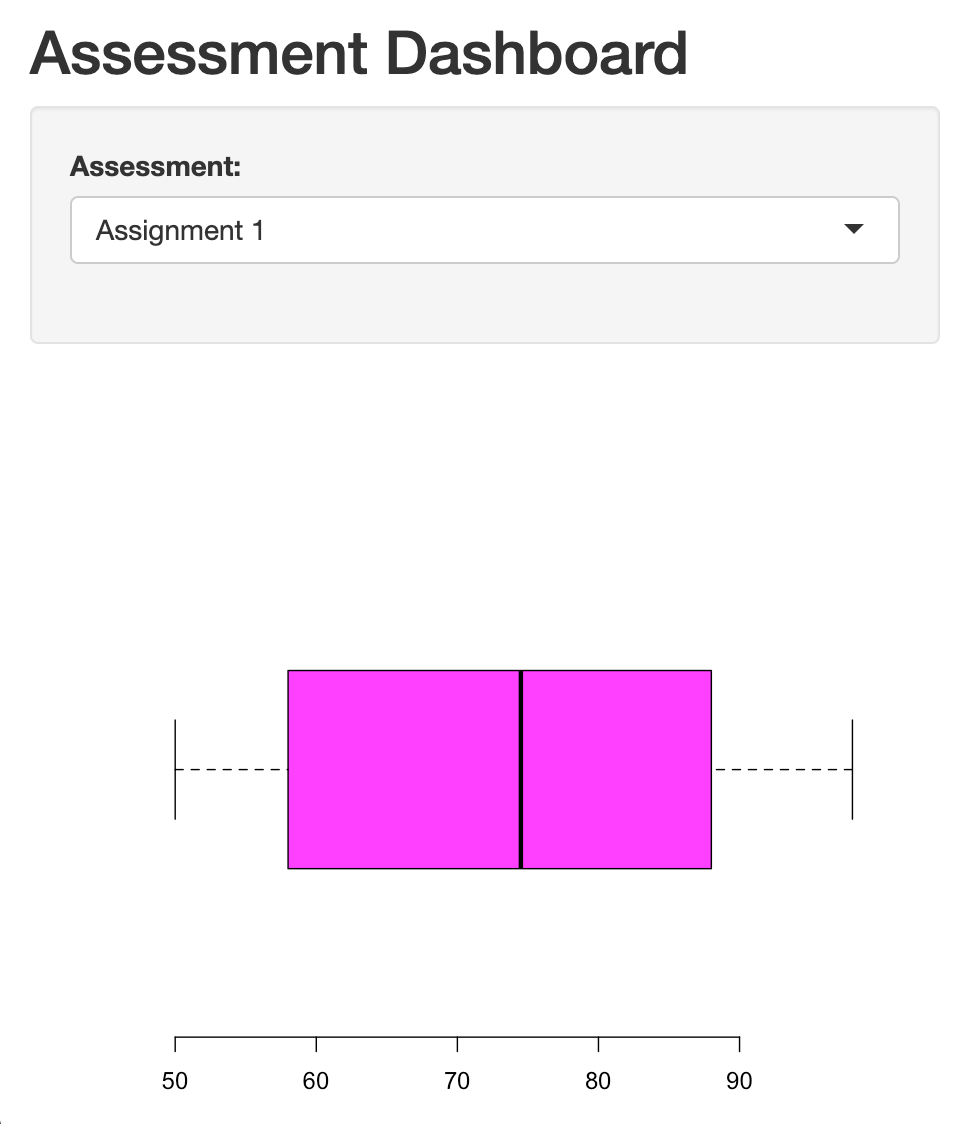
Figure 7.1: Shiny App Output
Data basics (see items 1a-1b) 1a. Import the data 1b. View the data
Build the output
Pre-process the data (see items 3a-3d) 3a. Filter out all assessments, except for assignments 3b. Determine the number of assignments in the data set 3c. Identify NA values 3d. Remove NA values
Determine how you would like to present the user interface(UI). For example, what type of layout will you use? Where will you place the filters and where will the output appear? How will you show the output as a boxplot?
Build the app using sidebarLayout and show the boxplot using plotOutput.
7.2 Exercise 7.2
Problem 1
- Revise the
nyuclassesapp to provide a default view of most recent distributions by most recent assignment due date using a ggplot boxplot.
Problem 2
- Revise app to include a selector by one or more students.
Problem 3
- Revise app to include a doughnut charts built with ggplot to show completion, late or incomplete assessments by assessment type.
7.3 Assignment 7
Identify your own data set and create a shiny app that allows the user to explore it (similar to the movie explorer).
Host the app on the shinyapps.io website.
Submit the URL to your published app.